rn-customizable-dialog
Simple and customisable dialog box component for react native which can be used for activity indicator, alert or any other kind of dialog.
SetUp
npm i rn-customizable-dialog
Usages
import { CustomDialog } from 'rn-customizable-dialog';
<CustomDialog
title='TITLE'
message='Message'
loading={this.state.loading}
action_required={this.state.action_required}
visible={this.state.visible}
onPress={()=> this.setState({ visible: false })}
onConfirm={() => this.onConfirmPressed()}
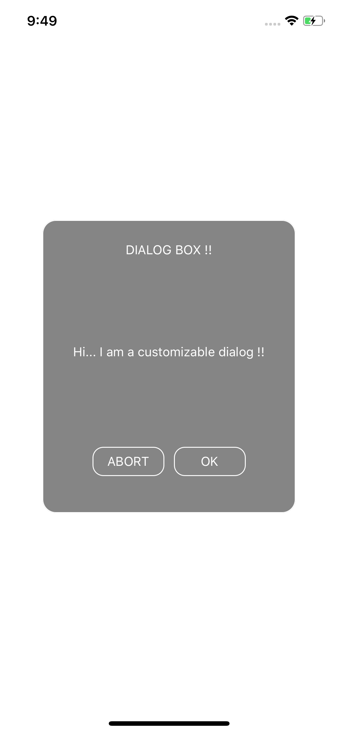
buttonPositiveTitle='OK'
buttonNegativeTitle='ABORT'
titleTextStyle={{ fontSize: 14, color: 'white' }}
buttonStyle={styles.buttonStyle}
buttonTextStyle={styles.buttonText}
bodyTextStyle={styles.dialogBodyText}
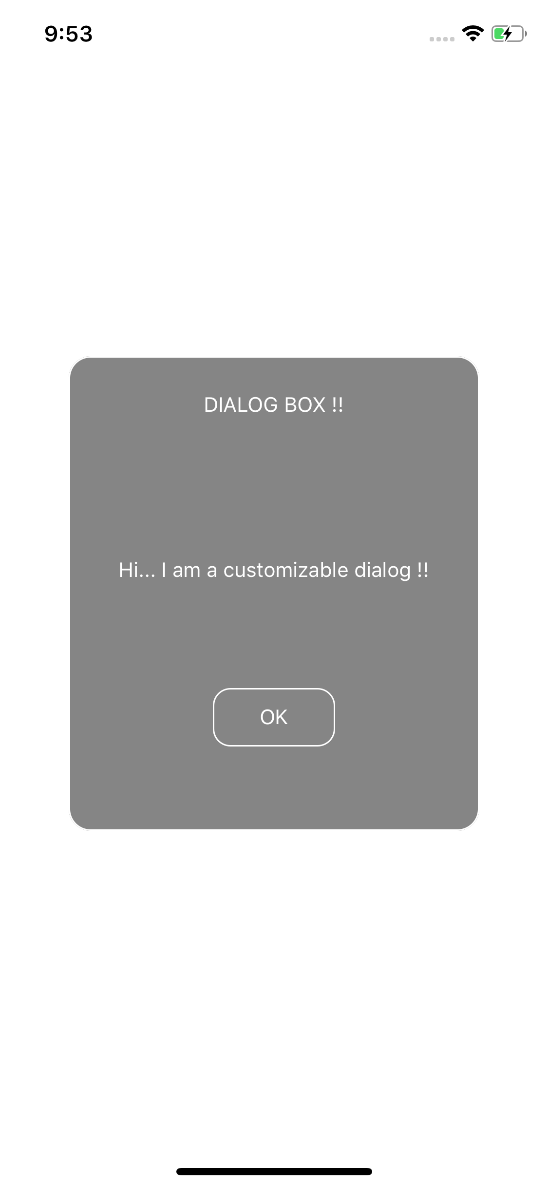
singleButtonTitle='OK'
/>`
Screenshots
Properties
| Prop | Type | default | Required | Note |
|---|---|---|---|---|
| visible | boolean | NA | Required | set to true to make the dialog visible |
| title | string | NA | Optional | title of the dialog |
| message | string | NA | Optional | content of the dialog |
| action_required | boolean | NA | Optional | When more than one button is required and any action to be performed by clicking the dialog box set this to true |
| onPress | function | NA | Required | To perform task on press of the single button or negative button |
| onConfirm | function | NA | Optional | Perform task onclick the positive button, use when action_required is true |
| buttonPositiveTitle | string | NA | Optional | Use when action_required is true |
| buttonNegativeTitle | string | NA | Optional | Use when action_required is true |
| titleTextStyle | object | NA | Optional | See example |
| buttonStyle | object | NA | Required | See example |
| buttonTextStyle | object | NA | Optional | See example |
| bodyTextStyle | object | NA | Optional | See example |
| singleButtonTitle | object | NA | Optional | See example, use when action_required is false |