rn-app-intro-screen
Easy-to-use yet very configurable app introduction slider/swiper
npm i rn-app-intro-screen --save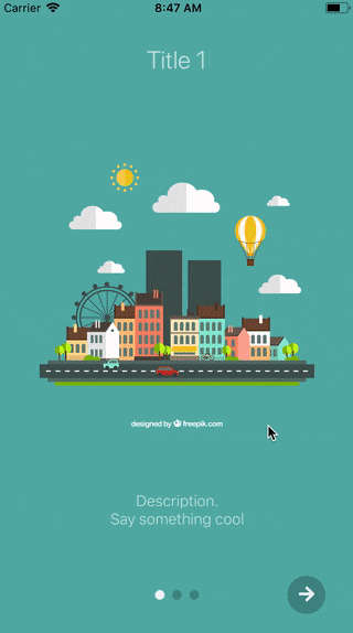 |
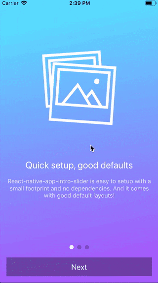 |
Table of contents
Usage
Basic example
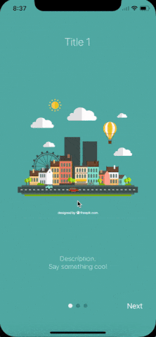
| No configuration | showSkipButton |
bottomButton and showSkipButton |
|---|---|---|
 |
 |
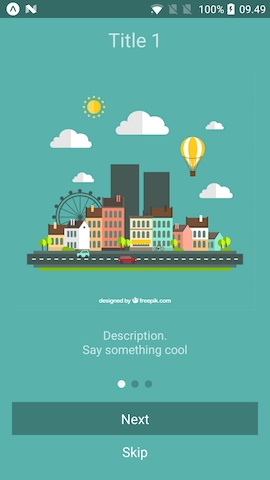 |
;;; const styles = StyleSheet; const slides = key: 'somethun' title: 'Title 1' text: 'Description.\nSay something cool' image: imageStyle: stylesimage backgroundColor: '#59b2ab' key: 'somethun-dos' title: 'Title 2' text: 'Other cool stuff' image: imageStyle: stylesimage backgroundColor: '#febe29' key: 'somethun1' title: 'Rocket guy' text: 'I\'m already out of descriptions\n\nLorem ipsum bla bla bla' image: imageStyle: stylesimage backgroundColor: '#22bcb5' ; Component thisstate = showRealApp: false { // User finished the introduction. Show real app through // navigation or simply by controlling state this; } { if thisstateshowRealApp return <App />; else return <AppIntro slides=slides onDone=this_onDone/>; }Configuring buttons
;;;; const styles = StyleSheet; // slides = [...] Component { return <View style=stylesbuttonCircle> <Ionicons name="md-arrow-round-forward" color="rgba(255, 255, 255, .9)" size=24 style= backgroundColor: 'transparent' /> </View> ; } { return <View style=stylesbuttonCircle> <Ionicons name="md-checkmark" color="rgba(255, 255, 255, .9)" size=24 style= backgroundColor: 'transparent' /> </View> ; } { return <AppIntro slides=slides renderDoneButton=this_renderDoneButton renderNextButton=this_renderNextButton /> ; }Custom slide layout
;;;;; const styles = StyleSheet; const slides = key: 'somethun' title: 'Quick setup, good defaults' text: 'rn-app-intro-screen is easy to setup with a small footprint and no dependencies. And it comes with good default layouts!' icon: 'ios-images-outline' colors: '#63E2FF' '#B066FE' key: 'somethun1' title: 'Super customizable' text: 'The component is also super customizable, so you can adapt it to cover your needs and wants.' icon: 'ios-options-outline' colors: '#A3A1FF' '#3A3897' key: 'somethun2' title: 'No need to buy me beer' text: 'Usage is all free' icon: 'ios-beer-outline' colors: '#29ABE2' '#4F00BC' ; Component <LinearGradient style=stylesmainContent paddingTop: propstopSpacer paddingBottom: propsbottomSpacer width: propswidth height: propsheight colors=propscolors start=x: 0 y: 1 end=x: 1 y: 1 > <Ionicons style= backgroundColor: 'transparent' name=propsicon size=200 color="white" /> <View> <Text style=stylestitle>propstitle</Text> <Text style=stylestext>propstext</Text> </View> </LinearGradient> ; { return <AppIntro slides=slides renderItem=this_renderItem bottomButton /> ; }Here a custom renderItem is supplied and the bottomButton-props has been set to true. Notice how the setup of slides has been configured to support icons and gradient backgrounds.
Props and options
The component extends FlatList so all FlatList-props are valid.
Configure looks
| Name | Type | Default | Description |
|---|---|---|---|
| skipLabel | string |
Skip |
Custom label for Skip button |
| doneLabel | string |
Done |
Custom label for Done button |
| nextLabel | string |
Next |
Custom label for Next button |
| prevLabel | string |
Back |
Custom label for Prev button |
| bottomButton | boolean |
false |
Enable to show a full-width button under pagination |
| buttonStyle | style |
null |
Styling of outer button component |
| buttonTextStyle | style |
null |
Styling of button text component |
| dotStyle | style |
{backgroundColor: 'rgba(0, 0, 0, .2)'} | Style of inactive pagination dots |
| activeDotStyle | style |
{backgroundColor: 'rgba(255, 255, 255, .9)'} | Style of active pagination dot |
| hidePagination | boolean |
false |
Enable to hide the pagination |
| renderNextButton | function |
renders a Text-component | Use to supply your own next button |
| renderPrevButton | function |
renders a Text-component | Use to supply your own prev button |
| renderDoneButton | function |
renders a Text-component | Use to supply your own done button |
| renderSkipButton | function |
renders a Text-component | Use to supply your own skip button |
| renderItem | function |
renders DefaultSlide |
Function returning a slide. The function is passed the slide object as wells as { topSpacer: Number, bottomSpacer: Number }. These show the "safe-space" where other UI is not interfering - take a look at DefaultSlide.js too see how they are set up. |
Configure behavior
| Name | Type | Default | Description |
|---|---|---|---|
| slides | object |
No default, required | An array of slide-objects |
| showSkipButton | boolean |
false |
Enable to show a skip button to the left of pagination dots. When bottomButton == true the skip button is a small text under the full-width next button |
| showPrevButton | boolean |
false |
Enable to show a previous button. If showSkipButton is true, the skip button will be displayed on the first page and prev button on subsequent one |
| hideNextButton | boolean |
false |
Enable to hide the next button |
| hideDoneButton | boolean |
false |
Enable to hide the done button |
| onSlideChange | function |
void |
Called when user goes changes slide (by swiping or pressing next/prev). Function called with arguments index: number, lastIndex: number |
| onDone | function |
void |
Called when user ends the introduction by pressing the done button |
| onSkip | function |
void |
Called when user presses the skip button |
slide object
Each slide object should contain at least a unique key. If you use the default layouts your object should furthermore contain:
| Name | Type | Note |
|---|---|---|
| title | string |
The title |
| titleStyle | Style-prop |
Styling for the title (e.g color, fontSize) |
| text | string |
Main text of slide |
| textStyle | Style-prop |
Styling for the text (e.g color, fontSize) |
| image | Image-source prop |
Slide image |
| imageStyle | Style-prop |
Styling for the image (e.g. size) |
| backgroundColor | string |
Slide background color |
If you use a custom renderItem-method you can design your slide objects as you see fit.
Example
You can run the example Expo-app by cloning the repo:
git clone https://github.com/asifvora/rn-app-intro-screen.gitcd rn-app-intro-screen/Exampleyarnyarn startQuestions?🤔
Hit me on 
License
Copyright (c) Asif Vora
Permission is hereby granted, free of charge, to any person obtaining a copy of this software and associated documentation files (the "Software"), to deal in the Software without restriction, including without limitation the rights to use, copy, modify, merge, publish, distribute, sublicense, and/or sell copies of the Software, and to permit persons to whom the Software is furnished to do so, subject to the following conditions:
The above copyright notice and this permission notice shall be included in all copies or substantial portions of the Software.
THE SOFTWARE IS PROVIDED "AS IS", WITHOUT WARRANTY OF ANY KIND, EXPRESS OR IMPLIED, INCLUDING BUT NOT LIMITED TO THE WARRANTIES OF MERCHANTABILITY, FITNESS FOR A PARTICULAR PURPOSE AND NONINFRINGEMENT. IN NO EVENT SHALL THE AUTHORS OR COPYRIGHT HOLDERS BE LIABLE FOR ANY CLAIM, DAMAGES OR OTHER LIABILITY, WHETHER IN AN ACTION OF CONTRACT, TORT OR OTHERWISE, ARISING FROM, OUT OF OR IN CONNECTION WITH THE SOFTWARE OR THE USE OR OTHER DEALINGS IN THE SOFTWARE.