


Webpack loader for composing sets (layers) of React components. It allows you to easily create themes and share entire component libraries. A couple of use-cases:
products
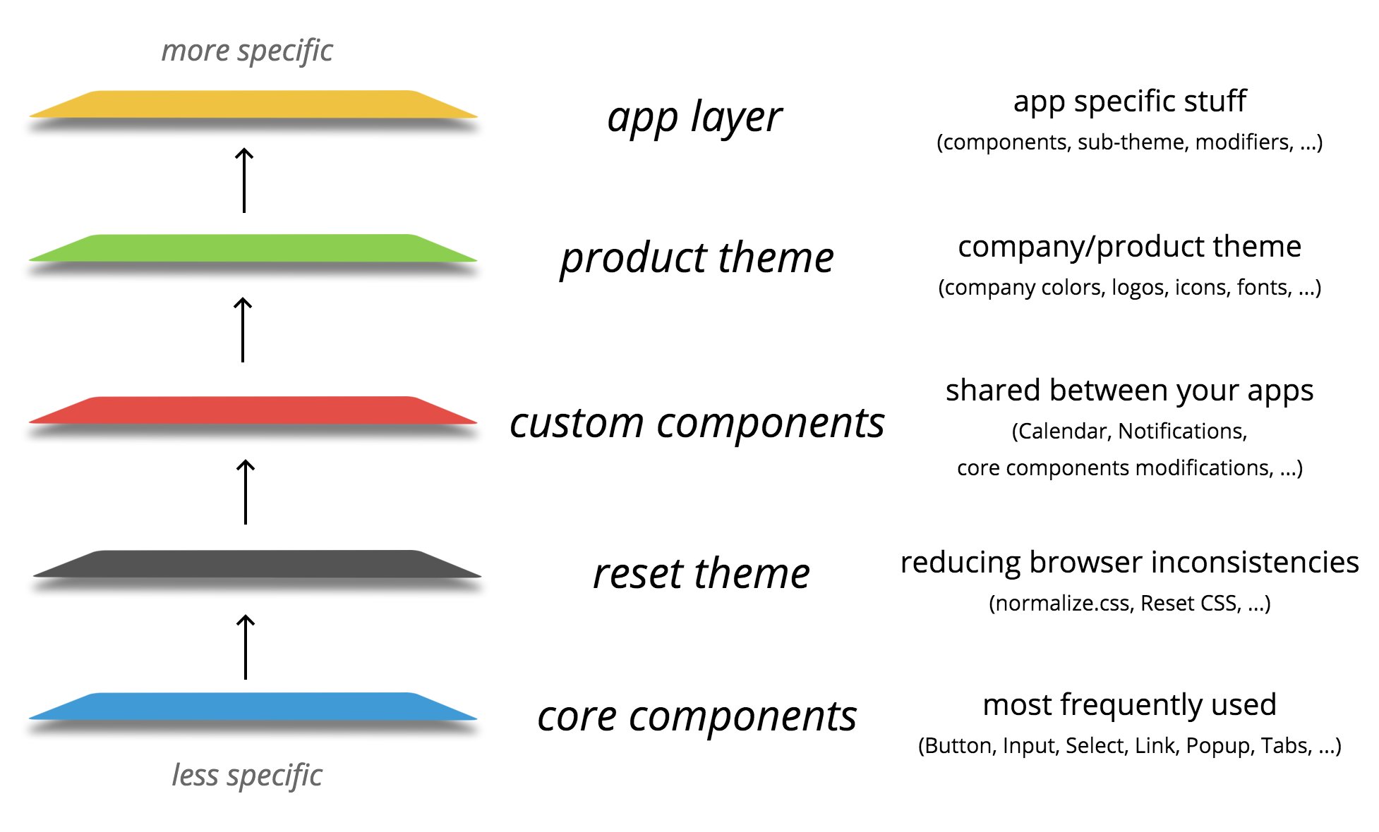
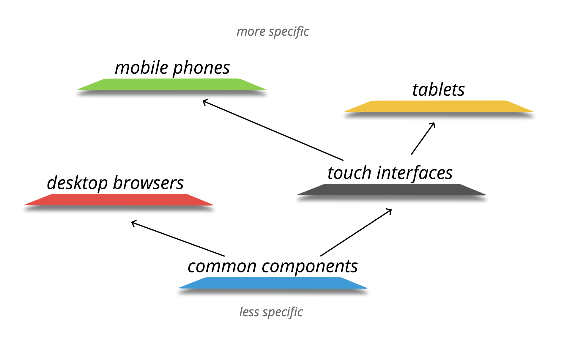
platforms
Usage
#
Components from layers are imported with a special #-character along with their styles. So instead of:
;;;you just write:
;It imports component from the nearest layer and styles from all layers.
With reBEM
Button is imported as factory (we just wrap it with React.createFactory(Button)), so we can use function calls instead of React.createElement(Button):
;;; { return }With JSX
Button is imported as is (see importFactory option in webpack config):
;; Component { return <div block="some-block"> <Button block="some-block" elem="button">'Click me'</Button>; </div> ; }Example
core-components
Initiate the component
.
└── core-components/
    └── button/
        └── index.js
Component {//...}}theme-reset
Reset browser specific styles
.
└── theme-reset/
    └── button/
        └── styles.less
custom-components
At some point we can extend our component in a separate layer. For example, add an icon to a button:
.
└── custom-components/
    └── button
        └── index.js
// import Button from 'core-components/button/index.js';// import from 'theme-reset/button/styles.less';; Component { /*...*/ } { return <Button ...thisprops> children this </Button> ; }product-theme
Now we may need to apply some theme styles:
.
└── product-theme/
    └── button/
        └── index.js
// import Button from 'custom-components/button/index.js';// import from 'theme-reset/button/styles.less';// import from './styles.less';; Component return <Button ...thisprops> children <div className="button-mask" /> </Button> ;.
└── product-theme/
└── button/
└── styles.less
.button // ... &__mask position: absolute; background: #f00; border: 2px solid #000; app
And finally we can use this button in our app with the optional local styles
.
└── app/
    └── somewhere.js
// import Button from 'product-theme/button/index.js';// import from 'theme-reset/button/styles.less';// import from 'product-theme/button/styles.less';// import from 'app/components/button/styles.less';; Component // ... return //... <Button icon="never-gonna-give-you-up.png" onClick=doStuff> 'Click me' </Button> //... ;Creating a layer
You can use any technologies in your layers (css-preprocessors, babel, etc.). A good practice in this case is to prebuild it, so consumer of your layer wouldn't have to do it for you. Some examples of prebuilded layers:
- core components with Babel
- theme-reset with LESS
folders structure
You can use any structure you want, the example below is just a guideline:
.
└── custom-layer/
    ├── index.js
    └── components/
        ├── button/
        │   ├── index.js
        │   └── styles.css
        ├── checkbox/
        ├── input/
        │   ├── index.js
        │   └── styles.css
        ├── radio/
        └── ...
layer config
Consumers of your layer need to know how to work with it, so a good practice is to create a layer config like this:
// custom-layer/index.jsvar path = ; moduleexports = path: path files: main: 'index.js' styles: 'styles.css' importFactory: true;path
Path to the components folder (it can be named components, lib, src, build, whatever).
files
File names to use when importing components from this layer.
main— component source: it can be optional if you are creating just css-themestyles— component styles: always optional. You can have entire layer (theme) made only with styles. But actually you can extend your components in themes too — for example if you want to add some presentation element in children (like we did in theButtonexample above)
importFactory
If you use #-requires inside your layer, it's better to specify if you use factories there or not. For more details please see the importFactory option below.
Webpack config
In your app you need to configure how layers should be composed, where you app components are, etc. Example:
// ... preLoaders: test: /\.js$/ loader: 'rebem-layers' query: layers: // shared layers // app components path: path files: main: 'index.js' styles: 'styles.less' // app source consumers: path // ...layers
Array of layer configs. If some layers already have config, you can just import it.
consumers
Array of paths where you want to use (consume) components from the layers (with #-imports). For example, files outside your app component folder or in a unit-tests folder.
importFactory
default: true
By default when you use #-imports, all components are importing wrapped with React factories (React.createFactory(...)), but you can disable it by setting this option to false.
However if you chose to leave it as true, for example if you use reBEM without JSX, you may encounter with a situation when you need class in unit-tests. In this case you can use ?class option:
; ;inject
default: false
If you want to mock dependencies of your components for unit-tests, set this option to true. It will allow you to do this:
// `inject` option in import path makes component injectable; const App = ; TestUtils;// ... testsYou can use inject along with ?class-option as well:
// injectable component imported as React class;