
React Tiny Feature Switch
🚗 A feature-packed, tiny (~650B), fast React Feature Toggle
This project uses React Hooks, so you need at least React version 16.8
Features
- It's small, so it won't take up your size budget (~650B)
- Tree-shakable so you only bundle what you use
- Define features using a JS object or external JSON file
- Toggle features using URL Query Parameters, e.g., http://domain.com?someFeature=true
- Comes with a dev mode Toggler that allows for easily toggling of features (toggle via URL Query)
- Conditionally render components if a feature is not enabled
- Written in TypeScript so you get good autocompletion
Installation
npm i react-tiny-feature-switch or yarn add react-tiny-feature-switch
Example
The left side of the example is the rendered code. The right side is the actual code used to render the left side. https://dericgw.github.io/react-tiny-feature-switch
Usage
Here is the basic gist of how to use it...
// features.json // The shape of the features object must be like so... [string]: boolean{ "avatar": false, "profile": true}// index.js; // Could be a JS file const App = <Features features=features> <OtherAppStufff /> </Features>; // profile.js; const Profile = <div> // See if the "avatar" feature is available <FeatureSwitch feature="avatar"> <img src="/users-profile-pic.png" alt="Profile Pic" /> // If the "avatar" is not available, then render something Else <Else> <img src="/generic-avatar-image.png" alt="Avatar" /> </Else> </FeatureSwitch> </div>;Components
<Features />
This is the Provider component that uses React Context in order to pass the props down to the other
components. It only has one prop, features, which takes an object of features whose key is the
feature name and value is a boolean. This component should be close to the root component so that
all of the child components have access to the provided props.
Props
| Name | Type | Default Value | Required | Description |
|---|---|---|---|---|
features |
Object { [string]: boolean } |
{} |
true | This is an object of features that the app will have and it should be in the form of { featureName: true } (or, false if the feature is disabled) |
<FeatureSwitch />
This component will wrap the features that are being worked on and either show them or hide them if
the feature is enabled, or disabled. The <FeatureSwitch /> component accepts two props, a feature
prop and children props. The feature prop is a string or string[] (array of strings). If the
string that is passed in is true in the features object, which is passed into the <Features />
component, the child components will be displayed.
If an array of strings are passed in, they will both need to be true in order
for the feature to be enabled. This could be useful for versioning the app. For instance, if your
are working on v1.1, then all of the features that are related to v1.1 could be set to true in
the features object. Also in that features object, there could be a v1.1 feature that is set to
true as well. Now, you do something like this: <FeatureSwitch feature={['profile', 'v1.1']} />.
If you want to hide all of the v1.1 features (maybe you need to do a hotfix), you can set the
v1.1: false in the features object, and none of the v1.1 features will be displayed.
The children prop is any React type node.
Props
| Name | Type | Default Value | Required | Description |
|---|---|---|---|---|
feature |
string |
true | This is the feature that will be either "on" or "off", depending on whether it is true or false in the features object of the <Features /> component. |
|
children |
React.ReactNode |
true | This is the component or components that will be rendered if the feature is enabled. |
<Else />
Sometimes it will be necessary to render parts of the UI when a feature is disabled - this is the job
of the <Else /> component. The <Else /> component should be a child to the <FeatureSwitch />
component. Check it out...
<FeatureSwitch feature="avatar"> <img src="/users-profile-pic.png" alt="Profile Pic" /> // If the "avatar" is not available, then render something Else <Else> <img src="/generic-avatar-image.png" alt="Avatar" /> </Else></FeatureSwitch>NOTE: The
<Else />component will not work if it is not a child of the<FeatureSwitch />component
Props
| Name | Type | Default Value | Required | Description |
|---|---|---|---|---|
children |
React.ReactNode |
true | This is the component or components that will be rendered if the parent feature, in the <FeatureSwitch />, is disabled. |
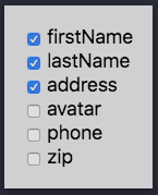
<FeatureToggler />
The <FeatureToggler /> is a helper component that easily allows a dev or QA engineer to toggle
features on and off. Just add the <FeatureToggler /> component to the app and you will notice a
div (bottom, right corner) with a checkbox for each feature is rendered in the app. The value of the
checkbox will reflect the features object of the <Features /> component. Here is what it looks
like:
NOTE: It is a good idea to conditionally render the
<FeatureToggler />component so that your production build does not include it.
The <FeatureToggler /> accepts one props - alwaysShow, which is a boolean. If this is set to
true, the <FeatureToggler /> will always be displayed. If this prop is not present, or set to
false, then the <FeatureToggler /> will only be shown if a URL Query param of featureToggler is
present in the URL, e.g., http://localhost?featureToggler=true
URL Query Params
You can pass query params in the URL to override a feature's state (enabled or disabled). If you
want to enable a feature, you can pass true or 1. Anything else will evaluate to false. For
instance:
http://localhost?firstName=true&lastName=1&profile=false&address=foobar
In the case above, here is the final evaluation:
firstName: truelastName: trueprofiletName: falseaddress: false
NOTE: The URL Query param values will override what is passed in to the
featuresobject.
Contributing
More on this very soon...
Issues
Open up an issue if you find one. If you can provide a reproduction, then please do. You can use codesandbox.io for this.