react-thailand-address-autocomplete
Autocomplete Thailand address input component for React.js
Insallation
yarn
yarn add react-thailand-address-autocomplete
npm
npm install --save react-thailand-address-autocomplete
Basic Usage
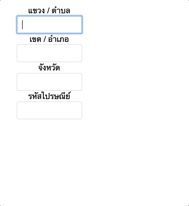
{ this } { const subdistrict district province zipcode = fullAddress this } { return <div> แขวง / ตำบล <InputAddress address="subdistrict" value=thisstatesubdistrict onChange=thisonChange onSelect=thisonSelect /> เขต / อำเภอ <InputAddress address="district" value=thisstatedistrict onChange=thisonChange onSelect=thisonSelect /> </div> ; }Props
address: String
-
Type of input address, including
subdistrict,district,province, andzipcode. -
Default value:
subdistrict
value: String
- The input content value.
onChange: Function(event)
- The callback function that is triggered when the input content is changed.
onSelect: Function(fullAddress)
- The callback function that is triggered when an autocomplete suggestion item is selected.
fullAddressis an object of full address.
filter: Function(items)
- The callback function that is triggered before suggestion items rendered.
itemsis an array of suggestion items.
<InputAddress address="province" value=thisstateprovince onChange=thisonChange onSelect=thisonSelect filter= items/>delimiter: String
-
The delimiter in autocomplete suggestion items that separate each part of address.
-
Default value:
,
placeholder: String
- Placeholder of the input.
highlight: String
-
Highlight color of an autocomplete suggestion item when a cursor on.
-
Default value:
#eee
unhighlight: String
-
Color of an autocomplete suggestion item when no cursor on.
-
Default value:
white
style: Object
- Inline style to apply to the input.
renderStyle: Object
- Inline style to apply to the box of autocomplete suggestion items.
Original idea
License
MIT