React Tag Custom


React Tag Custom is a simple tagging component ready to drop in your React projects. Orininally based on The React Tags project by Prakhar Srivastav this version removes the drag-and-drop functionality.
Installation
The preferred way of using the component is via NPM
npm install --save react-tag-custom
Usage
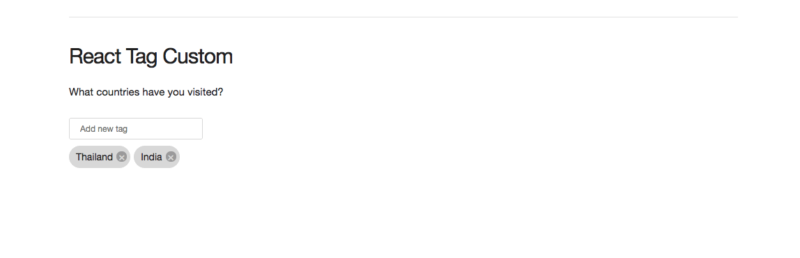
Here's a sample implementation that initializes the component with a list of initial tags and suggestions list. Apart from this, there are multiple events, handlers for which need to be set. For more details, go through the API.
;;; const KeyCodes = comma: 188 enter: 13; const delimiters = KeyCodescomma KeyCodesenter; Component { superprops; thisstate = tags: id: "Thailand" text: "Thailand" id: "India" text: "India" suggestions: id: 'USA' text: 'USA' id: 'Germany' text: 'Germany' id: 'Austria' text: 'Austria' id: 'Costa Rica' text: 'Costa Rica' id: 'Sri Lanka' text: 'Sri Lanka' id: 'Thailand' text: 'Thailand' ; thishandleDelete = thishandleDelete; thishandleAddition = thishandleAddition; thishandleDrag = thishandleDrag; } { const tags = thisstate; this; } { this; } { const tags suggestions = thisstate; return <div> <ReactTags tags=tags suggestions=suggestions handleDelete=thishandleDelete handleAddition=thishandleAddition delimiters=delimiters /> </div> }; ReactDOM;Options
tagssuggestionsdelimitersplaceholderlabelFieldhandleAdditionhandleDeletehandleFilterSuggestionshandleTagClickautofocusallowDeleteFromEmptyInputhandleInputChangehandleInputFocushandleInputBlurminQueryLengthremoveComponentautocompletereadOnlynameidmaxLengthinline
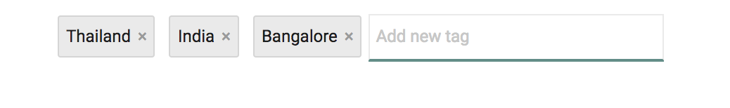
tags (optional)
An array of tags that are displayed as pre-selected. Each tag should have an id and text property which is used to display.
const tags = id: "1" text: "Apples" suggestions (optional)
An array of suggestions that are used as basis for showing suggestions. At the moment, this should be an array of strings.
const suggestions = id: "mango" text: "mango" id: "pineapple" text: "pineapple" id: "orange" text: "orange" id: "pear" text: "pear" ;delimiters (optional)
Specifies which characters should terminate tags input (default: enter and tab). An array of character codes.
const Keys = {
    TAB: 9,
    SPACE: 32,
    COMMA: 188,
};
<ReactTags
    delimiters: [Keys.TAB, Keys.SPACE, Keys.COMMA]
 />
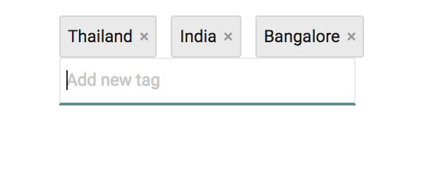
placeholder (optional)
The placeholder shown for the input. Defaults to Add new tag.
let placeholder = "Add new country"
labelField (optional)
Provide an alternative label property for the tags. Defaults to text.
<ReactTags
    tags={tags}
    suggestions={}
    labelField={'name'}
    handleDrag={}
 />
This is useful if your data uses the text property for something else.
handleAddition (required)
Function called when the user wants to add a tag (either a click, a tab press or carriage return)
{ // add the tag to the tag list}handleDelete (required)
Function called when the user wants to delete a tag
{ // delete the tag at index i}handleFilterSuggestions (optional)
To assert control over the suggestions filter, you may contribute a function that is executed whenever a filtered set of suggestions is expected. By default, the text input value will be matched against each suggestion, and [those that start with the entered text][default-suggestions-filter-logic] will be included in the filters suggestions list. If you do contribute a custom filter function, you must return an array of suggestions. Please do not mutate the passed suggestions array.
For example, if you prefer to override the default filter behavior and instead match any suggestions that contain
the entered text anywhere in the suggestion, your handleFilterSuggestions property may look like this:
{ var lowerCaseQuery = textInputValue return possibleSuggestionsArray}Note: The above custom filter uses String.prototype.includes, which was added to JavaScript as part of the ECMAScript 7
specification. If you need to support a browser that does not yet include support for this method, you will need to
either refactor the above filter based on the capabilities of your supported browsers, or import a polyfill for
String.prototype.includes.
handleTagClick (optional)
Function called when the user wants to know which tag was clicked
{ // use the tag details at index i}autofocus (optional)
Optional boolean param to control whether the text-input should be autofocused on mount.
<ReactTags autofocus=false ...>allowDeleteFromEmptyInput (optional)
Optional boolean param to control whether tags should be deleted when the 'Delete' key is pressed in an empty Input Box.
<ReactTags allowDeleteFromEmptyInput=false ...>handleInputChange (optional)
Optional event handler for input onChange
<ReactTags handleInputChange=thishandleInputChange ...>handleInputFocus (optional)
Optional event handler for input onFocus
<ReactTags handleInputFocus=thishandleInputFocus ...>handleInputBlur (optional)
Optional event handler for input onBlur
<ReactTags handleInputBlur=thishandleInputBlur ...>minQueryLength (optional)
How many characters are needed for suggestions to appear (default: 2).
removeComponent (optional)
If you'd like to supply your own tag delete/remove element, create a React component and pass it as a property to ReactTags using the removeComponent option. By default, a simple anchor link with an "x" text node as its only child is rendered, but if you'd like to, say, replace this with a <button> element that uses an image instead of text, your markup may look something like this:
The "ReactTags__remove" className and onClick handler properties can be automatically included on the <button> by using the JSX spread attribute, as illustrated above.
autocomplete (optional)
Useful for enhancing data entry workflows for your users by ensuring the first matching suggestion is automatically converted to a tag when a delimiter key is pressed (such as the enter key). This option has three possible values:
true- when delimeter key (such as enter) is pressed, first matching suggestion is used.1- when delimeter key (such as enter) is pressed, matching suggestion is used only if there is a single matching suggestionfalse(default) - tags are not autocompleted on enter/delimiter
This option has no effect if there are no suggestions.
readOnly (optional)
Renders the component in read-only mode without the input box and removeComponent. This also disables the drag-n-drop feature.
name (optional)
The name attribute added to the input.
<ReactTags
    name = "inputName"
    ...>
id (optional)
The id attribute added to the input.
<ReactTags
    id = "inputId"
    ...>
maxLength (optional)
The maxLength attribute added to the input. Specifies the maximum number of characters allowed in the input field.
<ReactTags
    maxLength = "42"
    ...>
inline (optional)
The inline attributes decides whether the input fields and selected tags will be rendered in-line.
<ReactTags
    inline
    ...>
<ReactTags
    inline={false}
    ...>
Styling
<ReactTags> does not come up with any styles. However, it is very easy to customize the look of the component the way you want it. By default, the component provides the following classes with which you can style -
ReactTags__tagsReactTags__tagInputReactTags__tagInputFieldReactTags__selectedReactTags__selected ReactTags__tagReactTags__selected ReactTags__removeReactTags__suggestionsReactTags__activeSuggestion
An example can be found in /example/reactTags.css.
If you need to set your own class names on the component, you may pass in
a classNames prop.
<ReactTags classNames= tags: 'tagsClass' tagInput: 'tagInputClass' tagInputField: 'tagInputFieldClass' selected: 'selectedClass' tag: 'tagClass' remove: 'removeClass' suggestions: 'suggestionsClass' activeSuggestion: 'activeSuggestionClass' ...>Dev
The component is written in ES6 and uses Webpack as its build tool.
Set up instructions
git clone git@github.com:wharley/react-tags.git
cd react-tags
npm install
npm run precommit
npm run start
Contributing
Got ideas on how to make this better? Open an issue!