
React styled toggle
React Toggle component written in TypeScript and powered by styled-components.
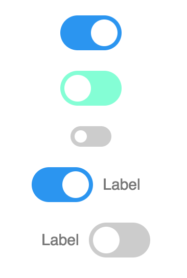
Demo
Installation
yarn add react-styled-toggle
Usage
import Toggle from 'react-styled-toggle';

render(){
	return <Toggle />
}
Development
yarn storybook
Build
yarn build
Props
| property | propType | required | default | description |
|---|---|---|---|---|
| checked | bool | - | - | |
| disabled | bool | - | - | |
| onChange | func | - | - | |
| backgroundColorChecked | string | - | "'#2193F3'" | |
| backgroundColorUnchecked | string | - | "'#ccc'" | |
| backgroundColorButton | string | - | "'#fff'" | |
| name | string | - | - | |
| value | string | - | - | |
| labelRight | string | - | - | |
| labelLeft | string | - | - | |
| sliderWidth | number | - | "26" | |
| sliderHeight | number | - | "26" | |
| width | number | - | "60" | |
| height | number | - | "34" | |
| translate | number | - | "26" |