React Store Locator
If you find any bugs/issues please tag me in them :D. Also feel free to recommend something you want or do a PR and inlcude a demo or testing of some sort and I'll accept it. Try not to break the main func of the module though.
Newest features will be added to the bottom of the readme for now. If you would like to re-write and update readme please let me know. Demos also need to be updated as well. I believe there are issues in the github if you wish to tackle them just do a PR :D.
Demo
Short Description
This module is used for when you have a list of stores/locations that you wish to put on a map and show information about each store/location.
Getting started
yarn add react-store-locator npm install --save react-store-locatorMake sure you have yarn installed if you wish to use it
Usage
Basic
import Map from 'react-store-locator'; { const locations = id: 1 lat: 50 lng: 251 show: false name: 'First Marker' id: 2 lat: 50 lng: 252 show: true name: 'Second Marker' id: 3 lat: 50 lng: 253 show: true name: 'Third Marker' return <Map = =/> // Pass google maps api key through here }Note: The map seems to work without a key ( you will get a warning ). Without a key you also may recieve less request than with a key. This is up to you.
Default map:
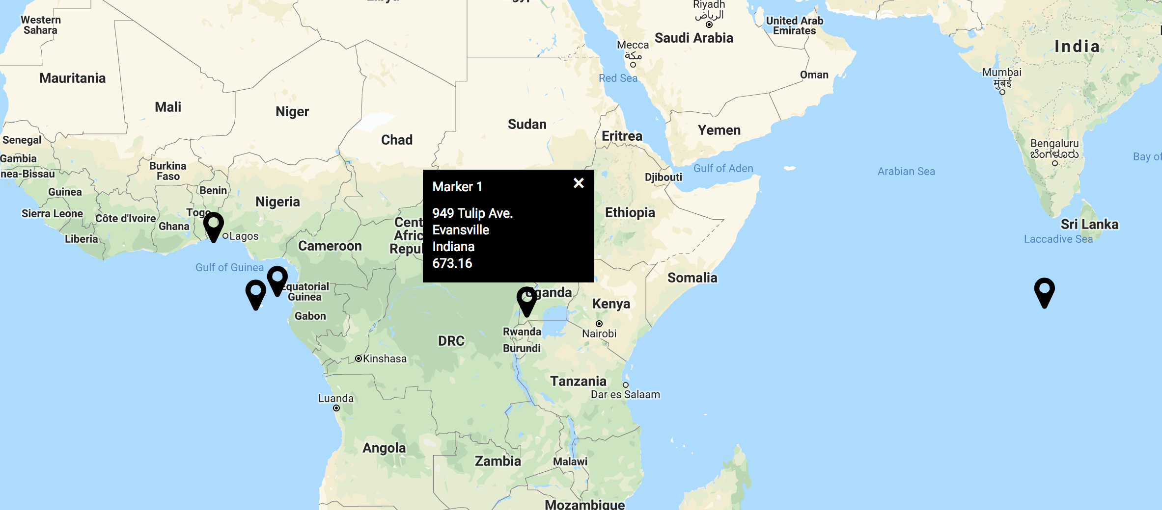
This will show a map with default markers and default info windows.
You will need to include all of these props for a minimum for each of your stores/locations. If you wish your information to show by default then set show to true otherwise set show to false.
By default the map will have a height of 800px and width of 100%. You can change these by passing through these values as props.
//...<Map = =>Start customizing
You can add your own custom pin and information window. Examples below.
Pin
Adding your own pin is super easy and with little set up you can have an awesome looking pin.
UPDATE: I ran into a problem in react when needing to pass down local props to my pin. In order to tackle this I added an update to let you pass an object instead of just the pin component (see below). In your component you should just be able to now use those local props with either props.pinProps or this.props.pinProps depending if you are using a class based component or functional based component.
We will pass through a function called handleLocationClick through props. If you wish to use the toggle feature for the Info window you will want to attach this to the parent element of your pin. If you wish for only a certain part of your pin to work then add it to that element. Make sure you pass through the id so the correct window will be toggled.
You will also need to pass through the children through the inside of your component, this way you can render the Info component. Style this component however you like or add an image instead.
Make sure you include the function handleLocationClick and pass through id.
Note: If you are using a class based component then you will use this.props... instead.
//...const myPin = props <div = = > propschildren </div> <Map = => // With pin props <Map = =>Custom Pin:
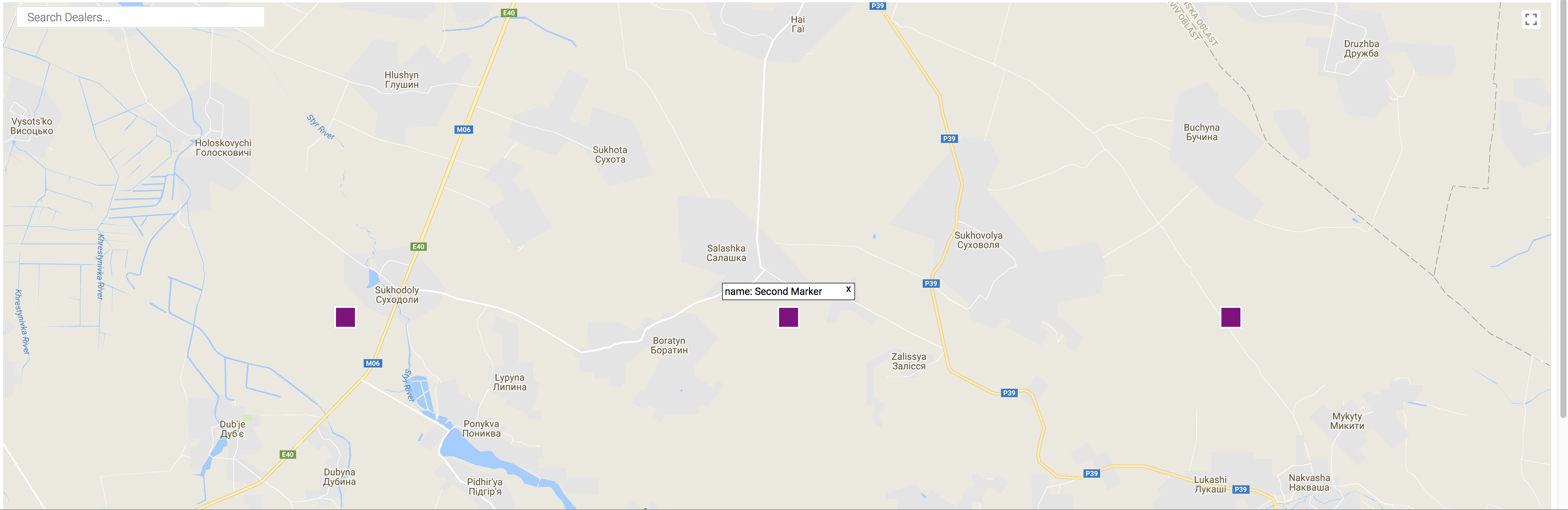
Info
import Info from 'react-store-locator' //... return <Map => location closeLocation return <Info => <div => locationname <div =>x</div> </div> </Info> </Map>closeLocation is a function that you must call on whatever you wish to close the Info window. Above we wrap [x] inside a div and apply an onClick to this div. When you click this it will close the Info window. We recommend adding a style of cursor: pointer to this element as well to make it more obvious that it does close the Info window.
You must pass show prop through the Info component if you want your info window to work correctly. Pass any jsx through the Info tag and it will be displayed. There you can style this however you wish.
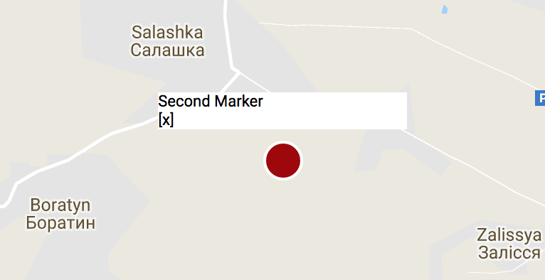
Without any styles:
With styles:
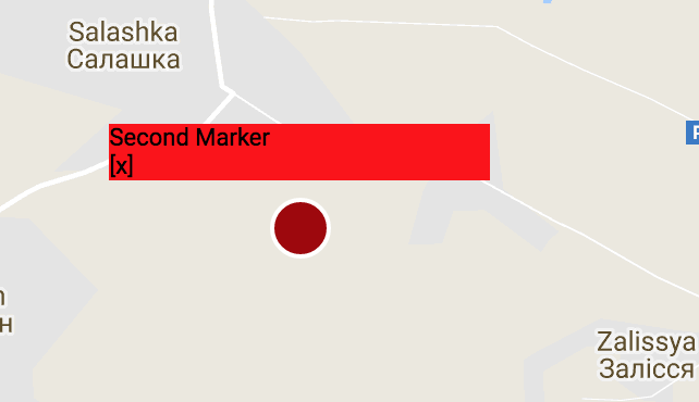
If you want to change the size of the window itself please pass through a style object through as a prop into Info. The style prop of the Info window will take three props.
//...const infoStyle = width: '150px' height: '30px' backgroundColor: 'yellow' <Info = =>// Content here</Info> // If not using custom Info component <Map = = />Other Features included
Search
There will be a custom search bar to search your map. This will recenter and zoom the map to what location you search. It will place a google marker, that you can customize how you like, on your current location.
Note: on map load there will not be a current location marker until you search, also when you search a new location your old marker will disappear.
Custom Search
As of version 0.5.0 there will now be a Search component you can bring in. This will allow you to have your own input and call it anywhere in your project. It should have the autocompletion and once searched update your map as well.
There are two props you can pass through: style, placeholder. The style prop passes through a react style object and placeholder takes a string. The className is storeLocatorSearchInput if you wish to use pure css instead.
import Search from 'react-store-locator'; //...{ return <div> <Map // /> <Search = = /> </div> }Initial map location (position and zoom)
By default the map is initially centered on provided locations or at default location Default map location if none given.
This can be overriden by setting by three different props, listed by precedence :
initialCenter(object withlatandlng) &initialZoom(number)initSearch(any search string)place(Google Maps API Place PlaceResult).
<Map = =<Map =><Map =>Note: when using initSearch prop there will be a delay between the map is rendered at desired location, due to the Google API load time and the Google PlacesService response time (used to get location from search string). In the meantime map will be centered on provided locations or at default location if none given.
Default map location
If inital map location is not set (via one of the 3 methods above) and no locations are given, map will be centered on defaultCenter at defaultZoom.
<Map = =>default values are defaultCenter: { lat: 0, lng: 180 } and defaultZoom: 8.
Adding Map styles
You can pass through map style like so:
<Map = />This uses a JSON object from https://mapstyle.withgoogle.com/. You can go here and copy and paste this through the mapStyle prop.
Adding custom google map Icons or customizing the default Icon
//... <Map=>Note: If you include both an icon, icon will render first. If no props are passed it will default to the default marker.
The icon takes an image url. You can also pass a local image through if you just import it like so:
import image from '../img/myimage.png';//... <Map =With custom image:
The customIcon is google's default icon, but you can change the color, and path. If you do not include one of these props then it will have a default so do not worry.
(From a stackoverflow post about this topic) You can also create the paths using a visual tool like https://inkscape.org/en/ (GNU-GPL, multiplatform). Some useful hints:
- Google API just accepts a single path, so you have to turn any other object (square, cercle...) into a path and join them as a single one. Both commands at the Path menu.
- To move the path to the (0,0), go to the Path Edit mode (F2) select all the control nodes and drag them. Moving the object with F1, won't change the path node coords.
- To ensure the reference point is at (0,0), you can select it alone and edit the coords by hand on the top toolbar.
- After saving the SVG file, which is an XML, open it with an editor, look for the svg:path element and copy the content of the 'd' attribute.
With custom icon:
Grabing stores/locations within window
This is a feature that is very useful when wanting to get information about the locations in your current window.
You will pass through a function through the onChange props and pass through locations as param. The function will be called on map load and any other time you move the map.
Note: If you cover part of your map this will still count markers that you may end up covering. If this is the case, it would be best to resize your map instead.
New feature for this "feature"
The returned stores/locations now will have a distanceFromCenter prop that will tell you the distance in miles they are from the center of your map. This way you can tell your user how far each store/location is.
//... { console // locations inside of current window} <Map =>Autocomplete Input
This will not update the map at all. This input is strictly for returning a location object and having google's autocomplete functionality.
All the props are listed below. You can also use pure css to style if you wish by targeting the class storeLocatorAutocomplete.
customOptions can be used to set custom options, check google Autocomplete doc for available options.
Note: This is a seperate component from the map so you should pass your api key in here as well if you wish to use this.
import AutoComplete from 'react-store-locator'; { console // place object returned} { return <div> <AutoComplete = = = ="My placeholder string" /> </div> }Control results returned on search
customOptions prop can be used on Map, Search and AutoComplete component to customize the results returned by Google in the search fields, check google Autocomplete doc for available options.
Example with AutoComplete to display only results from France :
import AutoComplete from 'react-store-locator'; { console // place object returned} { return <div> <AutoComplete = = = ="My placeholder string" = /> </div> }Center Marker on Move
This will put a marker in the center of the map when you move the map. If no props are passed it will default to the default marker.
//... <Map=>Submit search function for search callback
This will allow you to pass a function that will be called after a place has been found by the internal search that comes with the map.
//... { console; // should fire off once a new location has been found}<Map =>Map Loaded callback
This function is called when the map has finished loading.
//... <Map =>Tiles Loaded callback
This function is called when the visible tiles are rendered.
//... <Map =>Cluster Markers
default clusters:
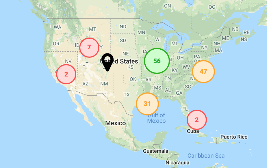
This one is pretty simple to do as you already have almost all the knowledge of what to do. You will simply pass an object through the prop cluster and yes you can use your own react component for each of the clusters. There is a default however if you choose to opt that direction. Below is an example.
<Map = // // = //.../>If you choose to not go with the default (I would recommend creating your own cluster pin), then you will have to create a react comp and do a tiny bit of maintence to get the map to work correctly. I will break everything down so there are no loose ends.
import React from 'react' // Note this could be a class based comp or func comp// I do believe react is going away from class based comp so we will use a func comp for this one const point_count // amount of points in a cluster getZoom // func to access the updated zoom of the cluster once clicked cluster_id // cluster_id needed to pass to getZoom lat lng updateMap // func to update the map pinProps // props passed to the comp by user = props console // ==> will return {prop: `value`} const size = point_count > 30 ? `large` : point_count > 20 ? `medium` : `small` // changing style of cluster const styles = cluster: cursor: `pointer` borderRadius: `50%` large: background: `#ccffcc` border: `2px solid #00b200` color: `#00b200` height: `45px` width: `45px` medium: background: `#ffedcc` border: `2px solid #ffa500` color: `#ffa500` height: `40px` width: `40px` small: background: `#ffdbdb` border: `2px solid #ff4c4c` color: `#ff4c4c` height: `35px` width: `35px` pointCount: position: `relative` top: `50%` transform: `translateY(-50%)` textAlign: `center` fontWeight: `600` return <div = = > <div =>point_count</div> </div> }Map Options
<Map mapOptions= ...anyGoogleMapOptions />