
react-spring-3d-carousel
A 3D Carousel component for images built with React and utilizing react-spring for controlling slide transitions. It's primarily meant to be controlled via the goToSlide prop but I also provided a showNavigation prop if you don't feel like making your own navigation.
This should go without saying, but if you use this component make sure to test it for performance and compatability with your target browsers.
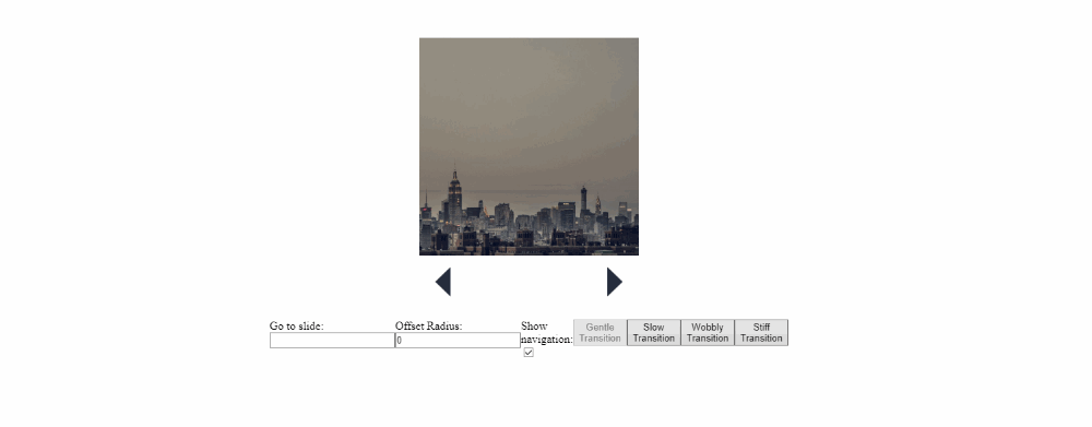
Example

Installation and usage
Install it via npm:
npm i react-spring-3d-carousel
or yarn:
yarn add react-spring-3d-carousel
Then import the Carousel component like so :
import Carousel from 'react-spring-3d-carousel';
The only thing this component needs to run is an array of slides, which are objects with a unique key property and a content property containing an image instance :
const slides = [
  {
    key: uuidv4(),
    content: <img src="https://picsum.photos/800/800/?random" alt="1" />
  },
  {
    key: uuidv4(),
    content: <img src="https://picsum.photos/800/800/?random" alt="2" />
  },
  {
    key: uuidv4(),
    content: <img src="https://picsum.photos/600/800/?random" alt="3" />
  },
  {
    key: uuidv4(),
    content: <img src="https://picsum.photos/800/500/?random" alt="4" />
  },
  {
    key: uuidv4(),
    content: <img src="https://picsum.photos/800/800/?random" alt="5" />
  },
  {
    key: uuidv4(),
    content: <img src="https://picsum.photos/500/800/?random" alt="6" />
  },
  {
    key: uuidv4(),
    content: <img src="https://picsum.photos/800/600/?random" alt="7" />
  },
  {
    key: uuidv4(),
    content: <img src="https://picsum.photos/800/800/?random" alt="8" />
  }
];

...

<Carousel slides={slides} />
And you're all set. You can also use props for better control of how the carousel looks and behaves:
Props
| Name | Default value | Description |
|---|---|---|
| slides | --- | An array containing elements of the form { key, content } where key holds any unique value and content holds a reference to a JSX <img /> to be displayed |
| goToSlide | null |
Setting this prop will cause the carousel to animate towards the provided index in the slides array. If showNavigation is set to false this prop is how you're expected to control the carousel. |
| offsetRadius | 2 |
Number of carousel elements to display to the sides of the current slide, this value is clamped between 1 and Math.floor(slides.length/2), and defaults to 2 when it's possible (if there are enough slide elements). |
| animationConfig | { tension: 120, friction: 14 } |
A config object passed to the slides' Spring element to control the nature of their animation, for more information check the react-spring docs. |