
React simple image zoom
A simple image zoom component
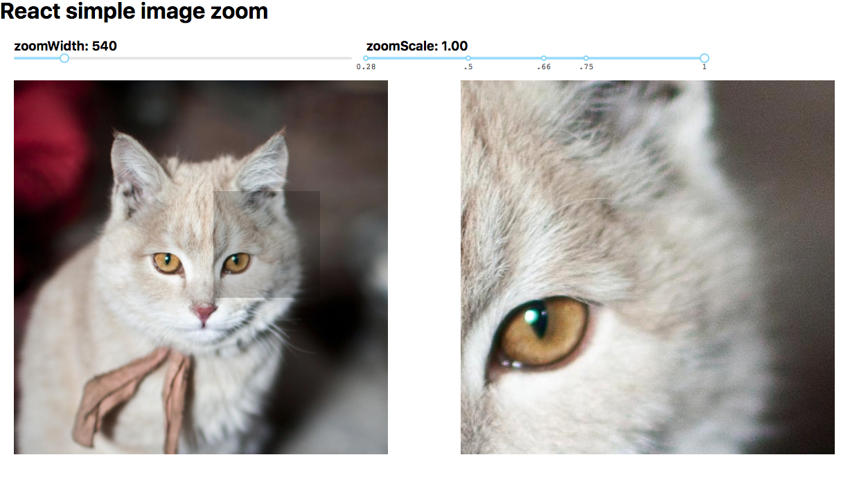
Demo
Install
| mgr | cmd |
|---|---|
| npm | npm install --save react-simple-image-zoom |
| yarn | yarn add react-simple-image-zoom |
Usage
;; ;See ./demo for a more detailed example.
Props
| prop | required | type | description |
|---|---|---|---|
| children | yes | any | pass the source image in as a child element |
| portalId | yes | string | ID of the target portal element |
| largeImgSrc | no | string | optional high-res source to use for the zoom container |
| imageWidth | yes | number | width of the original image on the screen |
| imageHeight | no | number | optional, pass in an image height to use for calculations. otherwise this component will figure it out. |
| zoomContainerWidth | yes | number | width of the portal zoom |
| zoomContainerHeight | no | number | height of the portal zoom |
| activeClass | no | string | optional, default is 'active'. applies this class to the image container when zooming is active |
| portalStyle | no | React.CSSProperties | optional, override the style of the portal. To extend the default style, use ImageZoom.defaultPortalStyle |
| portalClassName | no | string | optional, sets className on the portal element |
| zoomScale | no | number | optional, default is 1. Determines the amount of zoom. |
| responsive | no | boolean | optional, default is null. Component will listen for window resize and adjust accordingly |
Usage with react-slick
- For the magnifying glass to work, make sure you style
.slick-sidelike this:
Todo
- get component to work on mobile devices
License
Copyright © 2018 Aaron Lifton