react-simple-color-picker
React Simple Color Picker is a lightweight picker compatible with Tailwind and daisyUI, but it can still be used without Tailwind and daisyUI, and it gives the ability to add a predefined list of colors. If used with daisyUI, the picker will automatically adapt to the themes.
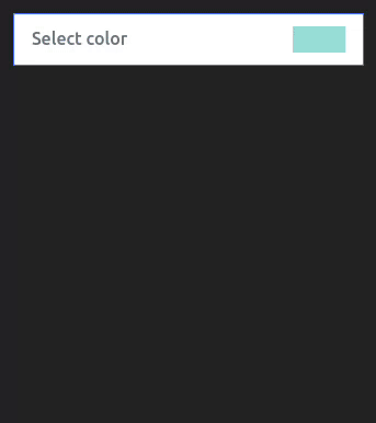
Light
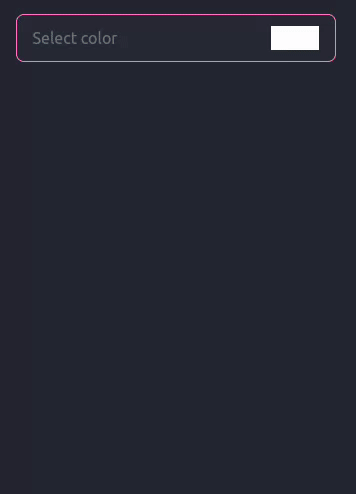
Dark with nativePicker option true
Install
npm i react-simple-color-picker-design
Simple usage
Styles !
If the picker does not look like what is on the documentation, it is likely that there is a CSS conflict with the picker.
// Base styles of picker
import 'react-simple-color-picker-design/styles/base.css'
// import if not using Tailwind /!\
import 'react-simple-color-picker-design/styles/withoutTailwind.css'
// import one theme if not using daisyUI /!\
import 'react-simple-color-picker-design/styles/light.css'
import 'react-simple-color-picker-design/styles/dark.css'
Component usage !
import { useEffect, useState } from "react";
import SimpleColorPicker from "react-simple-color-picker-design";

export default function Demo() {
  const [color, setColor] = useState("#9adedb");

  useEffect(() => {
    console.log("🚀 value changed ! :", color);
  }, [color]);

  return <SimpleColorPicker defaultColor={color} setColor={setColor} />
With Options
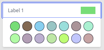
Example 1
<SimpleColorPicker
  labelOne="Label 1"
  labelTwo="Label 2"
  noCustomColor={true} // Disable custom color input
  nativePicker={true} // Swith to native html color picker
  defaultColor={color} // Base selected color
  setColor={setColor} // Update state
/>
Example 2
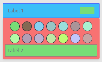
<SimpleColorPicker
  labelOne="Label 1"
  labelTwo="Label 2"
  inputClasses="bg-info" // Custom class for input
  boxClasses="bg-error" // Custom class for popUp box
  noCustomColor={false} // Disable custom color input
  nativePicker={true} // Swith to native html color picker
  defaultColor={color} // Base selected color
  setColor={setColor} // Update state
/>
Example 3
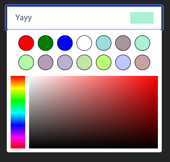
<SimpleColorPicker
  labelOne="Yayy"
  colorList={[
    "red",
    "green",
    "blue",
    "white",
    "#9adedb",
    "#aa9499",
    "#aaf0d1",
    "#b2fba5",
    "#b39eb5",
    "#bdb0d0",
    "#bee7a5",
    "#befd73",
    "#c1c6fc",
    "#c6a4a4",
    "#ff9899",
    "#ffb7ce",
    "#ca9bf7",
  ]}
  nativePicker={false} // Swith to native html color picker
  labelTwo="Custom List !"
  defaultColor="#aaf0d1" // Base selected color
  setColor={setColor} // Update state
/>