React Shopping Cart Starter Kit
This component comes with no batteries included, but allows for a great deal of flexibility. It was initially designed for shopping cart type of functionality and product collections (i.e., creating and editing orders), but is likely to be applicable in other contexts where a selection of some kind is involved.
Installation
$ npm install react-shopping-cart-starter-kit
Examples
The following third-party components and assets are used in the examples: React-Bootstrap, Bootstrap, Griddle (griddle-react), React DnD, Font Awesome, and the Lato Font.
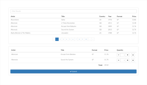
Bootstrap + Griddle example
This example also shows how to implement notifications using the various onItem* callbacks.
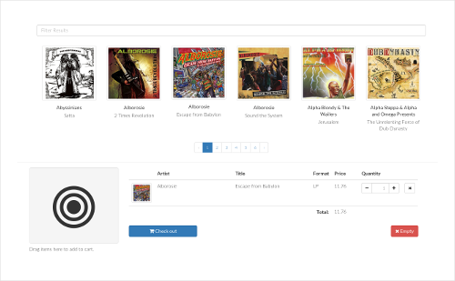
Drag and Drop example
Add products to the cart by dragging the product thumbnail to the drop area.
How to use this component
Preparation
Assign a unique id to each item used in your application. For demonstration, we will use the following key-value object with a catalog of five products in subsequent examples.
const myProducts = "product-1" : "Name" : "Canned Unicorn Meat" "Price" : "9.99" "product-2" : "Name" : "Disappearing Ink Pen" "Price" : "14.99" "product-3" : "Name" : "USB Rocket Launcher" "Price" : "29.99" "product-4" : "Name" : "Airzooka Air Gun" "Price" : "29.99" "product-5" : "Name" : "Star Trek Paper Clips" "Price" : "19.99" Hello, World!
To get started, we print out the products in a list, pass the column names to the cart component, and implement an onClick handler which adds the selected item to the cart by calling addItem.
const myProducts = "product-1" : "Name" : "Canned Unicorn Meat" "Price" : "9.99" "product-2" : "Name" : "Disappearing Ink Pen" "Price" : "14.99" "product-3" : "Name" : "USB Rocket Launcher" "Price" : "29.99" "product-4" : "Name" : "Airzooka Air Gun" "Price" : "29.99" "product-5" : "Name" : "Star Trek Paper Clips" "Price" : "19.99" const MyComponent = React ReactImprovements to Hello, World!
Next, we'll implement a row iterator to sum up the order total. It will appear in the table footer (See 'Customization' for details).
<Cart iterator=thisrowIterator ref='cart' columns='Name' 'Price' />This function is first called once to allow initialization, and then for each item in the cart. The object we return is being passed on as an argument to the subsequent call, together with the row item.
{ if !context /* Initialization call */ return total : 0 else /* Invoked once for each row */ const price = Numberrowdata'Price' return total : contexttotal + rowquantity * price }Finally, we'd like to have the submit button disappear when nothing is present in the cart. To achieve this, we introduce a canSubmit flag.
<Cart ref = 'cart' onChange = thiscartChanged iterator = thisrowIterator columns = 'Name' 'Price' /> <hr /> thisstatecanSubmit && <button onClick=thissubmit> Submit </button> Here are the implementations for cartChanged and getInitialState, which we add to MyComponent.
{ return canSubmit : false } { this }Editing an existing selection of items
Up to this point, we have assumed that the cart is initially empty. When working with an existing order or selection, we can provide an array of items to the cart's selection prop.
<Cart /* ... as before ... */ selection = id : 'product-2' quantity : 15 data : myProducts'product-2' id : 'product-3' quantity : 1 data : myProducts'product-3' To allow the user to revert any changes back to the order's initial state, we add a button that triggers the cart's reset method.
<button onClick=thisundoChanges> Undo changes </button>To make the submit button appear in edit mode, we add a call to cartChanged after the component has mounted.
{ thisrefscart } { this }To change how the component renders the cart's contents, implement the
containerComponentand/orrowComponentprops. (See Customization)
Props
Required
| Property | Type | Description |
|---|---|---|
| columns | Array | The columns used in the table of items currently in the cart. Items added to the cart should have keys matching the entries of this array. |
Optional
| Property | Type | Description | Default |
|---|---|---|---|
| items | Object | Normally, you pass an item's data with the call to addItem. As an alternative, you can provide an object here, mapping each key to an object with the item's attributes. |
|
| selection | Array | Initial selection. (Used when editing an existing order or selection of items). | [] |
| onItemAdded | Function | Called when an item is added to the cart. | () => {} |
| onItemRemoved | Function | Called when an item is removed from the cart. | () => {} |
| onItemQtyChanged | Function | Called when an item's quantity has changed. | () => {} |
| onChange | Function | Called when the state of the component changes. (You may want to implement this callback to toggle the visibility of a submit button, based on whether the cart is empty or not.) | () => {} |
| iterator | Function | A function used to pass state between rows. The real raison d'être for this function is to sum up the price of each product in an order and output a total in the footer. | () => { ... } |
| containerComponent | Component | A custom container component. | See 'Customization' |
| rowComponent | Component | A custom row component. | See 'Customization' |
| tableClassName | String | The CSS class name to apply to the table element. Whether this value is actually used or not depends on the implementation of containerComponent. |
|
| cartEmptyMessage | Node | A message shown when the cart is empty. | 'The cart is empty.' |
Initial data
When editing an existing selection, use the selection prop to pass the collection as an array in the following format.
const orderData = "id" : "item-1" "quantity" : 2 "data" : "name": "Canned Unicorn Meat" "price" : "9.99" "id" : "item-2" "quantity" : 1 "data" : "name": "Disappearing Ink Pen" "price" : "14.99" API
addItem(key, quantity, item)
To add an item to the cart, provide its id, a quantity, and the item itself. (The third argument may not be required if you have previously supplied an object to the component's items props.)
cartIf an item with the given id already exists in the cart, no new item is inserted. Instead, the quantity is adjusted accordingly for the existing entry.
cartcart cart "id" : "product-1" "quantity" : 2 "data" : "name": "Canned Unicorn Meat" "price" : "9.99" emptyCart()
Clears the cart.
reset()
Does the same as emptyCart(), unless you specify the selection prop, in which case the initial selection will be restored. That is, when editing an existing order, this method will revert the cart back to a state consistent with the order being edited.
getSelection()
Return the current selection.
"id" : "item-1" "quantity" : 2 "data" : "name": "Canned Unicorn Meat" "price" : "9.99" "id" : "item-2" "quantity" : 1 "data" : "name": "Disappearing Ink Pen" "price" : "14.99" isEmpty()
Returns true if the cart is empty, otherwise false.
removeItem(index)
In a typical implementation, it is not necessary to call this method directly. Instead, use this.props.removeItem from within the row component.
updateQuantity(index, quantity)
In a typical implementation, it is not necessary to call this method directly. Instead, use this.props.setItemQty from within the row component.
Customization
To gain more control over how the cart is rendered (beyond what can be done with CSS), it is possible to implement a custom row and/or container component.
<Cart rowComponent = MyRowComponent containerComponent = MyContainerComponent />Row component
The row component renders individual rows. The default implementation uses a <table> element at the top, and thus row data appears within a <tr> tag, however these could be pretty much anything, as long as the node tree follows the normal JSX rules.
Props
| Property | Type | Description |
|---|---|---|
| item | Object | The row item (see below). |
| columns | Array | The array of column names. |
| removeItem | Function | Callback to invoke to remove the item from the cart. |
| setItemQty | Function | Callback to invoke to change the selected quantity of an item. |
The item object
This object holds the id, current quantity of the item, and its properties (the data you specified when calling addItem). The format is as follows.
  {
    "id"       : "item-1",
    "quantity" : 2,
    "data"     : { "name": "Canned Unicorn Meat", "price" : "9.99" }
  }
Default implementation
const RowComponent = ReactContainer component
This component is responsible for rendering the container in which the cart's contents appear. For more creative layouts, you may want to use something other than a <table> here.
Props
| Property | Type | Description |
|---|---|---|
| columns | Array | The array of column names. |
| tableClassName | String | A CSS class name to be applied to the table element. (May be ignored by custom implementations.) |
| body | Node | The node tree generated by the row component. Typically rendered in the body portion of a table. |
| context | Object | A state object generated by the rowIterator, if one is used. |
Default implementation
const ContainerComponent = ReactBootstrap styles
In this example, we create a row component to "bootstrapify" the table. See examples for a more complete implementation.
main.js
const BootstrapRowComponent = React const MyComponent = Reactindex.html
License
This software is provided under the terms and conditions of the BSD License.