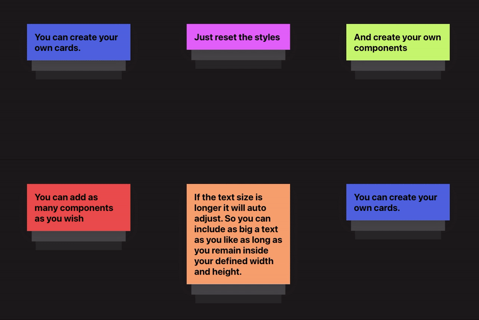
React Placards
Description
- A placards component inspired from Stripe
- ANNOUNCE your own Custom Components
- Built with Typescript
- Styled with Styled Components
Table of Contents
Installation
yarn add react-placardsGetting Started
A default height and width is given to the component but is required to render the component: Refer
  import React from 'react';
  import { Placards } from 'react-placards'
  import {CustomComponents} from '../somepath/CustomComponentLibrary.js'
  function App() {
    const items = [
      {
        id: "content-types",
        content: "You can pass in a plain text string.",
      },
      {
        id: "custom-components",
        content: <CustomComponents
          heading="Custom Components"
          date="31-01-2021"
          description={"OR you can create your own custom components"}
          {...extraProps}
        />
      }, ...];
    return (
      <div className="App">
        <Placards
          items={items}
        />
      </div>
    );
  }
  export default App;
Props
| name | description | required | default |
|---|---|---|---|
| items | collection of Item Type | true | [] |
| width | width of the component | false | 200 |
| height | height of the component | false | 200 |
| timing | delay between card switch | false | 5000 |
| cardStyles | style definitions for Top Card Style Props | false | check Top Card Style Props |
| stackCardStyles | style definitions for Stacked Cards Style Props | false | check Stacked Cards Style Props |
| containerStyles | style definitions for Container Style Props | false | check Container Style Props |
Item Type
| name | description | required | type |
|---|---|---|---|
| id | unique key for each component being rendered | true | string |
| content | content that renders inside the cards | true |
string or custom Component
|
You can pass in a component or a string to content
items = [
  {
    id: 'unique-id',
    content: <MyCustomComponent {...props} />
  },
  {
    id: 'unique-id-2',
    content: 'Text content'
  }
];
Top Card Style Props
Use the props below to change the styles of top card.
Note: Top card's styles will be applied to all the item's content
For more control on styles, reset the default styles and create your own Custom Card component
| name | description | required | default |
|---|---|---|---|
| backgroundColor | background-color applied to top card | false | #ffffff |
| borderRadius | border-radius applied to ALL sides of top card | false | 0px |
| boxShadow | box-shadow behind top card | false | 0 15px 35px rgba(50, 50, 93, 0.1),0 5px 15px rgba(0, 0, 0, 0.07) |
| padding | padding applied to top card | false | 0px |
cardStyles = {
  backgroundColor: 'red',
  borderRadius: '4px',
  boxShadow: '0 10px 30px black',
  padding: '10px'
};
Stacked Card Style Props
| name | description | required | default |
|---|---|---|---|
| secondColor | background-color applied to second card | false | #f0f0f0 |
| thirdColor | background-color applied to third card | false | #fafafa |
stackCardStyles = {
  secondColor: 'red',
  thirdColor: 'yellow'
};
Container Style Props
use these to place your cards inside the container
| name | description | required | default |
|---|---|---|---|
| height | height of the container | false | 200px |
| width | width of the container | false | 200px |
| overflow | overflow of the container | false | hidden |
| padding | padding of the container | false | 5% |
stackCardStyles = {
  height: 200,
  width: 200,
  overflow: 'hidden',
  padding: '5%'
};
Passing custom height/width
By default height & width have been set to 200px. Overide them by passing custom values.
<Placards items={items} width="400" height="400" />Passing custom timing
By default timing has been set to 5000ms. Overide it by passing custom timing.
<Placards items={items} timing="7000" />Passing custom styling for Card
Override cardStyles by passing custom styles
<Placards
  items={items}
  cardStyles={{
    padding: '10px',
    borderRadius: '4px',
    ...moreProperties
  }}
/>
Change second and third card's background
Override background colors of second and third cards
<Placards
  items={items}
  stackCardStyles={{
    secondColor: 'red',
    thirdColor: 'yellow'
  }}
/>
Meta
Inspired from Stripe's Announcement Banners. (Sadly has been removed now :'( )
Distributed under the MIT license. See LICENSE for more information.

