React-Native-Walkthrough
Simple and fully customizable walkthrough guide for your app!
Create amazing guides to help new users discovering your masterpiece 😉
Introduction
React-Native-Walkthrough is a library I started working on 6 month ago when I had spare time. I chose to develop it because I was looking for an easy to setup and highly customizable library to guide new users on my apps.
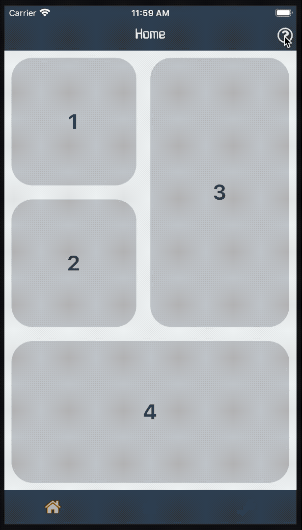
As you can see on the demo, the component stays inside the parent we gave him. Also, everything is dynamically computed to allow an accurate placement of the spotlight or the tooltip.
Demo

Install
npm i react-native-wlkt OR yarn add react-native-wlktGetting Started
Setup
Step 1 : Place the component Walkthrough wherever you want the tutorial to be.
TIPS: Usually it is better to put it at the root of your app 😏
import Walkthrough from 'react-native-wlkt'; ... const App = return <> ... <Walkthrough /> </> ;;Congratulations, you've finished setting up react-native-wlkt 🎉
That wasn't so hard, was it?
Scenarios
Step 1 : Register the components to be displayed in your interactive guide by encapsulating them in WalkthroughComponent.
import WalkthroughComponent from 'react-native-wlkt'; ... const HomeScreen = return <> ... <WalkthroughComponent ="textRnwlkt"> <Text>RNWLKT</Text> </WalkthroughComponent> ... </> ;;TIPS: When registering components, use an id coherent with the component being registered, it will help when creating scenarios 😎
NOTE:
WalkthroughComponentworks with the basic React Native components, if your component is not registered, try to encapsulate it in aViewcomponent
import WalkthroughComponent from 'react-native-wlkt'; ... const HomeScreen = return <> ... <WalkthroughComponent ="buttonRnwlkt"> <View> <Button ="RNWLKT" = /> </View> </WalkthroughComponent> ... </> ;; Step 2 : Create your scenario.
const myAmazingScenario = component: 'textRnwlkt' tooltipOptions: content: 'I am a TEXT element' component: 'buttonRnwlkt' tooltipOptions: content: 'I am a BUTTON element' ;Step 3 : Start the tutorial with startWalkthrough.
import ... startWalkthrough from 'react-native-wlkt'; ... const HomeScreen = return <> ... <Button ="Start" = /> ... </> ;;Okay, everything is setup now 🔥
You can find everything we did so far in examples/Example.js.
Scenario Options
NOTE:
spotlightOptions,overlayOptionsandtooltipOptionscan be set on each step and/or inWalkthroughprops (if they are inWalkthroughprops, they are the default values for the steps)
component {string} > null
The registered component you wish to be highlighted.
content {string, function} > ''
Content of the tooltip. (message to be displayed)
onNextIn {function} > null
Callback triggered when entering a step forward.
onNextOut {function} > null
Callback triggered when leaving a step forward.
onPrevIn {function} > null
Callback triggered when entering a step backward.
onPrevOut {function} > null
Callback triggered when leaving a step backward.
spotlightOptions
spotlightOptions.borderWidth {number} > 0
Width of the spotlight border.
spotlightOptions.borderRadius {number} > 0
Radius of the spotlight border.
spotlightOptions.borderColor {string} > orange
Color of the spotlight border.
spotlightOptions.padding {number} > 0
Padding between the component and the spotlight.
spotlightOptions.clickThrough {boolean} > false
Whether or not you can click through the spotlight.
overlayOptions
overlayOptions.backgroundColor {string} > black
Color of the overlay.
overlayOptions.diagonalBuffer {string} > black
Increase the size of the overlay. (this parameter is rarely used)
overlayOptions.opacity {number} > 0.8
Opacity of the overlay.
overlayOptions.onPress {function} > null
Callback triggered when clicking the overlay.
tooltipOptions
tooltipOptions.text.previous {string, function} > Previous
Text for 'Previous' button.
tooltipOptions.text.next {string, function} > ({ current, steps }) => `Next (${current}/${steps})`
Text for 'Next' button.
tooltipOptions.text.finish {string, function} > Finish
Text for 'Finish' button.
tooltipOptions.text.skip {string, function} > Skip
Text for 'Skip' button.
tooltipOptions.height {number} > 100
Height of the tooltip.
tooltipOptions.width {number} > 230
Width of the tooltip.
tooltipOptions.borderRadius {number} > 10
Radius of the tooltip border.
tooltipOptions.backgroundColor {string} > 'white'
Color of the tooltip.
tooltipOptions.fontSize {number} > 15
Font size of the tooltip content.
tooltipOptions.placement {string} > null
Placement of the tooltip. (must be one of ['topleft', 'top', 'topright', 'lefttop', 'left', 'leftbottom', 'righttop', 'right', 'rightbottom', 'bottomleft', 'bottom', 'bottomright' ])
NOTE: If
tooltipOptions.placementis not defined, the tooltip will be placed where there is available space.
tooltipOptions.offsetCenter {number} > 0
Offset between the center of the component and the tooltip. (does not work when the tooltip is centered on the component e.g. with ['top', 'bottom', 'left', 'right'])
tooltipOptions.offset {number} > 20
Offset between the component and the tooltip.
tooltipOptions.tooltipComponent {ReactNode} > null
Component to display instead of the default tooltip. (see Custom Tooltip)
Custom Tooltip
Your custom component will receive props from the Walkthrough :
tooltip :
top : ordinate position for the tooltip
left : abcisse position for the tooltip
tooltipopts : tooltipOptions from Scenario Options (see tooltipOptions)
tooltipcntx :
onPrev : handler for going to previous step
onNext : handler for going to next step
onSkip : handler for leaving the walkthrough
current : current step number
steps : number of steps in the scenario
You can find an example in examples/CustomTooltip.js.