react-native-popover
0.4.0
升级支持react16.2


A <Popover> component for react-native. This is still very much a work
in progress and only handles the simplest of cases, ideas and
contributions are very welcome.
Install
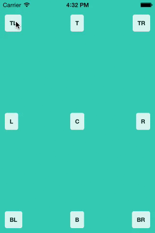
npm i --save react-native-popoverUsage
'use strict'; var React = ;var Popover = ;var AppRegistry StyleSheet Text TouchableHighlight View = ; var PopoverExample = React; var styles = StyleSheet; AppRegistry;Displaying the popover on top of other elements
React Native doesn't support directly setting a zIndex on a view. What is recommended instead is to rearrange your view hierarchy and put the popover last at the root of your app. See facebook/react-native#131
However, as an alternative, I recommend you use @brentvatne's react-native-overlay library to wrap <Popover /> and bring it to the front no matter where it sits in the render tree.
Props
| Prop | Type | Optional | Default | Description |
|---|---|---|---|---|
| isVisible | bool | Yes | false | Show/Hide the popover |
| fromRect | rect | No | {} | Rectangle at which to anchor the popover |
| displayArea | rect | Yes | screen rect | Area where the popover is allowed to be displayed |
| placement | string | Yes | 'auto' | How to position the popover - top | bottom | left | right | auto. When 'auto' is specified, it will determine the ideal placement so that the popover is fully visible within displayArea. |
| onClose | function | Yes | Callback to be fired when the user taps the popover | |
| customShowHandler | function | Yes | Custom show animation handler - uses a react-tween-state wrapper API in order to show the modal. See default show handler. | |
| customHideHandler | function | Yes | Custom hide animation handler - uses a react-tween-state wrapper API in order to hide the modal. See default hide handler. |
rect is an object with the following properties: {x: number, y: number, width: number, height: number}
Credits
The code supporting animations was inspired and adapted from @brentvatne's Transition.js mixin.
MIT Licensed