React Native Tree Band
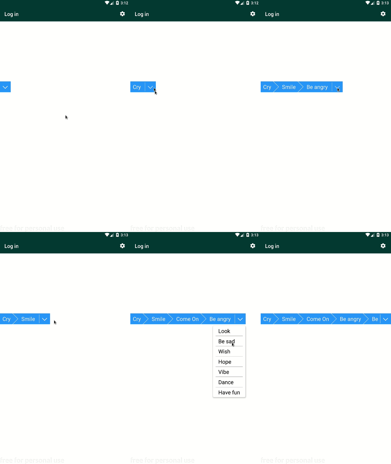
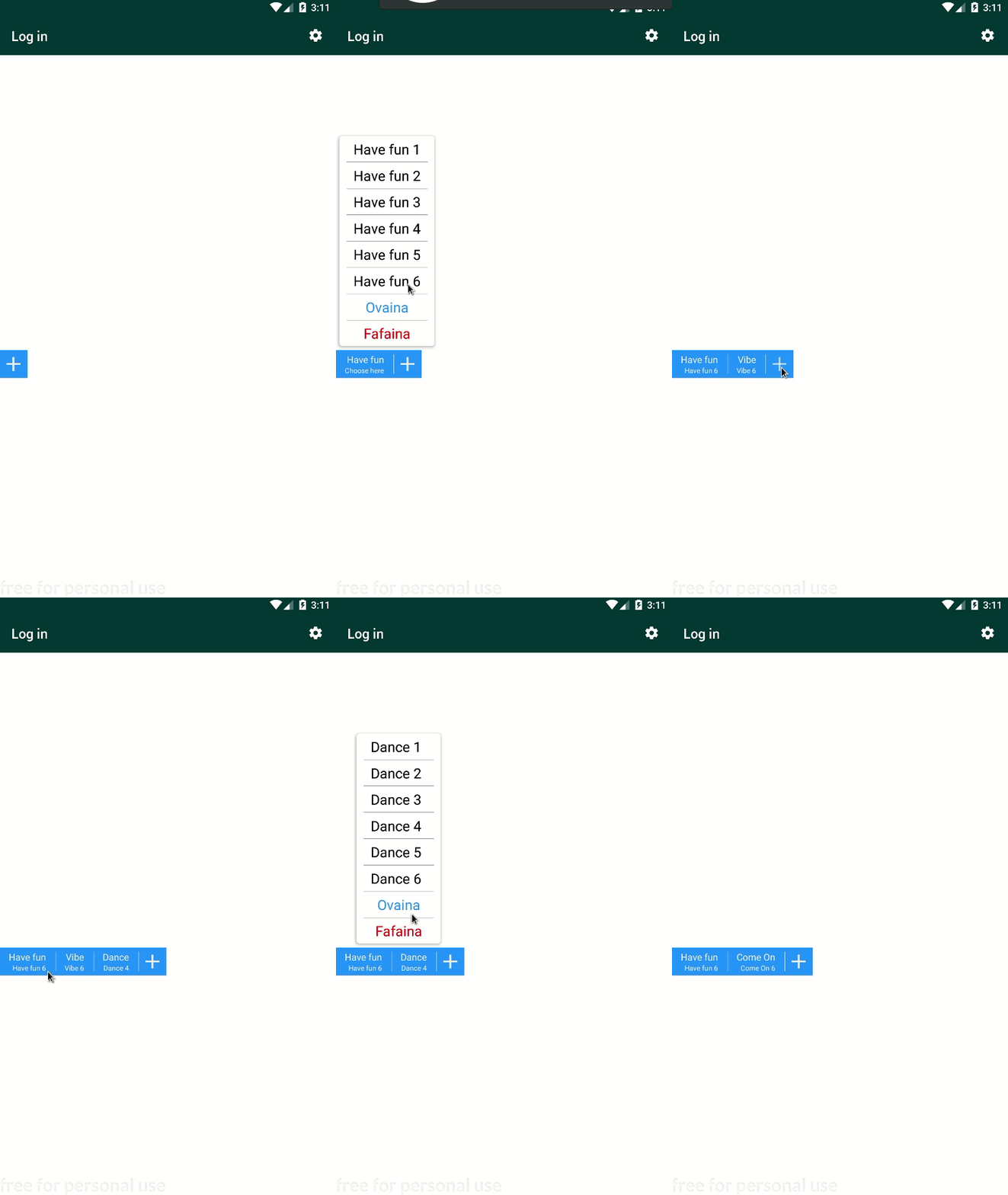
A Tree Band is a data lifeline for a tree structured data, The TreeBand Components will help you to easily navigate in your data. RNTreeBand uses Promises to move from a node to another one.
Want a Component to trace you tree line? You've got choice between TreeView band and DoubleChoice band
| TreeView | DoubleChoice |
 |
 |
Installation
To install run commands:
$ npm i -s react-native-tree-bandor
$ yarn add react-native-tree-bandTests
Default Test
{ return // ... <DoubleChoice /> <TreeView /> // ... }Simple Test
const stuffs = 'foods': label: 'Donut' label: 'Hot Dog' label: 'Pizza' cars: label: 'Mc Lauren' label: 'Nissan' type: 'nissan' nissan: label: 'FS 0004' label: 'FS 008' const options = label: 'Food' type: 'foods' key: 0 label: 'Cars' type: 'cars' key: 1 label: 'Pizza' type: 'pizzas' key: 2 const getOptionsForDoubleChoice = async { return itemtype ? : stuffsitemtype || }const getOptionsForTreeView = async { // maybe await for something return itemtype ? : stuffsitemtype || } { return // ... <DoubleChoice initialOptions = options getOptions = getOptionsForDoubleChoice /> <TreeView initialOptions = options getOptions = getOptionsForTreeView /> // ... }Use of Components
RNTB was built as every part of the componennt can be stylized the way you want, just by passing some style props.
List Of props
| name | Type | default | Details | With |
|---|---|---|---|---|
| style | StyleSheet Object | none | Stylize the bandParent (see Component tructure) | Both |
| bandHeight | number | 30 | Height of the band | Both |
| bandStyle | StyleSheet Object | none | Band style ex: {top:70, width: '100%'} |
Both |
| initialOptions | Array of Option (see Option structure) | default | Array of main options show on start | Both |
| dropdownCollapse | number | 5 | Margin around Dropdowns | Both |
| getOptions | function | default | Function to call to determine subOptions (next Options) | Both |
| dropdownStyle | Object | none | Main dropdown style (see dropdownStyle) | Both |
| itemDropdownStyle | Object | none | Sub-item dropdown style (see dropdownStyle) | DoubleChoice |
| optionLabels | Object | none | Labels for delete and Modify Buttons (see optionLabels) | DoubleChoice |
| single | boolean (or just presence) | false | Make List of Choice unique for use | DoubleChoice |
| autoPress | boolean (or just presence) | false | Make subchoice open after main choice is done | DoubleChoice |
Options (getOptions and initialOptions)
If you read the previous Simple Test section, you can see there are async functions that are called each time the tree changes, and the returned list are used in dropdown to compute the next tree level, these are options computed by the passed getOption function prop.
Thus, at the begining the Component needs a start point, the initial list of choice initialOptions.
Options is an array of object with label property, and eventualy with key property. Otherwise you can add any other properties as you want.
labelis used in for displaying on dropdown and others and is required,keyis used only onDoubleChoiceif you usesingleprop.
const options = label: 'Food' key: 0 ... label: 'Cars' key: 1 ... label: 'Pizza' key: 2 ... dropdownStyle and itemDropdownStyle
These props are object with some keys used to stylize the dropdown. There are ssseven keys
<TreeViewdropdownStyle = dropdown : backgroundColor: '#444' item : borderBottomWidth: 0 itemText : color: 'white' remove : backgroundColor: 'darkred' removeText : color: 'white' modify : backgroundColor: 'blue' modifyText :color: 'white' fontSize: 30/> dropdown: For the dropdown element Viewitem: For the dropdown item ViewitemText: For the dropdown item Textremove: For remove button (only with DoubleChoice)removeText: For remove button text (only with DoubleChoice)modify: For modify button (only with DoubleChoice)modifyText: For modify button text (only with DoubleChoice)
optionLabels (DoubleChoice only)
optionLabels is an Object label props for options in DoubleChoice.
// ...optionLabels = remove: "Remove it bro 😣" confirmRemove: "Please don't 😥" modify: "Change it bro! 😆"