react-native-simple-popover


react-native-simple-popover provides a simple popover implementation and supports automatic popover placement.
Installation
$ npm install react-native-simple-popover
This package does not provide native modules and does not require linking and rebuilding your application.
API
<PopoverContainer>
Provides ability for child Popover components to register and render inside this element. Child popovers are constrained
by this component and render above the children.
Props
| Prop | Type | Default | Description |
|---|---|---|---|
| padding | Number | 0 |
Pads component area to constrain your popovers. |
| children | ReactElements | null |
Element tree that you want your popovers to render in. |
<Popover>
Renders component with defined properties around the wrapped component.
Props
| Prop | Type | Default | Description |
|---|---|---|---|
| component | Component | 0 |
Popover component to render. |
| isVisible | Boolean | true |
Defines if popover is visible. |
| arrowColor | Color | 'white' |
Popover's arrow color. |
| arrowWidth | Number | 15 |
Popover's arrow width. |
| arrowHeight | Number | 10 |
Popover's arrow height. |
| placement | String | 'auto' |
Where popover should be placed related to the wrapped component. If 'auto', all placement options are tried and first suitable placement option is picked. Supported placement options: 'left', 'right', 'top', 'bottom', 'auto'. |
| children | ReactElement | null |
Element that you want your popover to point to. |
| pointerEvents | String | 'box-none' |
Controls whether the View can be the target of touch event. Supported options: 'auto', 'none', 'box-none' and 'box-only'. |
| offset | Object | { x: 0, y: 0 } |
Popover's offset setting. |
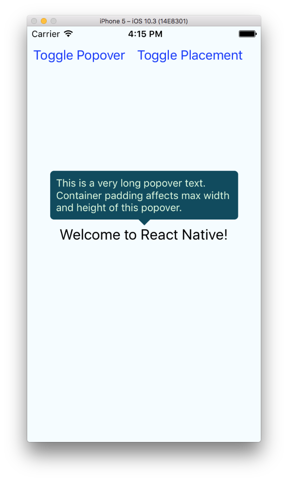
Example
Please check Example directory for an example project with the following implementation:
;;; state = isPopoverVisible: true popoverPlacement: 'top' ; { return <PopoverContainer padding=20> <View style=stylescontainer> <Popover placement=thisstatepopoverPlacement arrowColor="#114B5F" arrowWidth=16 arrowHeight=8 isVisible=thisstateisPopoverVisible component= <View style=stylespopoverContainer> <Text style=stylespopoverText> This is a very long popover text Container padding affects max width and height of this popover </Text> </View> > <Text style=styleswelcome> Welcome to React Native! </Text> </Popover> <View style=stylesbuttons> <Button title="Toggle Popover" onPress= { this; } /> <Button title="Toggle Placement" onPress= { this; } /> </View> </View> </PopoverContainer> ; } const styles = StyleSheet; AppRegistry;