react-native-side-drawer
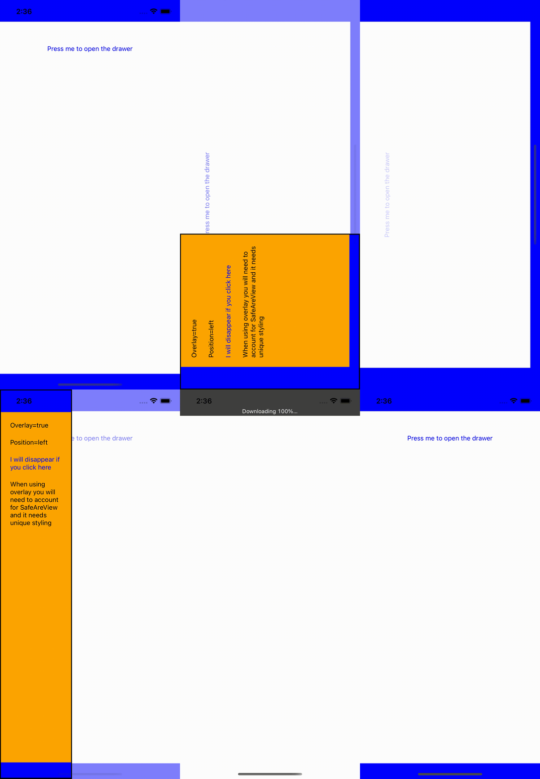
The following is taken from App.js in the example dir (blue is the safe area, which would need to be configured as seen in the example - taken on iPhone 13)
Status
Simple & lightweight side menu drawer.
Contents
Install
yarn add react-native-side-drawerOR
npm install react-native-side-drawerUsage
The below is a simple snippet of usage. It is recommended to use this library in conjunction with safe-area-context-view see React advise on this as well.
For a (near) full example used with SafeAreaContextView please go to the example: App example with SafeAreaContextView
import React from 'react'
import { View, Text, StyleSheet, TouchableOpacity } from 'react-native'
import MenuDrawer from 'react-native-side-drawer'

class Example extends React.Component {
  constructor(props) {
    super(props);
    this.state = {
      open: false
    };
  }

  toggleOpen = () => {
    this.setState({ open: !this.state.open });
  };

  drawerContent = () => {
    return (
      <TouchableOpacity onPress={this.toggleOpen} style={styles.animatedBox}>
        <Text>Close</Text>
      </TouchableOpacity>
    );
  };

  render() {
    return (
      <View style={styles.container}>
        <MenuDrawer
          open={this.state.open}
          position={'left'}
          drawerContent={this.drawerContent()}
          drawerPercentage={45}
          animationTime={250}
          overlay={true}
          opacity={0.4}
        >
          <TouchableOpacity onPress={this.toggleOpen} style={styles.body}>
            <Text>Open</Text>
          </TouchableOpacity>
        </MenuDrawer>
      </View>
    );
  }
}

const styles = StyleSheet.create({
  container: {
    flex: 1,
    backgroundColor: "#fff",
    alignItems: "center",
    justifyContent: "center",
    marginTop: 30,
    zIndex: 0
  },
  animatedBox: {
    flex: 1,
    backgroundColor: "#38C8EC",
    padding: 10
  },
  body: {
    flex: 1,
    alignItems: 'center',
    justifyContent: 'center',
    backgroundColor: '#F04812'
  }
})
Props
| Property | Description | Type | Default Value |
|---|---|---|---|
open |
Value toggling open and close of drawer | Boolean |
false (closed) |
drawerContent |
Drawer contents | React.Component |
Text component: Close |
drawerPercentage |
Value between 0 - 100, depicting the percentage of the screen the drawer will open | Integer |
45 |
animationTime |
Value depicting the time (in ms) the menu will slide open & close | Integer |
200 |
overlay |
Value toggling menu overlay or push. When overlay is true, the menu will overlay the background screen. When overlay is false, the menu will push the background screen to the side | Boolean |
true |
opacity |
Value between 0-1 for the opacity fade of background when the menu is open | Float |
0.4 |
position |
Value for the drawer to be left or right | String |
left |
Coming soon
- [x] iOS SafeArea support - Works with SafeAreaContextView with minor adjustments see: example App.js
- [x] Custom width of drawer and sliding time
- [x] Right and left drawer
- [x] Opacity fade of background screen
License
MIT


