React Native RGrid
React Native Responsive Bootstrap Grid


Getting Started
This library aims to ease the use of the same React Native codebase for mobile and web applications by porting Bootstrap 5 flexbox grid system to React Native.
It includes the same twelve column system and six responsive tiers of Bootstrap, and uses the same classes names. It uses matchmediaquery to evaluate media queries both in the web and mobile applications, with @expo/match-media as polyfill for mobile applications.
Styles classes are defined with StyleSheet, taking advantage of the performance and memory optimizations it provides.
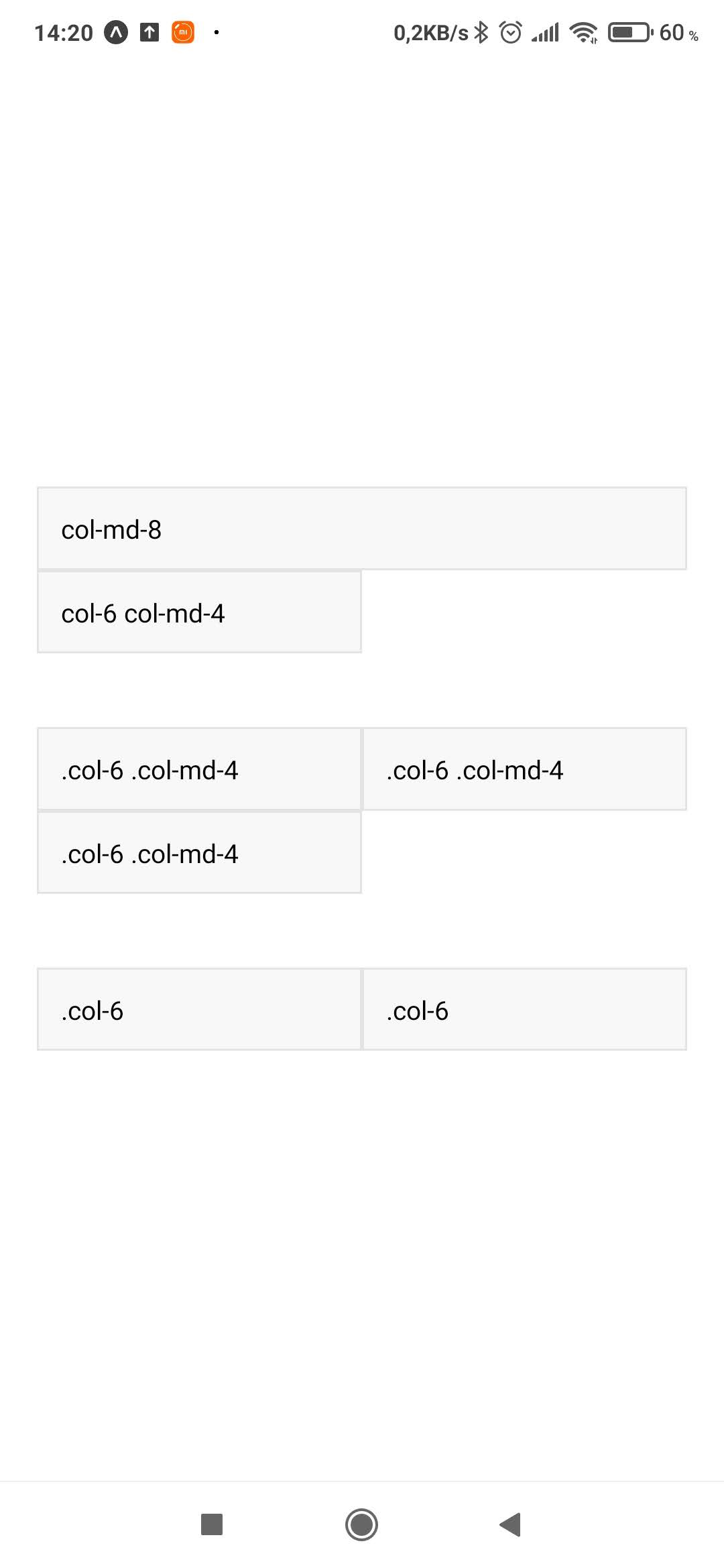
A quick sample, mimicking Bootstraps mix and match sample can be seen below:
| Portrait: 393px width | Landscape: 851px width |
|---|---|
 |
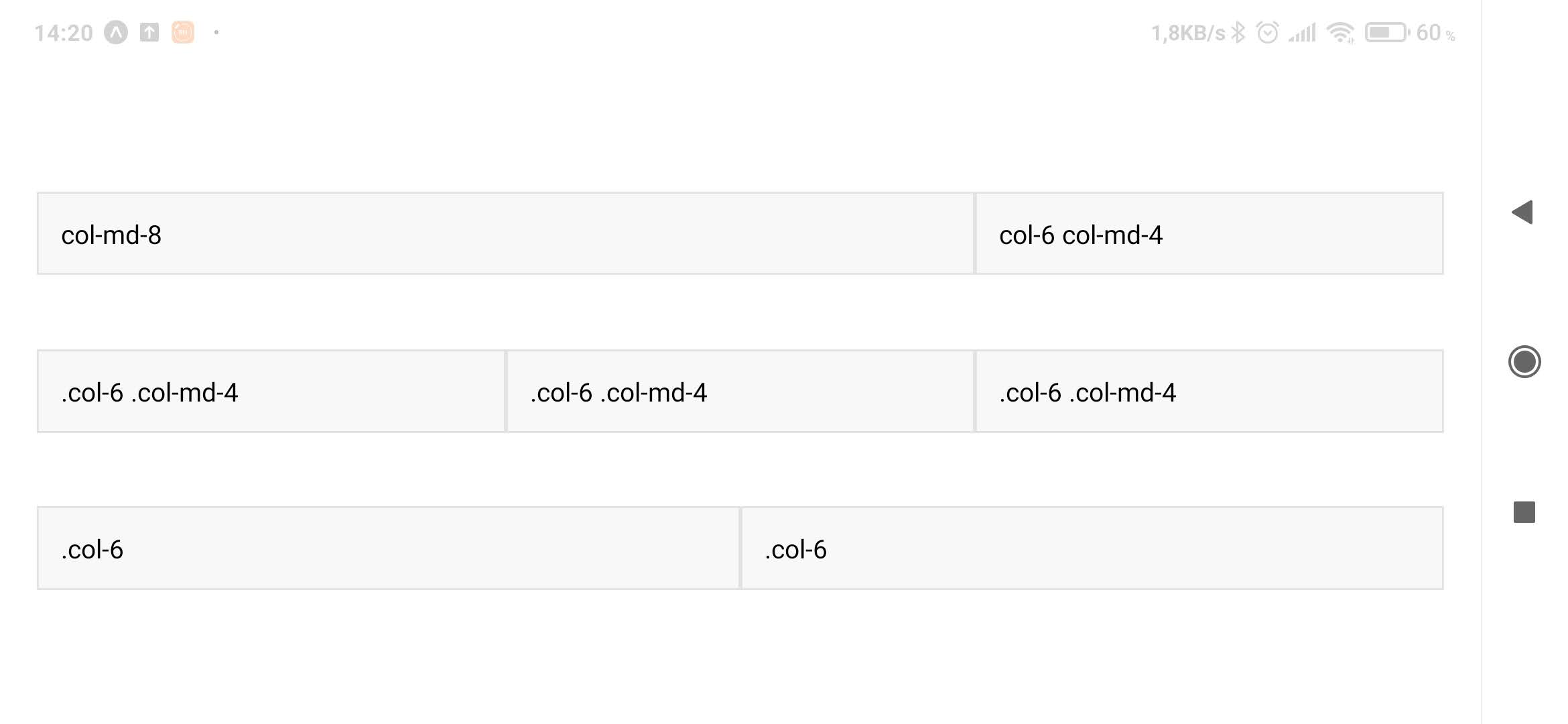 |
with the code to create it:
<RGrid>
  <RView classes="container-fluid">
    {/*Stack the columns on mobile by making one full-width and the other half-width*/}
    <RView classes="row">
      <RView classes="col-md-8">
        <Text>col-md-8</Text>
      </RView>
      <RView classes="col-6 col-md-4">
        <Text>col-6 col-md-4</Text>
      </RView>
    </RView>

    {/*Columns start at 50% wide on mobile and bump up to 33.3% wide on wider screens*/}
    <RView classes="row">
      <RView classes="col-6 col-md-4">
        <Text>col-6 col-md-4</Text>
      </RView>
      <RView classes="col-6 col-md-4">
        <Text>col-6 col-md-4</Text>
      </RView>
      <RView classes="col-6 col-md-4">
        <Text>col-6 col-md-4</Text>
      </RView>
    </RView>

    {/*Columns are always 50% wide*/}
    <RView classes="row">
      <RView classes="col-6">
        <Text>col-6</Text>
      </RView>
      <RView classes="col-6">
        <Text>col-6</Text>
      </RView>
    </RView>
  </RView>
</RGrid>
Installation
Using npm:
npm install --save react-native-rgridor using yarn:
yarn add react-native-rgridDemo Snack
You can try the library right away on this snack; its code is available on this git repository.
Usage
Bootstrap classes
The Grid system has been implemented following the same Bootstrap guidelines. The breakpoints have been configured with the same values as the Bootstrap grid system and they work in the exact same way.
The following is a list of the Bootstrap classes you will be able to use with react-native-rgrid:
- All of the container classes:
containercontainer-smcontainer-mdcontainer-lgcontainer-xlcontainer-xxlcontainer-fluid
- Row class:
-
row: wrappers for columns
-
- Columns responsive-classes:
-
col: for equal-width columns on all breakpoints -
col-{breakpoint}: for equal-width columns on the specified breakpoint and up -
col-*: for when you need a particularly sized column (e.g.col-4) -
col-{breakpoint}-*: for when you need a particularly sized column on the specified breakpoint and up (e.g. `col-md-4) -
col-auto: to size columns based on the natural width of their content on all breakpoints -
col-{breakpoint}-auto: to size columns based on the natural width of their content on the specified breakpoint and up
-
As with Bootstrap, you can mix and match these columns classes, so the content can be distributed on each grid breakpoint. Nesting is also supported.
Support for row columns, alignment and reordering classes will be added on a future version.
Components
The library exports two components: RGrid and RView.
RGrid
RGrid stands for Responsive Grid. It's the component in charge of configuring and initializing the Responsive Grid layout and styles classes. It should be used only once in the application:
export default function App() {
  return (
    <RGrid>
      <Text>React Native RGrid</Text>
    </RGrid>
  );
}
RView
RView stands for Responsive View. The classes ported from Bootstrap will only have effect if they are used in conjunction with RView, so its use is mandatory.
It defines a prop named classes, which can be either an Array where each item is a responsive class, or a String where responsive classes are separated by space.
Under the hood RView is replaced with a View component and evaluates the media queries to apply the appropriate styling, so you can expect it to behave in the exact same way as a View. Support for common View props will be added in a future, for now only style is supported.
export default function App() {
  return (
    <RGrid>
      <RView classes="container">
        <RView classes="row">
          <RView classes="col col-lg-2">
            <Text>1 of 3</Text>
          </RView>

          <RView classes="col-md-auto">
            <Text>Variable width content</Text>
          </RView>

          <RView classes={["col", "col-lg-2"]}>
            <Text>3 of 3</Text>
          </RView>
        </RView>
      </RView>
    </RGrid>
  );
}
Since the style prop is supported, you can apply custom styles to a RView, in the same way you would with a View:
export default function App() {
  return (
    <RGrid>
      <RView classes="container">
        <RView classes="row">
          <RView classes="col col-lg-2" style={styles.column}>
            <Text>1 of 3</Text>
          </RView>

          <RView
            classes="col-md-auto"
            style={[styles.column, { backgroundColor: "#ff0000" }]}
          >
            <Text>Variable width content</Text>
          </RView>

          <RView classes={["col", "col-lg-2"]} style={styles.column}>
            <Text>3 of 3</Text>
          </RView>
        </RView>
      </RView>
    </RGrid>
  );
}

const styles = StyleSheet.create({
  column: {
    backgroundColor: "#27292b08",
    borderWidth: 1,
    borderColor: "#27292b1a",
    paddingTop: 12,
    paddingBottom: 12
  }
});