react-native-picker-js

A Picker written in pure javascript for cross-platform support.
It is the fork of this repo and I will now maintain it react-native-picker.
Demo

Documentation
Props
- style style of picker, you can set width and height of picker in this prop
- pickerElevation elevation of picker (for issue https://github.com/beefe/react-native-picker/issues/27)
- pickerBtnText string, tool bar's confirm btn text
- pickerCancelBtnText string, tool bar's cancel ben text
- pickerBtnStyle textStylePropType, tool bar's btn style
- pickerToolBarStyle viewStylePropType, tool bar's style
- showDuration number, animation of picker
- showMask boolean, default to be false, cancel the picker by tapping in the rest of the screen support when setted to be true
- pickerTitle string, title of picker
- pickerTitleStyle textStylePropType, style of title
- pickerData array
- selectedValue any
- onPickerDone function
- onPickerCancel function
- onValueChange function
Methods
- toggle show or hide picker, default to be hiden
- show show picker
- hide hide picker
- isPickerShow get status of picker, return a boolean
Usage
Step 1 - install
npm install react-native-picker-js --save
or
yarn add react-native-picker-js
Step 2 - import and use in project
<Picker style= height: 300 showDuration=300 showMask=true pickerData={}//picker`s value List selectedValue={}//default to be selected value onPickerDone={}//when confirm your choice />Notice
support two modes:
1. parallel: such as time picker, wheels have no connection with each other
2. cascade: such as date picker, address picker .etc, when front wheel changed, the behind wheels will all be reset
parallel:
- single wheel:
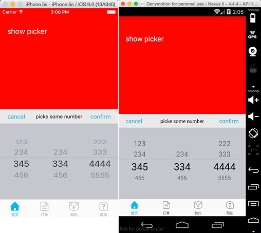
pickerData = 1234; selectedValue = 3;- two or more wheel:
pickerData = 1234 5678 ... ; selectedValue = 1 5;cascade:
- two wheel
pickerData = a: 1234 b: 5678 ... ; selectedValue = 'a' 2;- three wheel
pickerData = a: a1: 1234 a2: 5678 a3: 9101112 b: b1: 1234 b2: 5678 b3: 9101212 ... ; selectedValue = 'a' 'a1' 1;