react-native-picker-checkbox
A simple picker component with checkbox list for React-Native.

Contents

Example
$ cd example$ npm i$ react-native run-ios // For ios$ react-native run-android // For AndroidInstallation
npm install react-native-picker-checkbox --save
Usage
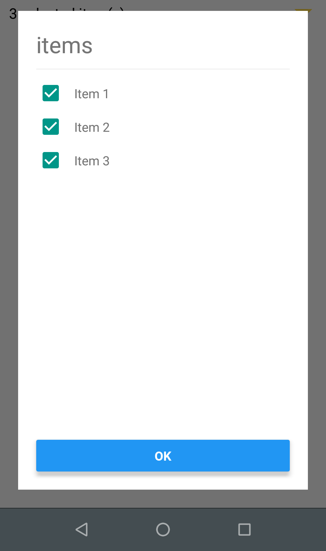
; { console; } const items = itemKey:1 itemDescription:'Item 1' itemKey:2 itemDescription:'Item 2' itemKey:3 itemDescription:'Item 3' ; { return <PickerCheckBox data=items headerComponent=<Text style=fontSize:25 >items</Text> OnConfirm= this ConfirmButtonTitle='OK' DescriptionField='itemDescription' KeyField='itemKey' placeholder='select some items' arrowColor='#FFD740' arrowSize=10 placeholderSelectedItems ='$count selected item(s)' /> }Properties
| Name | Type | Description | Default | Optional |
|---|---|---|---|---|
data |
array | Json with id and description | null | false |
headerComponent |
component | Header component | null | true |
ConfirmButtonTitle |
String | confirm button's title | confirm | true |
DescriptionField |
string | Description Field of data object | null | false |
KeyField |
string | key Field | null | false |
placeholder |
string | The text that will be rendered before items has been selected | null | true |
containerStyle |
object | picker container style | null | true |
arrowColor |
string | Arrow Color | #000 | true |
arrowSize |
number | Arrow Size | 8 | true |
dividerColor |
string | Divider Color | #EEEEEE | true |
dividerVisible |
boolean | Division between header and content | true | true |
placeholderSelectedItems |
string | Placeholder when there is selected item | ||
checkedItems |
JSON | items checked that will show when open the picker | null | true |
Contributing
If you'd like to see something added or changed to this module please open a new GitHub issue. Pull requests are always welcome.
License
- Apache-2.0. Vinicius Wovst