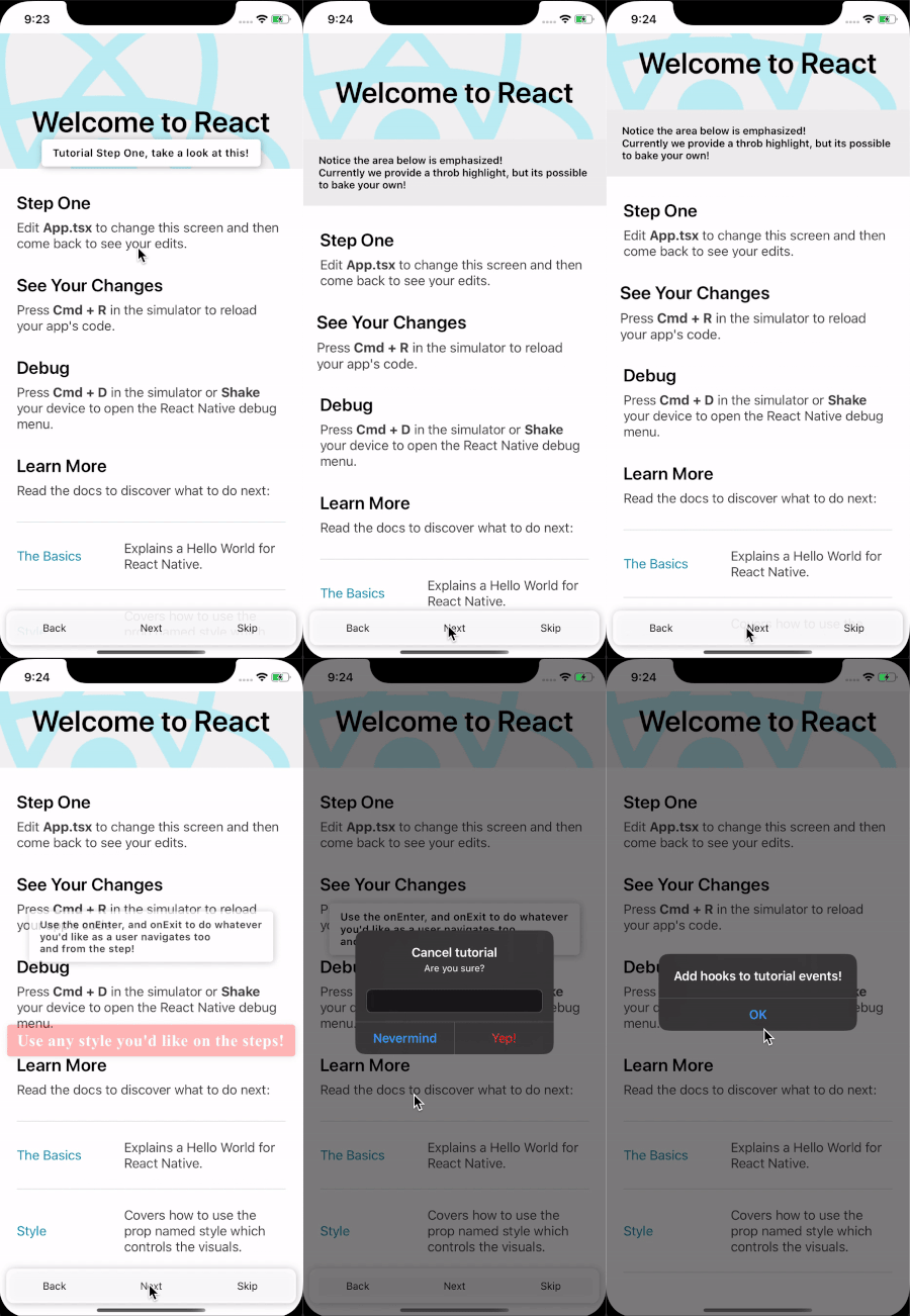
Getting Started
npm i react-native-onboard-tutorialDemo
Usage
Create Tutorial Object
You can take a look at the example App if you'd prefer to just see the code!
First, determine the steps you'd like to highlight. From there, create a tutorial state that'll be used in conjunction with Components to highlight portions of the App.
//Sample tutorial
export const tutorial = {
  id: "tutorial",
  active: true,
  currentStep: 0,
  steps: [
    {
      // Used to link the step to components
      id: "stepone",
      text: "Step one text!",
    },
    {
      id: "steptwo",
      text: "Outlet Text!",
      //Used to show text in the <TutorialTextOutlet /> component
      showOutlet: true,
    },
    //...more steps if desired
  ],
};
Provide the tutorial to the App
Next, let's add a provider around the boundary of the App that needs the explanation, if unsure put it at the root!
import { TutorialProvider } from 'react-native-text-outlet';
import { tutorial } from './appTutorial';

export const App = () => {
    return (
        <TutorialProvider tutorial={tutorial}>
           <RestOfTheApp />
        </TutorialProvider>
    )
API
Hooks
useTutorial()
Returns the current active tutorial state. See Tutorial Definition.
useActiveStep()
Returns the current active tutorial step. See ActiveStep Definition.
useStepListener((current:ActiveStep, previous:ActiveStep)=>void)
Listens for step changes, and calls the function with the current and previous steps anytime an action is taken.
useStep(stepId:string)
Returns the step with the matching stepId.
Components
<TutorialProvider/>
| Prop | Description | Default |
|---|---|---|
tutorial |
Mandatory - Information about the state of the tutorial. For details see [`types.ts | Tutorial`]('./lib/types.d.ts'). |
onEvent |
A function `(eventName:step | complete, info: { from: Step, to: Step }) => void`. |
<TutorialStep/>
The building block for any sort of Tutorial Step, we provide two out of the box, <TutorialText/>, and <TutorialHighlight/>, but this allows you to build your own. See <TutorialText />'s implementation for details on usage.
| Prop | Description | Default |
|---|---|---|
stepId |
Mandatory - The identifier attached to the step that this component represents. | None |
text |
Overrides the text for this step. | Text on the step in the tutorial. |
onEnter |
A function invoked when the step completes, function will be invoked with an event with this structure `{ direction:forward | backward, step:Step }. See [TutorialStepComponent.onExit`]('./lib/types.d.ts') for definition. |
onExit |
A function invoked when the step completes, function will be invoked with an event with this structure `{ direction:forward | backward, step:Step }. See [TutorialStepComponent.onExit`]('./lib/types.d.ts') for definition. |
<TutorialHighlight/>
A component to create a throbbing effect to highlight it's children. Inherits all the props from <TutorialStep/> and adds the following for customization.
| Prop | Description | Default |
|---|---|---|
emphasisScale |
How much to scale the component on the throb effect. | 1.02 |
<TutorialText/>
A component to show a text popover relative to it's children. Inherits all the props from <TutorialStep/> and adds the following for customization.
| Prop | Description | Default |
|---|---|---|
containerStyle |
Overrides the style on the View component wrapping the Text component. |
None |
textStyle |
Overrides the style on the Text component. |
None |
<TutorialTextOutlet/>
A component that shows text for a step that has the property showOutlet set to true. This is useful if you'd like to highlight an area, but add descriptive text elsewhere.
| Prop | Description | Default |
|---|---|---|
containerStyle |
Overrides the style on the View component wrapping the Text component. |
None |
textProps |
Overrides the props on the Text component. |
None |
stepFilter |
A function that allows more control over whether or not this component will display. Simply return true to show the component, or false to hide the component in response to the current step. (step: Step) => boolean
|
None |
<TutorialControls/>
A component to quickly get started with controls for the tutorial. The controls include, going back a step, stepping forward, and skipping the tutorial.
| Prop | Description | Default |
|---|---|---|
backText |
Override the back button text. | Back |
backStyle |
Overrides the props on the Text component. |
None |
backTextProps |
Props to pass to the Text component |
None |
nextText |
Override the next button text. | Next |
nextStyle |
Overrides the props on the Text component. |
None |
nextTextProps |
Props to pass to the Text component |
None |
skipText |
Override the skip button text. | Skip |
skipStyle |
Overrides the props on the Text component. |
None |
skipTextProps |
Props to pass to the Text component |
None |
containerStyle |
Overrides the style on the View component wrapping the controls ` |
None |

