Material Design Bottom Navigation for react-native
A highly accurate Bottom Navigation Component for react-native, based on Material Guidelines' Bottom Navigation.
- Support for iOS and Android (it's programmed only in JavaScript)
- Uses those dope Ripple Transitions between two background colors
- Follows the Material Design Guidelines
- Switches automatically between Fixed Navigation (up to 3 tabs) and Shifting Navigation (3 - 5 tabs)
- No dependencies
- Support for react-navigation
The Bottom navigation looks lovely. That's probably the reason why you're here. Using a Bottom Navigation is a good choice. More and more apps are switching from a Burger Menu and/or Tabs to a Bottom Navigation, including Google Apps.
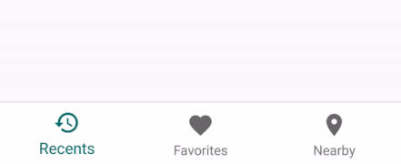
Fixed Bottom Navigation
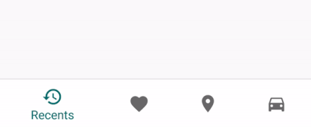
Shifting Bottom Navigation
Behind the Android System Navigation Bar
- Install
- But how? (Usage)
- Configuration
- Behind the Navigation Bar
- Usage for react-navigation
- Roadmap
- LICENSE
Install
# via npm $ npm install react-native-material-bottom-navigation-performance --save # via yarn $ yarn add react-native-material-bottom-navigation-performanceBut how?
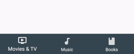
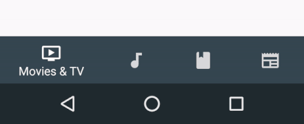
This is an example for a Bottom Navigation with 4 Tabs, each Tab has its own background color.
In this example, I used react-native-vector-icons as Icon Components. You can use whatever Component you want.
import React Component from 'react'import BottomNavigation Tab from 'react-native-material-bottom-navigation'import Icon from 'react-native-vector-icons/MaterialIcons' { return <BottomNavigation ="white" ="white" = = > <Tab ="#37474F" ="Movies & TV" = /> <Tab ="#00796B" ="Music" = /> <Tab ="#5D4037" ="Books" = /> <Tab ="#3E2723" ="Newsstand" = /> </BottomNavigation> }Configuration
Don't skip this part. You will be happy to know about all the good stuff you can configure here.
Note: If you are searching for more customization options, like label styles for fonts/positioning/..., they are intentionally not supported. More and more customizations would be actively against the Material Design Guidelines, and I want to encourage you to follow the Guidelines.
BottomNavigation
| Prop | Description | Type | Default |
|---|---|---|---|
activeTab |
Index of the preselected Tab, starting from 0. | number |
0 |
labelColor |
Text Color of the Tab's Label. Can be overwritten by the Tab itself. | string |
rgba(0, 0, 0, 0.54) |
activeLabelColor |
Text Color of the active Tab's Label. Can be overwritten by the Tab itself. | string |
labelColor |
rippleColor |
Color of the small Ripple Effect when the Tab will be pressed. Has opacity of 0.12. |
string |
black |
backgroundColor |
Background color of the Bottom Navigation. Can be overwritten by the Tab itself, to achieve different background colors for each active Tab. | string |
white |
onTabChange |
Function to be called when a Tab was pressed and changes into active state. Will be called with parameters (newTabIndex, oldTabIndex) => {}. |
function |
noop |
style |
Required. Style will be directly applied to the component. Use this to set the height of the BottomNavigation (should be 56), to position it, to add shadow and border. The only pre-set rule is overflow: hidden. |
object |
Required. |
innerStyle |
All tabs are wrapped in another container. Use this to add styles to this container. The main reason why you would want to use this is to put the Navigation behind the Android System Navigation Bar. See below for an example on how to achieve this. | object |
– |
shifting |
Turn manually on/off shifting mode. | boolean |
true if > 3 Tabs, otherwise false |
Hints:
- Elevation should be
8 - Height should be
56 - Width should be 100%
- Follow all specs defined in the Official Guidelines
Tab
| Prop | Description | Type | Default |
|---|---|---|---|
icon |
Required. Component to render as icon. Should have height and width of 24. |
ReactElement<*> |
Required. |
activeIcon |
Component to render as icon when the Tab is active. Should have height and width of 24. Use this to change the color of the icon. |
ReactElement<*> |
icon |
label |
Required. Text of the Label. | string |
Required. |
labelColor |
Text Color of the Label. | string |
labelColor of BottomNavigation |
activeLabelColor |
Text Color of the Label when the Tab is active. | string |
activeLabelColor of BottomNavigation |
barBackgroundColor |
Background color for the whole component, if the tab is active. | string |
backgroundColor of BottomNavigation |
onPress |
Function to be called when the Tab was pressed. When you use this, the pressed tab won't be active automatically. You need to set it to active by updating BottomNavigation.activeTab. This function will be called with the parameter (newTabIndex) => {} |
function |
– |
Behind the Navigation Bar
In the Material Design Guidelines you can see examples with the Bottom Navigation behind the Software Navigation Bar. That looks pretty sweet. In theory, that's pretty simple. In practice there's a problem: Not every device has a visible Navigation Bar. If someone has hardware buttons on his phone, the Navigation Bar is usually hidden. As of now, we can't simply detect if it's visible. If you don't detect it and just add the following code, the BottomNavigation will have a huge padding-bottom on devices without a Navigation Bar.
See Issue #28 for more informations with an initial proposal by @keeleycarrigan.
However, if you know what you're doing, you only need to adjust a few things:
Step 1. In order to make the System Navigation translucent, you have to add this to android/app/src/main/res/values/styles.xml:
<!-- Customize your theme here. -->@android:color/transparenttrueStep 2. The System Navigation has a height of 48dp. The Bottom Navigation should be 56dp tall. This makes a total height of 104. Use innerStyle to push the tabs above the System Navigation without pushing the whole Bottom Navigation above it.
<BottomNavigation = =>Step 3. You're done!
Usage for react-navigation
This package includes a Component to plug into react-navigation. It is as configurable as the standalone version. To achieve this, it uses a separate configuration inside tabBarOptions. You can only set those configurations for the Bottom Navigation inside the TabNavigatorConfig of TabNavigator() – not inside static navigationOptions or inside the RouteConfigs.
The following example will explain everything you need to get started.
import React from 'react'import NavigationComponent from 'react-native-material-bottom-navigation'import TabNavigator from 'react-navigation'import AppRegistry from 'react-native'; Component static navigationOptions = tabBarLabel: 'Movies & TV' <Icon = ="white" ="tv" /> { ... } Component static navigationOptions = tabBarLabel: 'Music' <Icon = ="white" ="music-note" /> { ... } Component static navigationOptions = tabBarLabel: 'Newsstand' <Icon = ="white" ="Newsstand" /> { ... } const MyApp = AppRegistryTabNavigatorConfig
tabBarComponent: UseNavigationComponentprovided byreact-native-material-bottom-navigation.tabBarPosition: Usebottom.tabBarOptions: react-navigation's configuration of the tab bar.
tabBarOptions
The only options, which will affect the Bottom Navigation, are the following:
style: Corresponds to thestyleprop ofBottomNavigation. If no height is specified, it will useheight: 56. This way you don't need any styling in most cases.bottomNavigationOptions: The options for the Bottom Navigation, see below.
bottomNavigationOptions
All options of BottomNavigation are available. They behave like the options in the standalone version, including fallback- and default-behaviour.
labelColoractiveLabelColorrippleColorbackgroundColorstyle: If specified,tabBarOptions.stylewon't be used.innerStyleshiftingtabs: Configuration for the tabs, see below.
Note: activeTab and onTabChange don't have any effect, since this is handled by react-navigation.
tabs
Each tab can be configured by its key from RouteConfigs. If you take a look at the example, you will see that MoviesAndTV, Music and Newsstand correspond to each other.
tabis an object with{ [routeKey]: tabOptions }
tabOptions
All options of Tab are available. They behave like the options in the standalone version, including fallback- and default-behaviour.
icon: If not specified, the icon insidestatic navigationOptions.tabBarof the scene will be used.activeIconlabel: If not specified, the label insidestatic navigationOptions.tabBarof the scene will be used.labelColoractiveLabelColorbarBackgroundColor
Why don't you use all the options provided by react-navigation?
At the time I developed this, react-navigation was in an early beta stage. It wasn't easy to get those options and add new options. I could only access the configs inside tabBarOptions, hence everything is stored there.
Roadmap
Check if they are any new features announced in the Issues.
LICENSE
MIT