Forked from react-native-list-popover.
React-Native List Popover
Popover is a great way to show a list of items for users to choose from. With component you can add a very simple pop over screen with a list of items as the child component and access the selected item from the parent component. It is a very easy way of adding a list of options to the UI.
The main properties to send from the parent component:
-
listlist of items to choose from -
isVisibleindicator that makes the popover visible or not -
onClickcallback function that takes anitemparameter to handle the click operation -
onClosecallback function to set the isVisible to false to close the popover
Screenshots
| Before | List Popover | Selected |
|---|---|---|
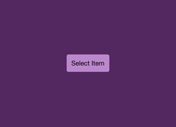 |
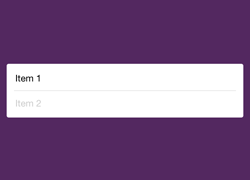 |
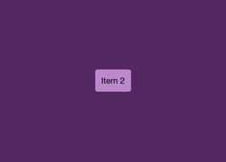 |
Usage
"use strict";

var React = require('react-native');
var ListPopover = require('react-native-list-popover');
var {
  AppRegistry,
  StyleSheet,
  Text,
  TouchableHighlight,
  View,
} = React;
var items = ["Item 1", "Item 2"];

var TestListPopover = React.createClass({
  getInitialState: function() {
    return {
      item: "Select Item",
      isVisible: false,
    };
  },

  showPopover: function() {
    this.setState({isVisible: true});
  },
  closePopover: function() {
    this.setState({isVisible: false});
  },
  setItem: function(item) {
    this.setState({item: item});
  },

  render: function() {
    return (
      <View style={styles.container}>
        <TouchableHighlight style={styles.button} onPress={this.showPopover}>
          <Text>{this.state.item}</Text>
        </TouchableHighlight>

        <ListPopover
          list={items}
          isVisible={this.state.isVisible}
          onClick={this.setItem}
          onClose={this.closePopover}/>
      </View>
    );
  }
});

var styles = StyleSheet.create({
  container: {
    flex: 1,
    alignItems: 'center',
    justifyContent: 'center',
    backgroundColor: '#532860',
  },
  button: {
    borderRadius: 4,
    padding: 10,
    marginLeft: 10,
    marginRight: 10,
    backgroundColor: "#B8C",
  },
});

AppRegistry.registerComponent('TestListPopover', () => TestListPopover);