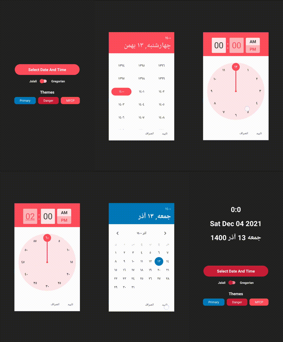
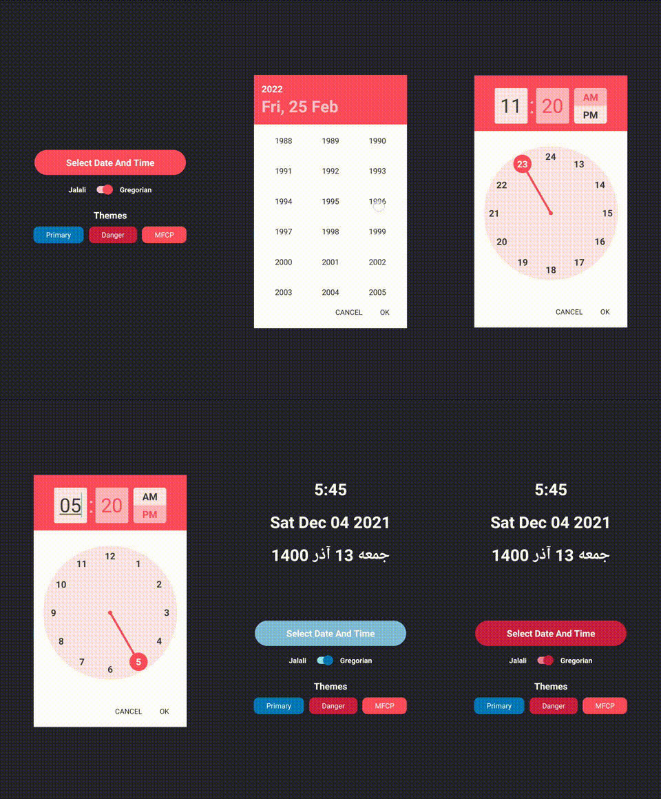
This package is a global, beautiful, customizable date and time picker for React Native.
- Time Picker
- Date Picker
- Customizable theme
- Customizable translation
- Support Jalali(Shamsi) and Gregorian
Install it using Yarn:
$ yarn add react-native-global-datetimepickerOf if you prefer NPM:
$ npm i react-native-global-datetimepickerAfter the installation, it's time to import the package in your app:
import GlobalDateTimePicker, {
    CalendarType,
    weekDaysJalali,
    yearMonthsJalali,
    DateTimePickerMode,
    DateTimePickerThemes,
    DateTimePickerTranslations,
} from 'react-native-global-datetimepicker';
Great job! You're all set. It's time to write some code now.
Let's kick things off by providing an example:
import React, {useState} from "react";
import GlobalDateTimePicker from 'react-native-global-datetimepicker';

export default function App() {
    const [ShowDateTimePicker, setShowDateTimePicker] = useState(false);
    const [SelectedDateJalali, setSelectedDateJalali] = useState<Date>();
    const [SelectedDateGregorian, setSelectedDateGregorian] = useState<Date>();
    return (
        <GlobalDateTimePicker
            visible={ShowDateTimePicker}
            initialDate={SelectedDateGregorian}
            onSelect={(gregorianDate, jalaliDate) => {
                setShowDateTimePicker(false);
                setSelectedDateJalali(jalaliDate);
                setSelectedDateGregorian(gregorianDate);
            }}
            onCancel={() => setShowDateTimePicker(false)}
        />
    );
}-
visibleprop is the state of visibility of the date picker -
initialDateprop is the initial value for the date picker, this date value should be gregorian -
onSelectprop is a function that will take care of changing the date by the user -
onCancelprop is a function that will take care of dismissing date picker by the user
Let's give an advanced example to use
import React, {useState} from "react";
import GlobalDateTimePicker, {DateTimePickerMode} from 'react-native-global-datetimepicker';

export default function App() {
    const [SelectedDateJalali, setSelectedDateJalali] = useState<Date>();
    const [SelectedDateGregorian, setSelectedDateGregorian] = useState<Date>();
    const [PickerMode, setPickerMode] = useState<DateTimePickerMode>(DateTimePickerMode.Day);

    return (
        <GlobalDateTimePicker
            mode={PickerMode}
            persianNumber={true}
            calendar={CalendarType.Jalali}
            visible={PickerMode !== undefined}
            theme={DateTimePickerThemes.Danger}
            initialDate={SelectedDateGregorian}
            translation={DateTimePickerTranslations.fa}
            onSelect={(gregorianDate, jalaliDate) => {
                setShowDateTimePicker(false);
                setSelectedDateJalali(jalaliDate);
                setSelectedDateGregorian(gregorianDate);
            }}
            onCancel={() => setShowDateTimePicker(false)}
        />
    );
}-
persianNumberprop enables the converter that converts English number to Arabic number -
calendarprop is the type of calendar the date picker should be used, there are two types of calendar type available in the library that you can import as CalendarType, the current calendar type is Gregorian and Jalali, default calendar type is Gregorian -
themeprop is an object that contains the color of each part of the component, there are three themes available in the library that you can import as DateTimePickerThemes and use them, the currently available theme is Primary and Danger and MFCP, the default theme is Primary, also you can create your own theme, the interface is like:
const MFCP = {
    Arrow: '#3b3b3b',
    DayText: '#232323',
    HeaderDay: '#ffc4c9',
    HeaderYear: '#ffc4c9',
    SelectedDay: '#ff4d5b',
    WeekDayText: '#a9a9a9',
    YearItemText: '#232323',
    TodayDayText: '#ff4d5b',
    ButtonRipple: '#2323231A',
    SelectedDayText: '#ffffff',
    SelectDayRipple: '#ff4d5b',
    HeaderBackground: '#ff4d5b',
    ContentBackground: '#ffffff',
    HeaderSelectedMode: '#ffffff',
    SelectedYearItemText: '#ff4d5b',
    TimeSeparator: '#ffb5b7',
    TimeInputForeground: '#ff4d5b',
    TimeInputBackground: '#ffb5b7',
    TimeInputFocusForeground: '#3b3b3b',
    TimeInputFocusBackground: '#ffe7e7',
    SelectedClockForeground: '#ffffff',
    ClockForeground: '#3b3b3b',
    ClockBackground: '#ffe7e7',
    ClockPointer: '#ff4d5b'
}-
translationprop is an object that contains the text of each part of the component. There are two languages supported units now that you can import as DateTimePickerTranslations and use them. The currently available language is English and Persian.
If you're interested in contributing to this project, first of all, I would like to extend my heartfelt gratitude.
Please feel free to reach out to me if you need help. My Email: AliRezaBeigyKhu@gmail.com Telegram: @AliRezaBeigy
Use the following command to build and run the example project
$ yarn
$ yarn build # If you have error about cp command, copy src/Assets/*.png to lib/Assets manually
$ cd example
$ yarn
$ yarn run androidMIT


