react-native-expanding-circle-transition
Preview
Installation
npm install react-native-expanding-circle-transition --save
Props
| Props | type | description | required or default |
|---|---|---|---|
| color | string | Color of the circle view | 'orange' |
| size | number | Size of the circle view. Important: It has to fit in the window | Math.min(width, height) - 1 |
| scaleShrink | number | Scale factor to shrink the circle | 0 |
| scaleExpand | number | Scale factor to expand the circle | 4 |
| transitionBuffer | number | Buffer between the transition and the animation. The transition must happen before the circle is hidden | 5 |
| duration | number | Animation duration | 800 |
| expand | bool | Expand the circle if true, reduce the circle if false | true |
| position | enum | Circle position : ['topLeft', 'topRight', 'bottomLeft', 'bottomRight', 'center', 'left', 'right', 'top', 'bottom', 'custom'] | 'topLeft' |
| customLeftMargin | number | Custom position's left margin from the center of the circle positioned at topLeft | 0 |
| customTopMargin | number | Custom position's top margin from the center of the circle positioned at topLeft | 0 |
| easing | func | React Native Animation Easing | Easing.linear |
How to use
To trigger the animation, you need to use a ref to call the start function of this component. To change the scene before the circle is hidden, pass a callback(check out usage exemple handlePress function).
Usage exemples
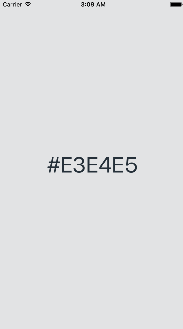
const ANIMATION_DURATION = 1200const INITIAL_VIEW_BACKGROUND_COLOR = '#E3E4E5'const CIRCLE_COLOR1 = '#29C5DB'const CIRCLE_COLOR2 = '#4EB8AE'const CIRCLE_COLOR3 = '#81C781'const CIRCLE_COLOR4 = '#B0D882'const TRANSITION_BUFFER = 10const POSITON = 'custom' const reactMixin = { superprops thisstate = viewBackgroundColor: INITIAL_VIEW_BACKGROUND_COLOR circleColor: CIRCLE_COLOR1 customLeftMargin: 0 customTopMargin: 0 counter: 0 thishandlePress = thishandlePress thischangeColor = thischangeColor } { let pressLocationX = eventnativeEventlocationX let pressLocationY = eventnativeEventlocationY this } { const circleColor counter = thisstate let newCounter = counter < 3 ? counter + 1 : 0 let newCircleColor = this this this } { this } { } { let circleColor viewBackgroundColor customTopMargin customLeftMargin = thisstate return <View style= stylescontainer backgroundColor: viewBackgroundColor > <TouchableWithoutFeedback style=stylestouchable onPress=thishandlePress> <View style=stylestouchableView> <Text style=stylestext>viewBackgroundColor</Text> </View> </TouchableWithoutFeedback> <CircleTransition ref= { thiscircleTransition = circle } color=circleColor expand customTopMargin=customTopMargin customLeftMargin=customLeftMargin transitionBuffer=TRANSITION_BUFFER duration=ANIMATION_DURATION easing=Easinglinear position=POSITON /> </View> } const styles = StyleSheet