

Crossplatform React-Native Components
Beautiful React-Native components using react-native-paper and other libraries. If using a paper provider your theme should be applied to all the components.
Show me Components!
Package renamed
Previous package name: @crossplatform/react-native-components
New package name: react-native-cross-components
Install
When using Expo icons and Paper are bundled.
Note that version of React-Native-Vector-Icons is bound by Expo for compatibility.
The iconset used is currently FontAwesome v4 icons. Ability to customize which iconset is used might be added.
Native
Install with react-native-paper and react-native-vector-icons if you don't already have them.
npm i react-native-cross-components npm i react-native-paper npm i react-native-vector-icons react-native link yarn add react-native-cross-components yarn add react-native-paper yarn add react-native-vector-icons react-native linkExpo prev CRNA
npm i react-native-cross-components yarn add react-native-cross-componentsDocumentation
See our GitHub Pages generated from code comments. This documentation is also available as intellisense / auto complete.
The styles used by this library are exported for your convenience.
See Components below for examples


Table of Contents
- [Show me Components!](#-show-me-components----components-)
- Install
- Documentation
- Components
Table of contents generated with markdown-toc
Components
CrossButton
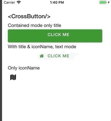
Renders an FontAwesome Button if only iconName is supplied, else an Paper Button.
For properties and documentation, see API reference - Class CrossButton.
Styles can be customized using ButtonStyle, IconStyle and style properties.
However, react-native-paper is currently missing the option to customize fontSize.
Examples
Button with title, but no icon and mode contained (background color):
; ;Button with title and iconName, default text mode (no background):
; ;Clickable icon:
; ;CrossBusyIndicator
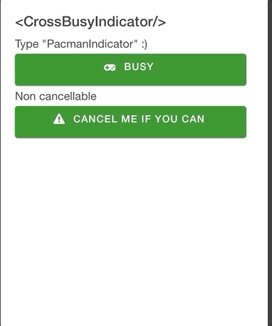
Renders a react-native-modal containing cool animations from react-native-indicators.
For properties and documentation, see API reference - Class CrossBusyIndicator.
Examples
Feedback message and PacmanIndicator type (because, why not).
CrossBusyIndicator isBusy= type='PacmanIndicator' isCancelButtonVisible= message="Loading.." onCancel= /Non-cancellable and custom styles for spinnerProps and messageStyle:
CrossBusyIndicator spinnerProps= messageStyle= isBusy= isCancelButtonVisible= message="Resistance is futile" /Custom modal props:
CrossBusyIndicator modalProps= isBusy= isCancelButtonVisible= message="Busy busy busy.." /CrossSpinner
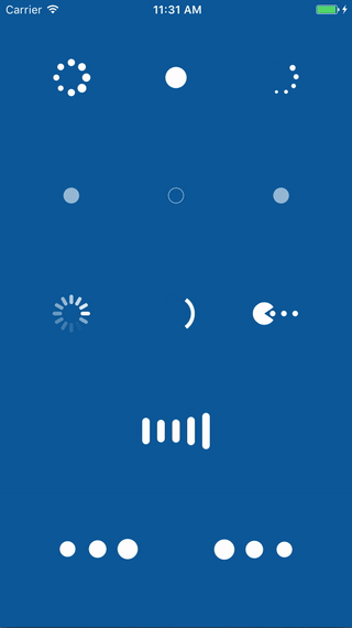
Basically just wraps react-native-indicators so you can provide the type you want via property.
For properties and documentation, see API reference - Class CrossSpinner.
Examples
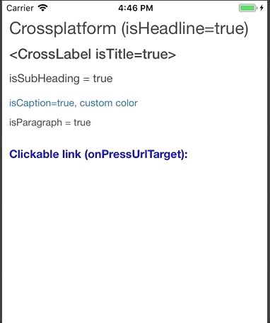
CrossSpinner type= style= /CrossLabel
Wraps react-native-paper typhography components and can also act as a clickable text link.
For properties and documentation, see API reference - Class CrossLabel.
Examples
Headline component:
CrossLabel isHeadline=Crossplatform isHeadline=true</CrossLabel>Title component:
CrossLabel isTitle=<CrossLabel isTitle=true></CrossLabel>Subheading (with custom style):
CrossLabel isSubheading= style= isSubHeading = true /CrossLabelCaption component (with custom style):
CrossLabel isCaption= style= isCaption=true, custom color /CrossLabelParagraph component (with custom style):
CrossLabel isParagraph= style= isParagraph = true /CrossLabelURL link using onPressUrlTarget property. You can also set color using linkColor.
CrossLabel onPressUrlTarget="https://www.typescriptlang.org/" isSubheading= style= Clickable link onPressUrlTarget: /CrossLabelRegular onPress event:
CrossLabel onPress= style= onPress message /CrossLabelCrossEditor
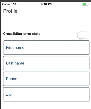
A Paper TextInput that also supports masking using react-native-masked-input.
For properties and documentation, see API reference - Class CrossEditor.
Examples
Basic usage
CrossEditor label= onChangeText= value= /Masked input usage. For maskProps documentation see react-native-masked-input.
CrossEditor label="Phone" maskProps= /