react-native-column-slider
A pure JavaScript Slider component, UI similar to iPhone brightness regulator.
Usage
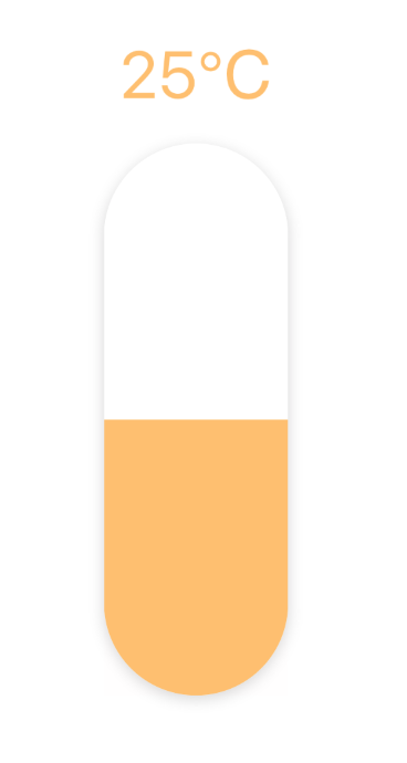
$ npm i react-native-column-slider;;; PureComponent { return <View style=stylescontainer> <ColumnSlider height=300 width=100 min=0 max=50 step=1 minimumTrackTintColor='#ffc069' maximumTrackTintColor='#fff' textStyle= color: '#ffc069' suffix="℃" /> </View> ; } const styles = StyleSheet;Props
| Property | Type | Default | Description |
|---|---|---|---|
| value | number | 0 | Initial value of the slider. |
| disabled | bool | false | If true the user won't be able to move the slider. |
| min | number | 0 | Initial minimum value of the slider. |
| max | number | 0 | Initial maximum value of the slider. |
| step | number | 0 | Step value of the slider. The value should be between 0 and maximumValue - minimumValue). |
| minimumTrackTintColor | string | '#fff' | The bottom color. |
| maximumTrackTintColor | string | '#eee' | The top color. |
| onChange | function | null | Callback continuously called while the user is dragging the slider. |
| onComplete | function | null | Callback called when the user finishes changing the value (e.g. when the slider is released). |
| style | style | null | The style applied to the slider container. |
| textStyle | object | null | The style applied to the value text. |
| icon | node | null | The bottom icon. |
| width | number | 100 | The with of component. |
| suffix | string | null | The suffix of the value. |
| borderRadius | number | 0 | The border radius of component. |