react-native-checkbox-heaven
ReactNative Checkbox components which contains 17 design type.Built in with the help of react-native-vector-icons. Currently supports icon sets:
- fa prefix for FontAwesome by Dave Gandy
- ios prefix for Ionicons by Ben Sperry
- mat prefix for MaterialCommunityIcons by MaterialDesignIcons.com
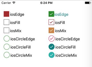
I categorized checkboxes to 3 type:
- Edge (outlined icon for both state)
- Fill (filled icon for both state)
- Mix (outlined for unchecked, filled for checked state)
Default checkboxes

Styled checkboxes
Installation guide
- First react-native-vector-icons must be installed and linked
- Run:
$ npm install react-native-checkbox-heaven --save
Examples
1.Import component
;2.Basic use (default icon is iosMix)
<CheckBox onChange= checked=true/>3.Full
;; state = checked: false { this } { return <View style=stylescontainer> <CheckBox label='demo label' labelStyle=styleslabelStyle iconSize=28 iconName='matMix' checked=thisstatechecked checkedColor='#008080' uncheckedColor='#8b0000' onChange=thishandleOnChange disabled=true disabledColor='red' /> </View> ; } const styles = StyleSheet; AppRegistry; API
| Property | Type | Default Value | Description |
|---|---|---|---|
| style | object | {} | Style for TouchableOpacity |
| checked | bool | false | Checbox state |
| onChange | func | Handler function for button press. Required | |
| labelPosition | string | 'right' | Position for label ('right' or 'left') |
| labelStyle | object | {fontSize:16,marginLeft:3} | Style for Text |
| iconName | string | 'iosMix' | Icon name |
| iconStyle | object | {} | Custom style for Icon react-native-vector-icons |
| iconSize | number | 30 | Icon size |
| checkedColor | string | '#464646' | Icon color for checked state |
| uncheckedColor | string | '#464646' | Icon color for checked state |
| disabled | bool | false | Disable checkbox |
| disabledColor | string | '#888' | Disabled color |
License
This project is licenced under the MIT License.
Contribution
Speacial thanks to udarts, Maksim Degtyarev and pitchourou. Any contribution welcome!