react-native-buttonex
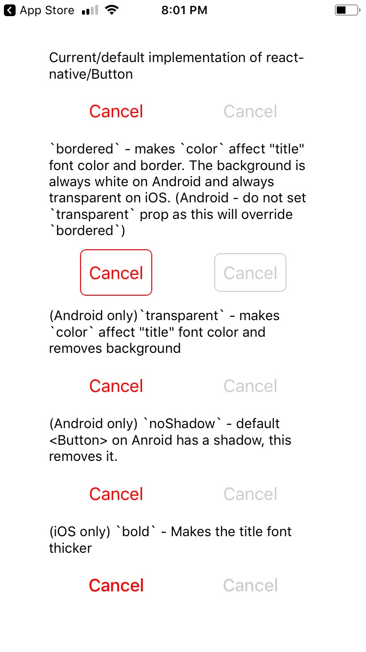
This module is a copy of the default react-native/Button component from here - http://facebook.github.io/react-native/docs/button.html - https://github.com/facebook/react-native/blob/master/Libraries/Components/Button.js - everything works exactly the same. This official component by React Native is very close to look of the native buttons we see on iOS and Android. However there are some minor changes needed to really get that perfect look. This module adds some new props to perfectly acheive the various native styles we see on Android and iOS.
Table of Contents
- How does the native button really look?
- Usage
- Installation
- Import
- Render
- Properties
- Demo
- Screenshots / Screencast
- Android
- iOS
- Future / To Do
How does the native button really look?
This is a great article which shows screenshots - Android VS. iOS: Compare 20 UI Components & Patterns Part 1 and Part 2 - (Original Article in Chineese). It shows the various button components on Android and iOS.
Below are screenshots of where I find these button styles in native apps:
- Bordered Style
- iOS
- App Store
- Default state: https://i.imgur.com/BY4Hdh3.png (the "GET" button)
- Pressed state: https://i.imgur.com/fEcSMED.png (the "OPEN" button)
- This is the effect got by creating a
system/roundedRecttypeUIButton- https://developer.apple.com/documentation/uikit/uibuttontype/1624021-system
- App Store
- Android
- Google Play store
- https://i.imgur.com/Q4qWbNF.png (the "UNINSTALL" button)
- Google Play store
- iOS
- Bold Style (iOS Only)
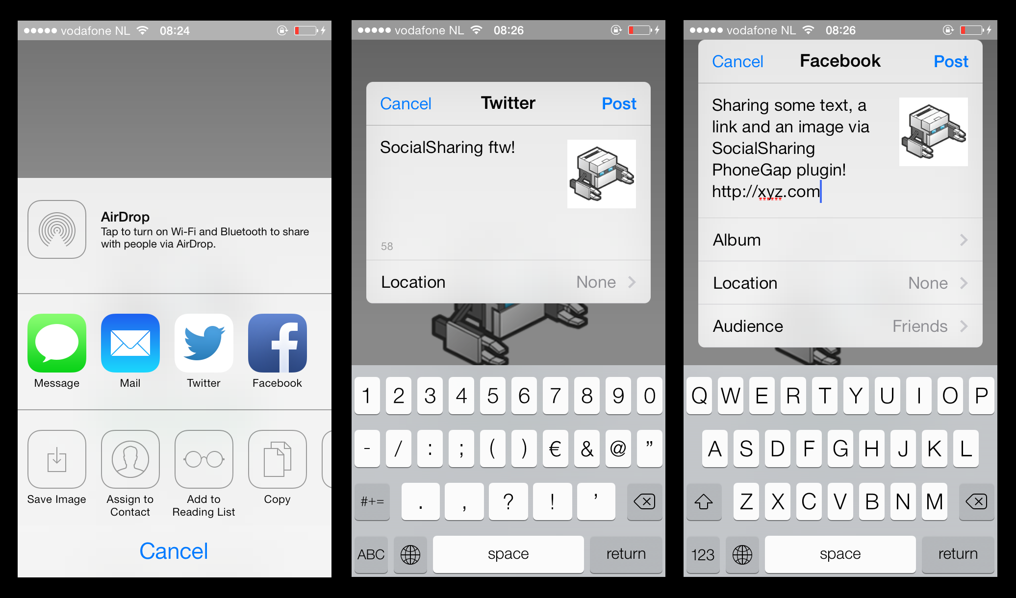
- Share dialog
- Text Button
- iOS
- This is the default look of all buttons on iOS
- Android
- All dialogs
- https://i.imgur.com/JdZmwGK.png ("CANCEL" button is in default state, "OK" button is in pressed state)
- All dialogs
- iOS
- Flat Style (Android only)
- Google Play Store
- https://i.imgur.com/Q4qWbNF.png (The "OPEN" button)
- Google Play Store
Usage
Installation
npm i react-native-buttonex
Import
import Button from 'react-native-buttonex'
Render
All styles accept the properties of:
disabledloadinglightRipple
Other properties behave differently based on the style. This is explained below.
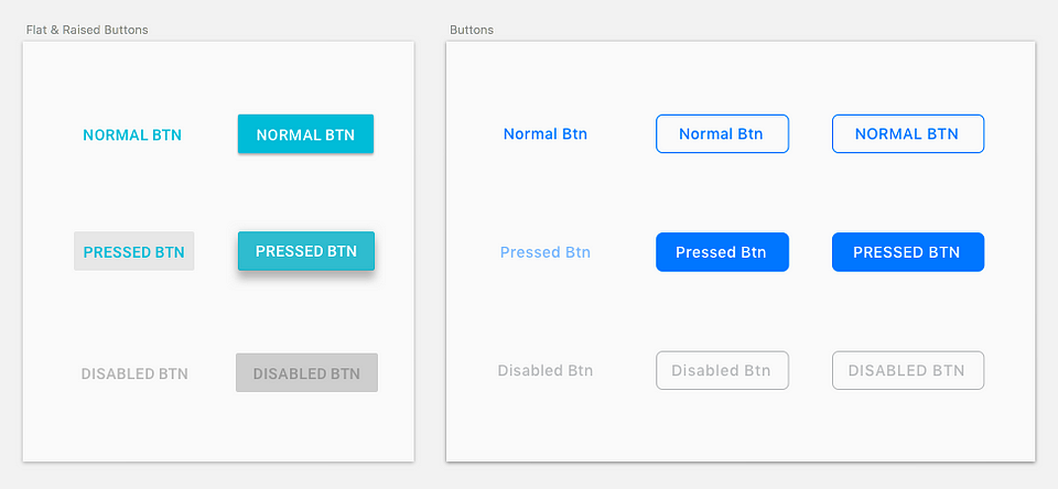
Default Style (Android - Raised Style) (iOS - Text Button Style)
<Button title="Hi" />
- This is an exact copy of the default React Native component - http://facebook.github.io/react-native/docs/button.html.
- Android Behavior
- Description - A raised button with a solid background color.
- Applicable Properties
color- Changes the color of the background.black- Makes the title label black. Useful if the the default color of white is not readable on background color determined bycolor.animated- While the button is pressed, the button raises up more in elveation. This is the default behavior on Android native button, however in this package it is an option, because this option does not useuseNativeDriver, so it is not the best performance.
- iOS Behavior
- Applicable Properties
color- Changes the color of the title label.bold- Increase font weight of title to 500.
- Applicable Properties
Bordered Style
<Button title="Hi" bordered />
- Android Behavior
- Description - Background color defaults to white.
- Applicable Properties
color- Changes the color of the title label and border.noBackground- Make the background transparent. If this prop is set at same time asblack, this property takes precedence, and a black background will not be applied.black- Makes the background color of the button black.
- iOS Behavior
- Description - Background color is transparent. On press, the title label color goes to white, and the background turns into color set by
color. The animation on press usesuseNativeDriver. - Applicable Properties
color- Changes the color of the title label and border. When button is pressed, this becomes the background color.bold- Increase font weight of title to 500.
- Description - Background color is transparent. On press, the title label color goes to white, and the background turns into color set by
Text Button Style (Android Only)
<Button title="Hi" noBackground />
- Behavior
- Description - A text label button with a transparent background.
- Applicable Properties
color- Changes the color of the title label.
Flat Style (Android Only)
<Button title="Hi" flat />
- Behavior
- Description - Same as "raised style" but without the elevation.
- Applicable Properties
color- Changes the color of the background.black- Makes the title label black. Useful if the the default color of white is not readable on background color determined bycolor.
Properties
| Prop | Type | Default | Required | Description |
|---|---|---|---|---|
| animated | bool | (Android only) Makes the "raised button style" raise even more on press. | ||
| black | bool | (Android only) Changes either the title color, border color, or background color, depending on style. See Usage section above. | ||
| bold | bool | (iOS only) Makes the font weight heavier. | ||
| bordered | bool | Gives the button a border. | ||
| borderedActiveTextColor | bool | *(iOS only) Only use if you have set "bordered" and color="white". Because default when active, the font color is white so text will not be visible when active. | ||
| flat | bool | (Android only) Removes the shadow which is there by default on Android. | ||
| lightRipple | bool | (Android only) Use in dark themes. When you want the ripple to be white. Default is rgba(0, 0, 0, 0.12) |
||
| loading | bool | (Android only) Disables onPress handler and shows a spinner. I plan to implement this for iOS soon. I haven't found the style guide for this yet. |
||
| noBackground | bool | (Android only) Gives a transparent background color to the button. | ||
| small | bool | (iOS only) Makes the text smaller. Not yet properly supported with bordered. | ||
| ...Button.props | All other props of the standard react-native <Button> component. |
Demo
A demo is available as an Expo Snack - https://snack.expo.io/@noitsnack/react-native-buttonex-v2.0
Screenshots / Screencast
Android
HD Screencast - https://gfycat.com/IncompatibleConfusedBergerpicard

iOS
Bordered button in pressed state - https://github.com/Noitidart/react-native-buttonex/blob/master/screenshots/ios-pressed.jpg?raw=true
Future / To Do
- iOS font size "small" and "medium" and current (18) should be "default" which is largest, discuss with designers out there
- Small size on iOS (small-bordered is used in App store)
- Maybe medium size on iOS I think this is used in headers
- Android only - for raised button, option to animate/elevate more on press prop - not yet implemented as
useNativeDriverdoesn't work withelevationyet (default button on android is elevated, and pressing elevates it more && the ripple here is different, on press it elevates but doesnt start ripple until onPressOut, onPressIn it also gets a tinge darker - default is #d6d7d7 but when pressed it goes to #c9caca) - loading state
- Android (android has no morph antimation) (available in v2)
- iOS
- Android - the ripple is not respecting border radius of 2, i think this is bug on RN side though
- Android - check what the ripple color should be for the various forms