React Modular Audio Player
React Audio Player Component for HTML5 Audio: Customizable, Modular, & Styleable
This is the react audio player solution you've been looking for! It looks great with almost no learning curve, and setup is fast 'n easy. If you want more options, it's highly customizable and easily styled.

Check out examples with accompanying code snippets.
Features
- Single component, ready for use instantly
- Customizable, modular, and styleable
- Add your own icons, change the order, decide which subcomponents/icons are rendered
Table of Contents
Setup
Only required prop is an ARRAY of audioFile OBJECTs, which follows the pattern
[{ src: "/linkToAudioFile",
  title: "Toxic",
  artist: "Britney Spears" }]
Within the audioFile object, only src is required, title and artist are optional. If you only want to include a single piece of text as the name, set it as the title with no artist.
Quick setup with this simple example
import AudioPlayer from 'react-modular-audio-player';

let playlist = [
  { src: "/music.mp3",
    title: "Song",
    artist: "Singer" },
  { src: "/moreMusic.mp3",
    title: "Another Song",
    artist: "Another Singer" }
];

//inside render() function
<AudioPlayer
  audioFiles={playlist}
/>
Acceptable Props
| Prop Name | Value Type | Default Value | isRequired | Explanation |
|---|---|---|---|---|
| audioFiles | array of objects | no default value | yes | array of audioFile objects following the pattern { src: "/required string pointing to audio file", title: "optional title of track", artist: "optional artist name"} |
| rearrange | array of objects | no default value | no | see more information about rearrange prop below |
| playerWidth | string | "20rem" | no | sets the width of the player, can be set to any acceptable css unit |
| hideSeeking | bool | false | no | prevents the seeking bar from being rendered |
| hideForward | bool | false | no | prevents the skip forward icon from being rendered |
| hideLoop | bool | false | no | prevents the loop current track icon from being rendered |
| hideRewind | bool | false | no | prevents the rewind/previous icon from being rendered |
| hideTime | bool | false | no | prevents the current time/duration from being rendered |
| hideName | bool | false | no | prevents the scrolling marquee that displays track name and artist from being rendered |
| loopPlaylist | bool | false | no | causes the playlist to continue playing again after the last track finishes |
| sliderClass | string | "slider" | no | sets the className of the volume and seeking input range elements for easier css styling |
| playIcon | string | included in module | no | accepts a string referencing an img src that will be rendered as the default initial play icon |
| playHoverIcon | string | included in module | no | accepts a string referencing an img src that will be rendered as the play icon when mouse is hovering, note: enter the same string as playIcon if you don't want the icon to change when hovering |
| pauseIcon | string | included in module | no | accepts a string referencing an img src that will be rendered as the default pause icon |
| pauseHoverIcon | string | included in module | no | accepts a string referencing an img src that will be rendered as the pause icon when mouse is hovering, note: enter the same string as pauseIcon if you don't want the icon to change when hovering |
| forwardIcon | string | included in module | no | accepts a string referencing an img src that will be rendered as the default forward icon |
| forwardHoverIcon | string | included in module | no | accepts a string referencing an img src that will be rendered as the forward icon when mouse is hovering, note: enter the same string as forwardIcon if you don't want the icon to change when hovering |
| rewindIcon | string | included in module | no | accepts a string referencing an img src that will be rendered as the default rewind icon |
| rewindHoverIcon | string | included in module | no | accepts a string referencing an img src that will be rendered as the rewind icon when mouse is hovering, note: enter the same string as rewindIcon if you don't want the icon to change when hovering |
| volumeIcon | string | included in module | no | accepts a string referencing an img src that will be rendered as the default volume icon when track is not playing |
| volumeEngagedIcon | string | included in module | no | accepts a string referencing an img src that will be rendered as the volume icon when track is playing, note: enter the same string as volumeIcon if you don't want the icon to change when track is playing |
| muteIcon | string | included in module | no | accepts a string referencing an img src that will be rendered as the default mute icon when track is not playing |
| muteEngagedIcon | string | included in module | no | accepts a string referencing an img src that will be rendered as the mute icon when track is playing, note: enter the same string as muteIcon if you don't want the icon to change when track is playing |
| loopIcon | string | included in module | no | accepts a string referencing an img src that will be rendered as the default loop icon |
| loopEngagedIcon | string | included in module | no | accepts a string referencing an img src that will be rendered as the loop icon when looping is engaged or mouse is hovering over default loop icon |
| iconSize | string | "1rem" | no | can be set to any acceptable css unit, icon images' heights are set to size entered, widths are set to auto |
| fontFamily | string | "sans-serif" | no | can be set to any acceptable css font-family, changes font of the scrolling title/artist marquee and time/duration |
| fontWeight | string | "100" | no | can be set to any acceptable css font-weight, changes font-weight of the scrolling title/artist marquee and time/duration |
| fontSize | string | "small" | no | can be set to any acceptable css font-size, changes font-size of the scrolling title/artist marquee and time/duration |
| fontColor | string | "black" | no | can be set to any acceptable css color, changes color of the scrolling title/artist marquee and time/duration fonts |
Rearrange Prop
The rearrange prop allows you to render subcomponents in any order you wish. It also allows you to build your audioplayer in multiple columns called tiers.
The rearrange prop allows you to arrange the following subcomponents. All of these subcomponents are referenced by a string name.
Available Subcomponents
| Name | Description |
|---|---|
| "play" | renders the play icon |
| "rewind" | renders the rewind/previous icon |
| "forward" | renders the skip/forward icon |
| "loop" | renders the loop icon |
| "name" | renders the scrolling title/artist marquee |
| "time" | renders the current time/duration |
| "seek" | renders the seeking range input |
| "volume" | renders the volume/mute icon and corresponding range input |
Tier Object
The rearrange prop accepts an array of objects, representing tiers. The tier object follows the pattern below.
//Single Tier Object Shape
{
  className: "string",
  style: {JSXstyleElement: "value"},
  innerComponents: [
    {
      type: "subcomponent string name",
      style: {JSXstyleElement: "value", JSXstyleElement: "value"}
    },
    {
      type: "another subcomponent string name",
      style: {JSXstyleElement: "value"}
    },
  ]
}
Example Tier Object
Below is an example tier rendering the play icon and volume icon/range input with comments.
{
  //className supplies a CSS class to the div containing the given subcomponents
  className: "first-tier",

  //style is an optional property
  //style appends and rewrites the default styling options for the current tier
  //style accepts an object with any JSX inline style properties
  style: {marginBottom: "0.3em"}

  //innerComponents is an array of objects that arrange the desired subcomponents
  innerComponents: [
    {
      //type is a string that will render a specific subcomponent
      type: "play",

      //style is an optional property
      //style appends and rewrites the default styling options for the div containing the subcomponent
      //style accepts an object with any JSX inline style properties
      style: {width: "fit-content"}
    },
    {
      type: "volume"
    }
  ]
}
Default Styling When Using rearrange Prop
Tiers have two default inline style properties, tier and innerComponent. Both of these JSX inline styles can be appended or rewritten with the style properties available within the rearrange prop.
Default Tier Styling
The tier div itself, which contains all the tier's innerComponents, has the following default style
defaultTierStyle = {
  display: "flex",
  flexDirection: "row",
  justifyContent: "left",
  alignContent: "left",
  width: "100%"
}
Default innerComponent Styling
The innerComponent div, which contains a specific subcomponent, has the following default style
defaultInnerComponentStyle = {
  display: "flex",
  alignItems: "center",
  justifyContent: "left",
  width: "100%"
}
Example AudioPlayer using rearrange
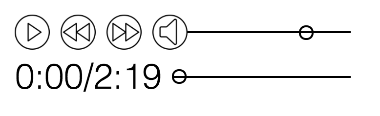
Below is an example of a custom arranged AudioPlayer with two tiers. The first tier contains the play, rewind, forward, and volume innerComponents. The second tier contains the time and seek innerComponents. It appears like this:
let rearrangedPlayer = [
  {
    className: "tier-top",
    style: {margin: "0.3rem"},
    innerComponents: [
      {
        type: "play",
        style: {width: "fit-content"}
      },
      {
        type: "rewind",
        style: {width: "fit-content"}
      },
      {
        type: "forward",
        style: {width: "fit-content"}
      },
      {
        type: "volume"
      }
    ]
  },
  {
    className: "tier-bottom",
    style: {margin: "0rem 0.3rem 0.3rem 0.3rem"},
    innerComponents: [
      {
        type: "time",
        style: {width: "fit-content"}
      },
      {
        type: "seek"
      }
    ]
  }
]

//render
<AudioPlayer
  rearrange={rearrangedPlayer}
  audioFiles={anArrayOfAudioFileObjects}
  playerWidth="10em"
  fontSize="1.5rem"
  iconSize="1.5rem"
/>
Styling
AudioPlayer component
To style the whole AudioPlayer component, you can target the class 'audio-player'.
Icons
The icon sizes are set by the iconSize prop, but individual icon sizes and styling can be overwritten by the following selectors.
| Selector | Info |
|---|---|
| #play-icon | requires !important attribute, includes pause icon |
| #rewind-icon | requires !important attribute |
| #forward-icon | requires !important attribute |
| #volume-icon | requires !important attribute |
| #loop-icon | requires !important attribute |
Range-input
To style the range-input for the volume and seek subcomponents, provide a class selector name for the sliderClass prop (not 'slider', which will have the default styling). I recommend using http://danielstern.ca/range.css/#/ to generate your desired slider style. Include the class name you provided as a prop in the Namespace input at the bottom of the page under 'General'. Copy the generated code into your style sheet and Voila!, a new slider style.
//in render()
<AudioPlayer
  sliderClass="my-slider"/>

//in style sheet
input[type=range].my-slider {
  //style
}
input[type=range].my-slider:focus {
  //style
}
input[type=range].my-slider::-webkit-slider-runnable-track {
  //style
}
input[type=range].my-slider::-webkit-slider-thumb {
  //style
}
input[type=range].my-slider:focus::-webkit-slider-runnable-track {
  //style
}
input[type=range].my-slider::-moz-range-track {
  //style
}
input[type=range].my-slider::-moz-range-thumb {
  //style
}
input[type=range].my-slider::-ms-track {
  //style
}
input[type=range].my-slider::-ms-fill-lower {
  //style
}
input[type=range].my-slider::-ms-fill-upper {
  //style
}
input[type=range].my-slider::-ms-thumb {
  //style
}
input[type=range].my-slider:focus::-ms-fill-lower {
  //style
}
input[type=range].my-slider:focus::-ms-fill-upper {
  //style
}