⚛ React Minimal Dropdown
Pretty straightforward: I needed a tiny dropdown (or as others might say popover) component which was good for exactly one thing: a user clicks on a trigger and content appears directly next to it. That's it. No built-in <select> imitation or whatever. Just a plain dropdown. I looked at dozens of existing React dropdown components but all of them were either overcomplicated (for my needs) or unmaintained or had a really bad code quality (or all of it). The result: React Minimal Dropdown.
You can configure a direction, you have a very little and neutral default styling and that's it. Use it if you need the simplest possible Dropdown with zero dependencies, adjust and style it to your needs and be happy :)
Project philosophy
We take the stability and performance of this package seriously, because one day it might run millions of times a day in browsers all around the world. Updates are thoroughly reviewed for performance impacts before being released.
I don't aim to cover any exotic use case but instead I focus on a minimum of features a dropdown should have. Thus the name react-minimal-dropdown. The react-minimal-dropdown package follows the SemVer standard for versioning.
(Inspired by classnames)
Demo
Quick demo wich shows the available props can be found here: https://react-minimal-dropdown.surge.sh
Installation
npm install react-minimal-dropdown
or:
yarn add react-minimal-dropdown
Usage
There are 3 components you must use to get Dropdown functionality:
<Dropdown>– as mandatory wrapper<Trigger>– acts as trigger to show and hide content<Content>– the content to be shown
Trigger and Content are defined as static members of the Dropdown component so you only have to import Dropdown and can then use it as <Dropdown.Trigger> and <Dropdown.Content> in your JSX instead of having to import all of them explicitly (which is also possible though).
React Minimal Dropdown is built using Webpack with umd as libraryTarget so it should work fine in all environments.
Example
You can find a live example here: https://manuelbieh.github.io/react-minimal-dropdown/example/
;;; // or import and use the components directly:// import { Dropdown, Trigger, Content } from 'react-minimal dropdown' const Example = { return <Dropdown direction="right" beak> <DropdownTrigger>Click me!</DropdownTrigger> <DropdownContent> You clicked the dropdown trigger! </DropdownContent> </Dropdown> ;};Attention: Don't forget to also include the css file from react-minimal-dropdown/dist/index.css!
Styling
Internally RMD uses CSS Modules for scoped styling so you should not be worried that including RMD might break your CSS. If you want to overwrite the existing default styling you can use the predefined BEM like CSS classes:
ReactMinimalDropdownReactMinimalDropdown__ContentReactMinimalDropdown__Trigger.
Also there are modifier classes both for the direction …
ReactMinimalDropdown--topReactMinimalDropdown--rightReactMinimalDropdown--bottomReactMinimalDropdown--left
and the open state:
ReactMinimalDropdown--isOpenReactMinimalDropdown--isClosed
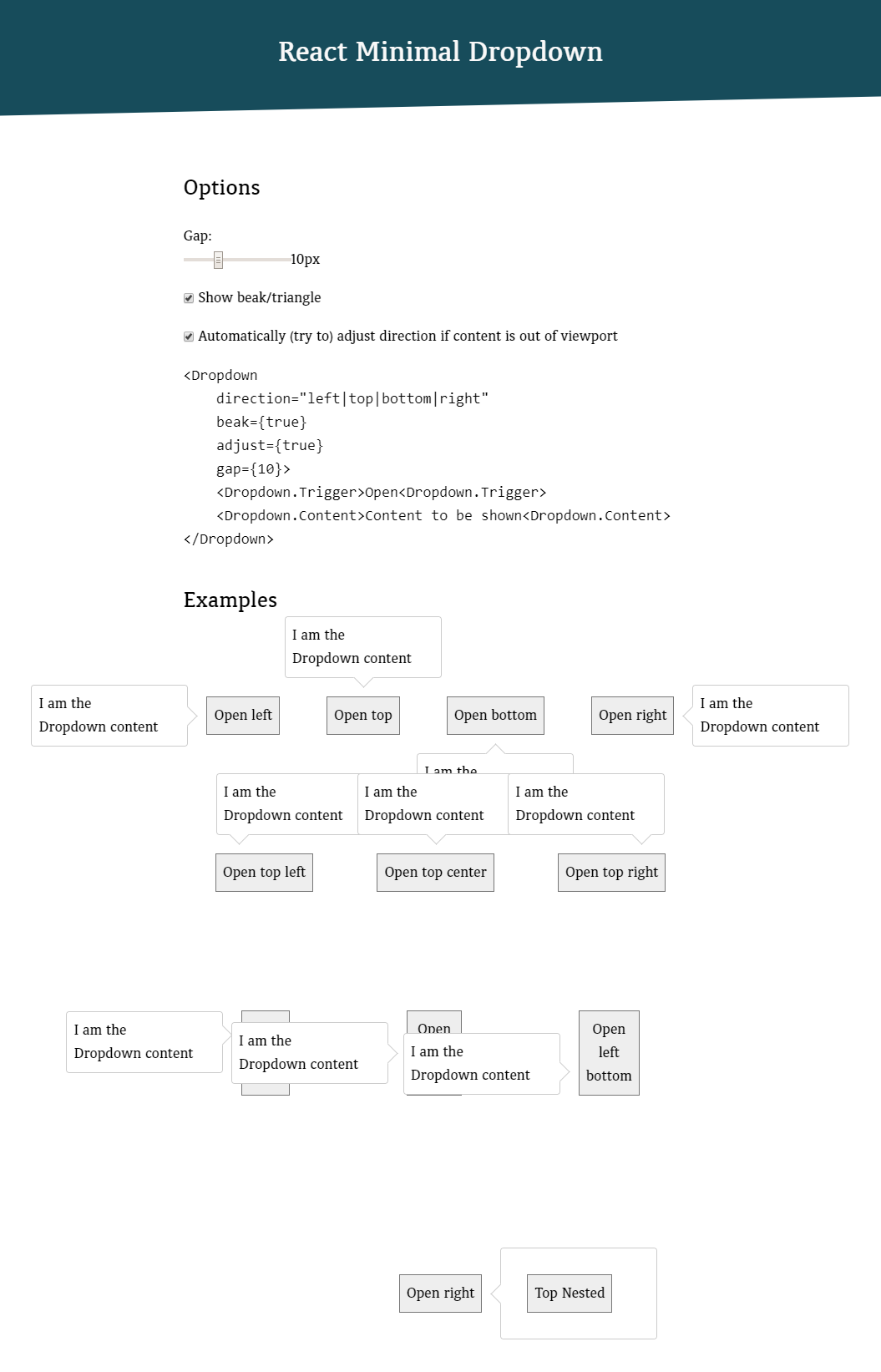
Options
| Prop | Default | Description |
|---|---|---|
adjust |
true |
Adjust content position if it is out of viewport. The component will try to open it the opposite direction then. |
beak |
false |
Show a beak/triangle |
direction |
bottom |
Where to open the dropdown (Possible values: top, right, bottom, left) |
edge |
center | Where to align the content. (Can be left, center, right when direction is set to top or bottom and bottom, center, top when direction is set to left or right) |
gap |
0 |
gap/margin between the content and the trigger |
ignoreScroll |
true |
Don't recalculate the content position on window.scroll |
ignoreResize |
false |
Don't recalculate the content position on window.resize |
show |
false |
flag to have the dropdown content opened initially. This is only respected when the component gets mounted first! |
Events
You can trigger callbacks on certain events. Just use the following props on the <Dropdown> element:
| Event | Description |
|---|---|
| onOpen | Fires after this.state.show gets set to true |
| onClose | Fires after this.state.show gets set to false |
API
There are some methods you can use on the <Dropdown> element to control it from outside.
| Method | Description |
|---|---|
.show() (alias: .open()) |
Open the dropdown |
.hide() (alias: .close()) |
Close the dropdown |
.toggle() |
Toggle the dropdown state |
.isOpen() |
(Boolean) Check if the dropdown state is currently open or not |
.recalculatePosition() |
Recalculate the position of the <Dropdown.Content> |
Todo
- Add some tests
- Add typings for TypeScript and Flow
- …
Changelog
- [2.0.0]: Removed deprecated code (callback refs, componentWillReceiveProps, etc), streamlined build process, using Flow instead of PropTypes, removed on(Before|After)(Open|Close) in favor of onOpen and onClose, upgraded to Babel 7, updated all devDependencies
- [1.1.0]: Possibly breaking:
<Dropdown>default style was changed todisplay: inline-block(wasblockbefore).block={true}prop was added to switch to block.
License
MIT. Copyright (c) 2017-2018 Manuel Bieh.
Preview