react-material-ui-calendar
React calendar using material-ui

Install
npm install --save react-material-ui-calendarExample/Demo
Check out the demo HERE!
Usage
import React Component from "react"; import Calendar from "react-material-ui-calendar"; { return <Calendar />; }Props
| Props | Arg type |
|---|---|
| generalStyle | inline style object |
| light | boolean(default is false) |
| selection | function |
| modes | string (default is "day", "month", "year") |
generalStyle
generalStyle is a prop you can pass to the component to style the calendar window.
{ return <Calendar = /> ; }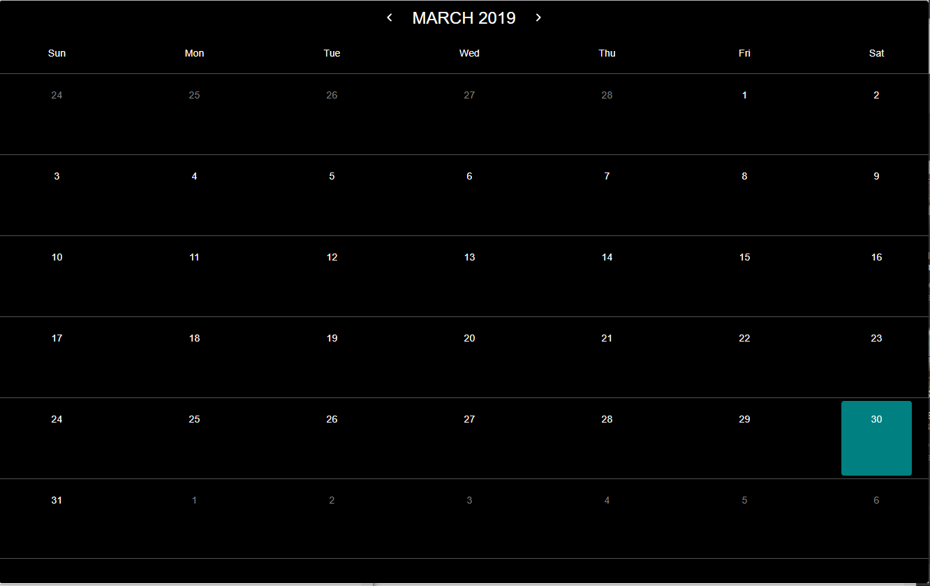
light
light mode turns the normal white text to black text. Default is set to false for dark mode.
{ return <Calendar = = /> ; }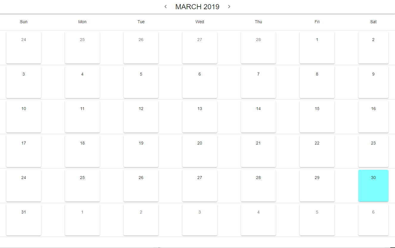
selection
If you wish have the component return the selection, you can pass a function to the selection prop like below.
import React Component from "react"; import Calendar from "react-material-ui-calendar"; { console; }; { return <Calendar = = /> ; }mode selection - day
This is the default mode and will display the regular calendar for users to select a day. mode="day" is not required.
{ console; }; { return <Calendar = = ="day" /> ; }mode selection - month
Displays the twelve months of the year for users to select the month. The return values for months start at 0 for January, 1 for Febuary, etc. eg. If you selected July, the return month is 6.
{ console; }; { return <Calendar = = ="month" /> ; }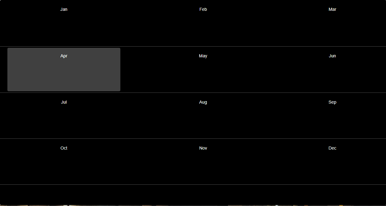
mode selection - year
Displays the years for users to select.
{ console; }; { return <Calendar = = ="year" /> ; }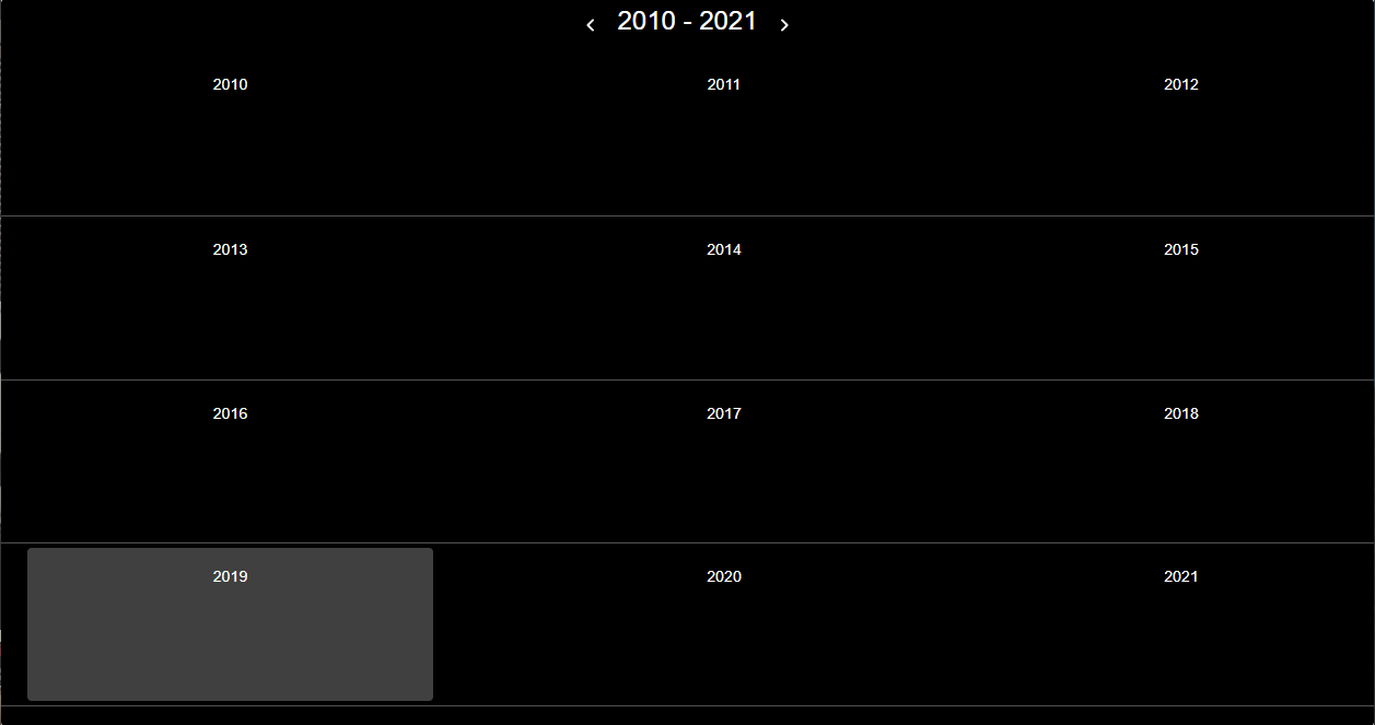
License
MIT © joswong13