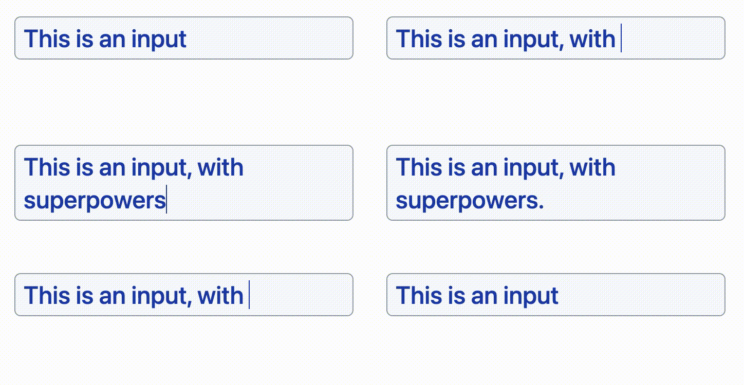
react-line-wrapping-input
<input type="text"> elements don't wrap nor adjust their size to the content.
<textarea> elements wrap, but don't adjust their size to the content, and they allow line breaks.
What about an input that wraps when the content is too long, but doesn't allow user-entered line breaks?
No easy way to do that natively on the web. This package solves that using a neat trick and a textarea element. No need to mess around with contenteditable.
Installation
npm install --save react-line-wrapping-input
Usage
import LineWrappingInput from "react-line-wrapping-input";<LineWrappingInput
{/*
No required props.
You'll probably want value and onChange for controlled inputs.
You can also use onBlur and any other textarea props.
There are some custom props too, see below.
*/}
/>Required styles
Because of browser default styles, some CSS resets are required.
.line-wrapping-input {
  border: 0; /* add a border on the container if you want one */
  background: "transparent"; /* add a background on the container if you want one */
  text-align: "left"; /* you may also use right or center here */
  padding: 0; /* change 0 for your desired padding */
  font: "inherit"; /* you may set a font here if you wish */
}
Pasting the snippet into your CSS file will work, but you can use custom classes or inline styles instead if you prefer (read the Styling section).
How it works
It renders a div element with two overlapping children: a textarea and another div. The inner div renders the textarea's content too (but it's invisible!), and since divs automatically resize according to their content, the textarea does as well.
This solution is inspired by this CSS tricks article, with the added feature of emulating a single-line input by stripping line breaks.
Styling
You can add CSS rules to the built-in classes, supply your own, or use inline styles.
Built-in classes:
- Use the
.line-wrapping-input-containerselector to style the container. - Use the
.line-wrapping-inputselecctor to style the textarea and the invisible element.
Add your own classes:
- Use the
containerClassNameprop to add classes to the container. - Use the
classNameprop to add classes to the textarea and the invisible element.
Inline styles:
- Use the
containerStyleprop to add styles to the container. - Use the
styleprop to add styles to the textarea and the invisible element.
A way to style just the
textareaor the invisible element is not provided. The autosizing would break if they don't have matching styles.
Some more inline styles will be added by the package, those are required for the component to work.
Custom props
Apart from all textarea props except for rows, there are a few extra features you can take advantage of.
blurOnLineBreak
Set blurOnLineBreak={true} to blur the input when the user presses the return key. Otherwise, the return key will move the cursor to the end of the content.
On regular HTML text inputs, the return key doesn't jump to the end, but I've found no way to prevent this.
onReturn
If you want to do anything else when the user presses the return key (for example, submitting data), use the onReturn event.
suffix
The suffix prop renders some optional static text after the editable portion of the input. It can be useful for fields with units, such as "___ minutes".
The suffix is rendered in a span tag. Use the .line-wrapping-input-suffix selector, the suffixStyle prop and/or the suffixClassName prop to style it if you need to.
readOnly
In addition to the standard disabled prop, a readOnly boolean prop is included. This will unmount the textarea and show the static content instead. It can be useful when a disabled field is not desirable or if distinct read-only and disabled states are required.
ref
The ref to the textarea element is exposed via forwardRef, if you need to access it for some reason.
overlapTechnique
To overlap the textarea and the invisible element, the default behavior is to use display: grid and overlapping grid areas. An equilvaent result can be achieved with absolute positioning. If you prefer that you can use overlapTechnique="absolute".
Tricks
Growing the field horizontally
If you set the container element (.line-wrapping-input-container) to have width: fit-content, you'll get an input that expands horizontally up to its max-width (if one is set) and then wraps over to the next line.
Use overlapTechnique="absolute" for best results.
Maximum rows
There's no straightforward way to set the maximum amount of rows for the input, but there's a trick you can use.
Set max-height and overflow: auto on the container element (using the .line-wrapping-input-container selector, the containerClassName prop or the containerStyle prop). The max-height should match the height that your maximum lines would have.
Make sure your padding is on the input and your border is on the container, that way the scrolling behavior will look better.
How to get the correct max-height value
If you're using an absolute value for line-height, you'll need max-height: PADDING_TOP + PADDING_BOTTOM + BORDER_TOP + BORDER_BOTTOM + DESIRED_MAX_LINES * LINE_HEIGHT.
If you're using a relative value for line-height, your absolute line height is LINE_HEIGHT times FONT_SIZE.
You can use calc() if you need to mix units or reference CSS variables.
Known issues
text-align and suffix
The suffix prop will not display correctly when using text-align: center or text-align: right.
