React Lazy Paginated Tree
React tree-view component built for performance, customizability and large data sets. This library provides:
- A base theme built on top of material UI
- Flexible styling (provide a theme or override the default theme)
- The ability to plug in your own custom components
- Lazy loading (i.e. load children when expanding a node)
- Pagination for long lists of child nodes
- Animations when expanding and collapsing nodes
- The ability to override default methods for expanding/collapsing/selecting nodes
- Keyboard accessibility
Install
npm install react-lazy-paginated-tree --save
Running the Example project
The /example project can be used as a development environment for the RLPT package.
To run the project, navigate to the /example folder and run the following commands.
npm install
npm start
To develop on a local development build of RLPT the easiest thing to do at the moment
is to symlink the package to the module in /example. To do this:
cd react-lazy-paginated-tree
npm link
cd react-lazy-paginated-tree/example
npm link react-lazy-paginated-tree
This will serve the build assets in dist so make sure to run npm run build to update the assets.
For more information on creating npm symlinks - https://docs.npmjs.com/cli/link.
Dependencies
This library depends on:
Please ensure that these are included in your project.
Quick Start
'use strict'; ;;; { return <Tree nodes=SampleTree useLocalState=true />; } const content = document;ReactDOM;Demo
An online demo for the quick start, theming, lazy loading and pagination can be found Here.
API
<Tree />
The component accepts the following props:
Data Props
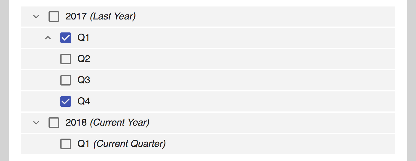
nodes: Array<Node>: (required) A list of nodes that represent the top level of the tree
Format (one node with one child):
{
  id: 5,
  name: '2018',
  description: 'Current Year',
  children: [
    {
      id: 6,
      name: 'Q1',
      description: 'Current Quarter',
      children: [],
      numChildren: 0,
      expanded: false,
      selected: false,
    },
  ],
  numChildren: 1,
  expanded: false,
  selected: false,
},
State Props
useLocalState: boolean: boolean that if set to TRUE will leverage local tree state only and not reflect prop changes. If you are using a state management framework such as Redux do NOT set this property to true.
Lazy Loading Props
loadChildren: Function: function to load children of a node, called with(node: Node, pageLimit?: number). A parse method must be specified if the structure of children returned from this method doesn't matchArray<Node>.parse: Function: function that accepts a list of children (via loadChildren) and returns a list ofArray<Node>. This must be provided if loadChildren doesn't returnArray<Node>.
Pagination Props
paginated: boolean: If true the tree will attempt to paginate by concatenating existing nodes with nodes returned by loadChildren.pageLimit: number: pagination page limit.
Change Tracking Props
onUpdate: Function: function called with(state: TreeState)whenever the tree state changes. Can be used to hook into external data providers (i.e. with Redux).
Callback Props
toggleCallback: Function: function called with(e: Event, node: Node)as a callback to node expand/collapse event.selectCallback: Function: function called with(e: Event, node: Node)as a callback to node selection event.- by default, will trigger on the OnClick event of the node.
- if
doubleClickSelect = truethen it will fire on the OnDoubleClick event - does not support both OnClick and OnDoubleClick events for node selection
Style Overrides
theme: Theme: The easiest way to add custom styling. Simply provide atheme: Themejavascript styles object override the default theme.indentWidth: number: The padding depth for each level of nesting within the tree.
Component Overrides
The component tree looks like this:
<List>
  <Loading />
  <ListItem>
    <DepthPadding />
    <Expander />
    <Checkbox />
    <Body />
  </ListItem>
  <Paginator />
</List>
Each of these components can be substituted with your own custom component. The default theme is built on Material-UI. The components are:
List: <React.Component />ListItem: <React.Component />Expander: <React.Component />Checkbox: <React.Component />Body: <React.Component />Paginator: <React.Component />Loading: <React.Component />DepthPadding: <React.Component />
Package Exports
Tree Component
import { Tree } from 'react-lazy-paginated-tree'
Themes
import { defaultTheme, minimalTheme } from 'react-lazy-paginated-tree'
Sample Nodes
import { SampleTree } from 'react-lazy-paginated-tree'
Flow Types
import type {
  TreeProps,
  TreeState,
  TreeNodeProps,
  TreeNodeState,
  Node,
  Theme,
  CheckboxProps,
  BodyProps,
  ExpanderProps,
  ListItemProps,
  ListProps,
  LoadingProps,
  DepthPaddingProps,
} from 'react-lazy-paginated-tree'
Flow-Type Definitions
: TreeProps
export type TreeProps = {
  nodes: Array<Node>,
  pageLimit?: number,
  parse?: Function,
  style?: Object, // equivalent to overriding theme.treeStyle
  className?: string | Object,
  theme?: Theme,
  indentWidth?: number,
  List?: any,
  ListItem?: any,
  Expander?: any,
  Checkbox?: any,
  Body?: any,
  Paginator?: any,
  Loading?: any,
  DepthPadding?: any,
  toggle?: Function,
  onKeyToggle?: Function,
  select?: Function,
  onKeySelect?: Function,
  loadChildren?: Function,
  selectCallback?: Function,
  toggleCallback?: Function,
  useLocalState?: boolean,
  paginated?: boolean,
};
: TreeState
export type TreeState = {
  nodes: Array<Node>,
};
: TreeNodeProps
export type TreeNodeProps = {
  depth: number,
  node: Node,
  theme: Theme,
  indentWidth: number,
  List: any,
  ListItem: any,
  Expander: any,
  Checkbox: any,
  Body: any,
  Paginator: any,
  Loading: any,
  DepthPadding: any,
  loadChildren: Function,
  parse: ?Function,
  pageLimit: ?number,
  selectCallback?: Function,
  toggleCallback?: Function,
  useLocalState?: boolean,
  paginated?: boolean,
  doubleClickSelect?: boolean,
};
: TreeNodeState
export type TreeNodeState = {
  expanderLoading: boolean,
  paginatorLoading: boolean,
  expanded: boolean,
  selected: boolean,
  children: Array<Node>,
  page: number,
};
: Node
export type Node = {
  id: string,
  name: string,
  description: string,
  children: Array<Node>,
  numChildren: number,
  page: number,
  expanded: boolean,
  selected: boolean,
};
: Theme
export type Theme = {
  treeStyle: Object,
  bodyStyle: Object,
  bodyTextStyle: Object,
  checkboxStyle: Object,
  checkboxIconStyle: Object,
  checkboxIconCheckedStyle: Object,
  expanderStyle: Object,
  listItemStyle: Object,
  paginatorStyle: Object,
  paginatorTextStyle: Object,
  loadingStyle: Object,
  loadingTextStyle: Object,
  listStyle: Object,
  bodyClassName: ?String,
  bodyTextClassName: ?String,
  checkboxClassName: ?String,
  expanderClassName: ?String,
  listClassName: ?String,
  listItemClassName: ?String,
  loadingClassName: ?String,
  loadingTextClassName: ?String,
  paginatorClassName: ?String,
  paginatorTextClassName: ?String,
};
: CheckboxProps
export type CheckboxProps = {
  checked: boolean,
  theme: Theme,
  node: Node,
  onChange: Function,
  onKeyPress: Function,
  selected: boolean,
};
: BodyProps
export type BodyProps = {
  theme: Theme,
  node: Node,
  onClick: Function,
  onKeyPress: Function,
};
: ExpanderProps
export type ExpanderProps = {
  theme: Theme,
  node: Node,
  onClick: Function,
  onKeyPress: Function,
  expanded: boolean,
};
: ListItemProps
export type ListItemProps = {
  theme: Theme,
  node: Node,
  children: any,
  onClick: Function,
  onDoubleClick: Function,
  onKeyPress: Function,
};
: ListProps
export type ListProps = {
  theme: Theme,
  node: Node,
  children: any,
};
: PaginatorProps
export type PaginatorProps = {
  theme: Theme,
  node: Node,
  onClick: Function,
  onKeyPress: Function,
  indentWidth: number,
  depth: number,
};
: LoadingProps
export type LoadingProps = {
  theme: Theme,
  node: Node,
  indentWidth: number,
  depth: number,
};
: DepthPaddingProps
export type DepthPaddingProps = {
  indentWidth: number,
  depth: number,
  children: any,
};
License
MIT.