
react-kindness 
A lightweight, fully-customizable kind screen guide for React
To install
$ npm install --save react-kindnessPut this somewhere in your component tree,
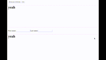
;; // ... KindnessPanel enabled= onExit= /then point out some elements that you want your guests to focus on
Kindness input type="text" //Kindness Kindness message="Click here to submit your post!" button type="submit"Submit</button>/KindnessWhen the <KindnessPanel /> becomes enabled={true}, the screen guide starts.
Props of <KindnessPanel />
; ;Props of <Kindness />
Customizing a panel content
By default <KindnessPanel /> uses <KindnessPanelContent /> internally. By passing a function as a child, you can customize the content.
KindnessPanel enabled= Properties of the argument is these:
;(wip) Get additional variables from <Kindness />
When you pass a function to <Kindness /> as a child, you can use additional variables.
Kindness /KindnessTodo
- When scrolling a spot is something wrong
- How can I put all into a single root dom
- Jump to a target with animated-scroll-to
- Why my popper doesn't flip on viewport boundary
- 0.3.0 Fancy API for customising
- 0.4.0 More tests
- Scroll X
-
onClickOutsideof<KindnessPanel /> - Disabling user interactions
onClickOutside - feat:
<Kindness shape={'circle'|'rect'} />with smooth spot transition of each - mod: Scroll to a target with decent margin even with circle spot
- Accept a function as a child to
<Kindness />
License
MIT