React Infinite Grid 
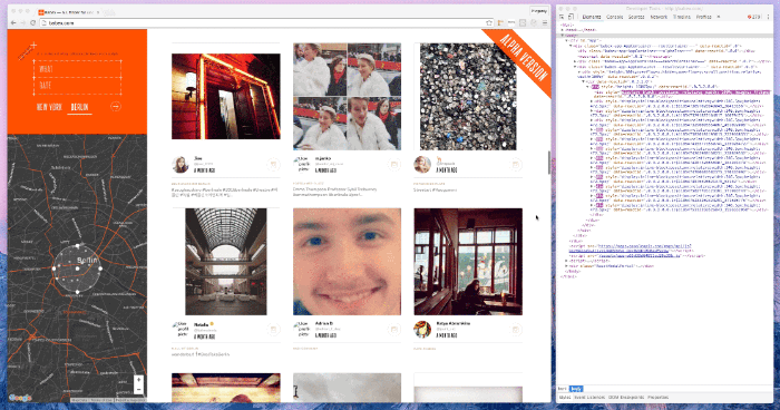
Hint: Pay attention to the DOM.
Installation
npm install --save react-ingrid
Features
- windowing - render only visible items
- relative positioning - all items position relative each other
- supports Immutable.js
Usage
// Regular array or Immutable.js Listconst items = id:1 foo: 'bar' ... // Your component must accept 'data' prop.const ItemComponent = ... const props = ItemComponent items itemWidth: 100 itemHeight: 100 /* load more items */ more: Boolean // has more loading: Boolean ...<Ingrid ...props/> // or with decoratorconst Grid = ItemComponentProps
ItemComponentitemsitemWidthitemHeightloadmoreloadingpaddingToppaddingLeftonScrollChangePreloaderComponentpreloaderHeightisShowingPreloadershouldPrerenderAll
ItemComponent (required)
Use your ✨imagination✨ to define how your grid items should look.
This component gets:
data- The data to render (plain object or Immutable.js)
It should return a react component. For example:
const ItemComponent = <div> <h1>datatitle</h1> </div>items (required)
An array (or Immutable.js List) of items to display. For example:
const items = id:1 foo: 'bar' ...itemWidth & itemHeight (required)
ItemComponent's width and height.
For example, to render adaptive Ingrid (like with CSS media queries) you can do:
... const itemWidth itemHeight = windowWidth >= 320 && windowWidth < 376 ? 200 200 : windowWidth >= 568 && windowWidth < 667 ? 300 300 : windowWidth >= 1435 && windowWidth < 1445 ? 400 400 : 500 500 const props = ... ItemComponent: UserPhoto itemWidth itemHeight ... return <Ingrid ...props /> ...load (required)
Function that loads more items when user scrolls. Ingrid will call "load" every time user scrolls a page (unless you provide the more prop). You design how items are modelled. Therefore, it's your responsibility to load and sort items in your store.
more (optional, boolean)
Ingrid loads items when user scrolls. You must provide a boolean to tell whether you have more items to load.
By default, it is always true.
loading (required, boolean)
Normally you don't want to send multiple load requests at the same time. To tell Ingrid not to do it provide a boolean.
Also, you might want to show a preloader while loading new items. For example:
const ImagesGrid = { const props = ... loading ... return <Ingrid ...props /> } Component ... { const loading = thisprops return loading ? <ImagesGrid /> : this }paddingTop (optional)
You might want to add extra padding on top. This is the best place to do it 😉
Note: Do not do it via CSS — Ingrid will not be able to calculate the top of the container, and everything will shake.
paddingLeft (optional)
The same is as the paddingTop but for the left side
getPaddingTop (optional)
This function is called when Ingrid is scrolled. It has the following signature:
where:
value- current paddingTop, if it > 0 or paddingTop prop then content was scrolled
You might want to use it to hide/show some element (hide a menu). For example:
const ImagesGrid = { const props = ... ... return <Ingrid ...props /> } // ImagesActions.jsconst handleGridScroll = { const menuHeight = 300 const isMobile = if isMobile && value > menuHeight if isMobile && value < menuHeight } Component ... { const isShowingMenu = thisprops return ... isShowingMenu ? <Menu /> : '' ... }isShowingPreloader (optional, boolean)
Ingrid shows a preloader while loading new items. We don't recommend to disable this behaviour. The better way is to create your own preloader and pass it through PreloaderComponent prop.
By default, it is true.
PreloaderComponent (optional)
If you don't happy with our default preloader use your ✨imagination✨ to implement your own.
const PreloaderComponent = <div> <h1>Much loading So wait</h1> </div>preloaderHeight (optional)
You can add more space for your preloader here.
shouldPrerenderAll (optional)
If you want to render your grid on the server side you should set this propery true. In this case all items will be rendered on the initial render call.
Examples
License
MIT