
🏁 React Final Form HTML5 Validation


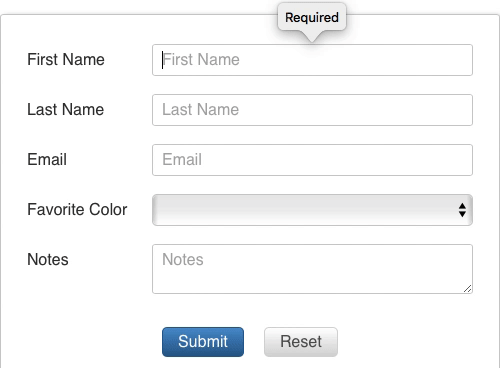
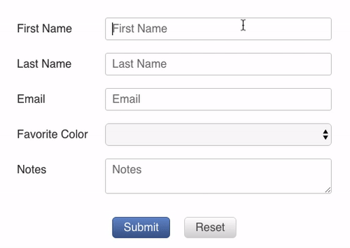
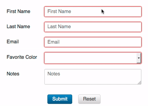
🏁 React Final Form HTML5 Validation is swappable replacement for 🏁 React Final Form's Field component that provides two-way HTML5 Validation bindings. The bindings are two-way because any HTML5 contraint validation errors will be added to the 🏁 Final Form state, and any field-level validation errors from 🏁 Final Form will be set into the HTML5 validity.customError state. Unfortunately, this functionality is not compatible with 🏁 React Final Form record-level validation, so the two should not be mixed.
Why not add this functionality directly into the officially bundled Field component?
Good question. The reason is that not everyone needs this functionality, and not everyone is using 🏁 React Final Form with the DOM (e.g. some people use it with React Native). Therefore it makes sense to make this a separate package. This version of Field is a thin wrapper over the official Field component, and the only Field API that this library uses/overrides is the field-level validate prop, so even if you are using this library's Field component, you will still get improvements as features are added to the 🏁 React Final Form library in the future.
| Safari | Chrome | Firefox |
|---|---|---|
 |
 |
 |
Installation
npm install --save react-final-form-html5-validation react-final-form final-formor
yarn add react-final-form-html5-validation react-final-form final-formExample 👀

Usage
The way you specify rules and error messages in HTML5 is by giving first a rule prop, e.g. required, min, maxLength, and then an error message prop, e.g. valueMissing, rangeUnderflow, or tooLong, respectively. This library comes with built-in English defaults for the error messages, but you will probably want to override those by passing in your own.
import Form from 'react-final-form'import Field from 'react-final-form-html5-validation' const MyForm = <Form = = />Table of Contents
Rules and Messages
These all come from the HTML Standard.
| Rule | Value | Message | Meaning |
|---|---|---|---|
badInput |
The value is invalid somehow | ||
max |
Number |
rangeOverflow |
The value is too high |
maxLength |
Number |
tooLong |
The value is too long |
min |
Number |
rangeUnderflow |
The value is too small |
minLength |
Number |
tooShort |
The value is too short |
pattern |
string |
patternMismatch |
The value does not match the regular expression |
required |
boolean |
valueMissing |
The value is missing |
step |
Number |
stepMismatch |
The value does not match the step granularity |
typeMismatch |
The value does not match the specified type |
API
In addition to all the FieldProps that you can pass to the standard Field, to an HTML5 Validation Field, you may also pass:
Rules
max?: Number
The maximum value allowed as the value for the input. If invalid, the rangeOverflow error will be displayed.
maxLength?: Number
The maximum length allowed of the input value. If invalid, the tooLong error will be displayed.
min?: Number
The minimum value allowed as the value for the input. If invalid, the rangeUnderflow error will be displayed.
minLength?: Number
The minimum length allowed of the input value. If invalid, the tooShort error will be displayed.
pattern?: string
A string regular expression to test the input value against. If invalid, the patternMismatch error will be displayed.
required?: boolean
Whether or not the field is required. If invalid, the valueMissing error will be displayed.
step?: Number
The step size between the min and max values. If invalid, the stepMismatch error will be displayed.
Messages
badInput?: string
The message to display when the input is invalid somehow.
patternMismatch?: string|(value?: any, props: Object) => string
The message to display when the value does not match the pattern specified by the pattern prop.
rangeOverflow?: string|(value?: any, props: Object) => string
The message to display when the value is higher than the max prop.
rangeUnderflow?: string|(value?: any, props: Object) => string
The message to display when the value is lower than the min prop.
stepMismatch?: string|(value?: any, props: Object) => string
The message to display the value is not one of the valid steps specified by the step prop.
tooLong?: string|(value?: any, props: Object) => string
The message to display when the value longer than the value specified by the maxLength prop.
tooShort?: string|(value?: any, props: Object) => string
The message to display when the value shorter than the value specified by the minLength prop.
typeMismatch?: string|(value?: any, props: Object) => string
The message to display when the value does not match the type prop.
valueMissing?: string|(value?: any, props: Object) => string
The message to display when the value is required, but missing.
Internationalization
If internationalization is important to your project, you should probably create a component that wraps this component, pulls the localized messages from the context, and renders:
<Field />