React Filteredlist
A very versatile Datalist component with filtering. It is very configurable with many hooks for utilizing the component's behaviors. More specific documentation to come.
Table of contents
- Screenshots
- Development
- Installation
- Usage
- Breaking Changes
- Documentation
Screenshots
Filteredlist w/ custom display component screenshot 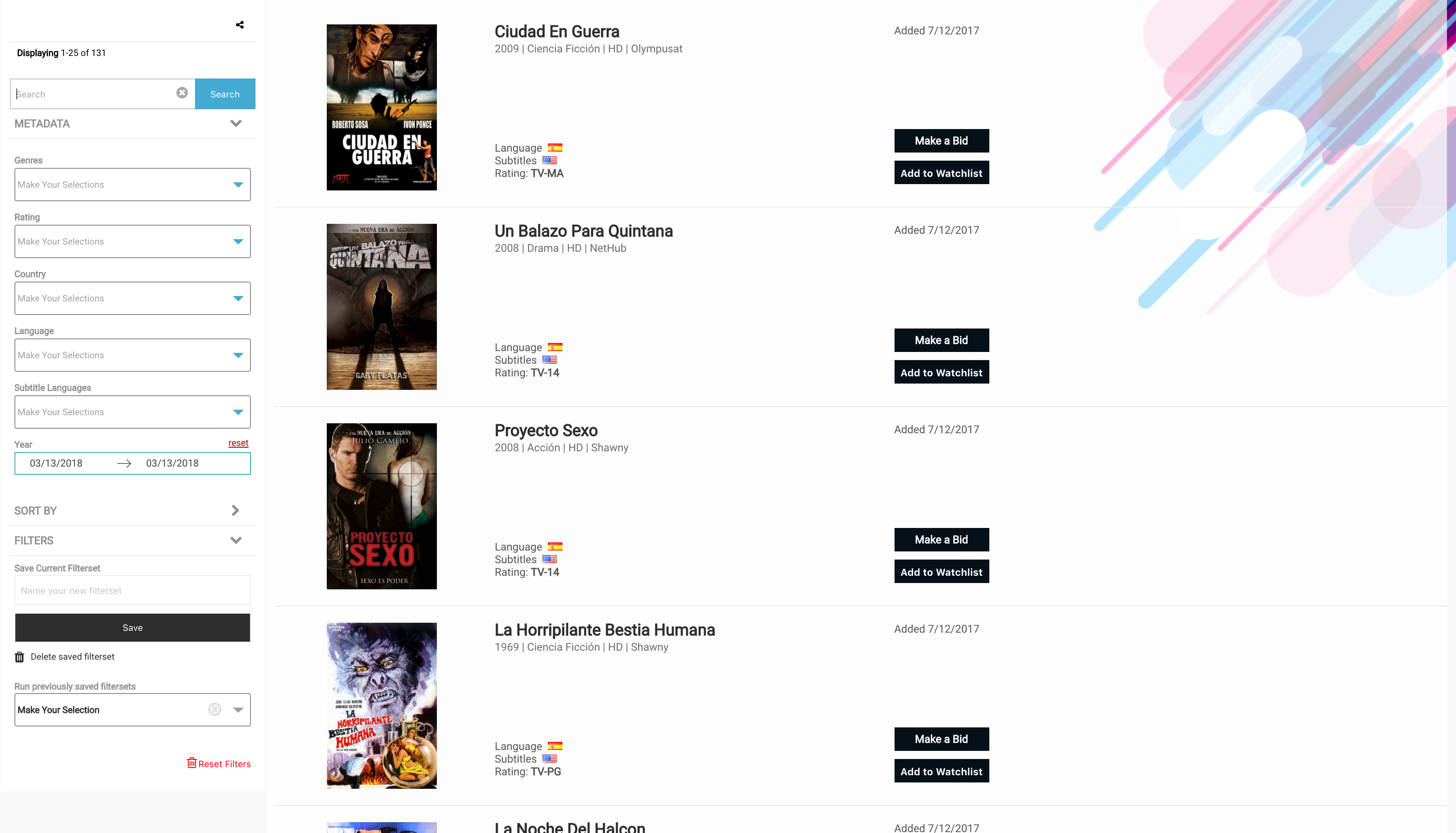
Filteredlist w/ default text component screenshot 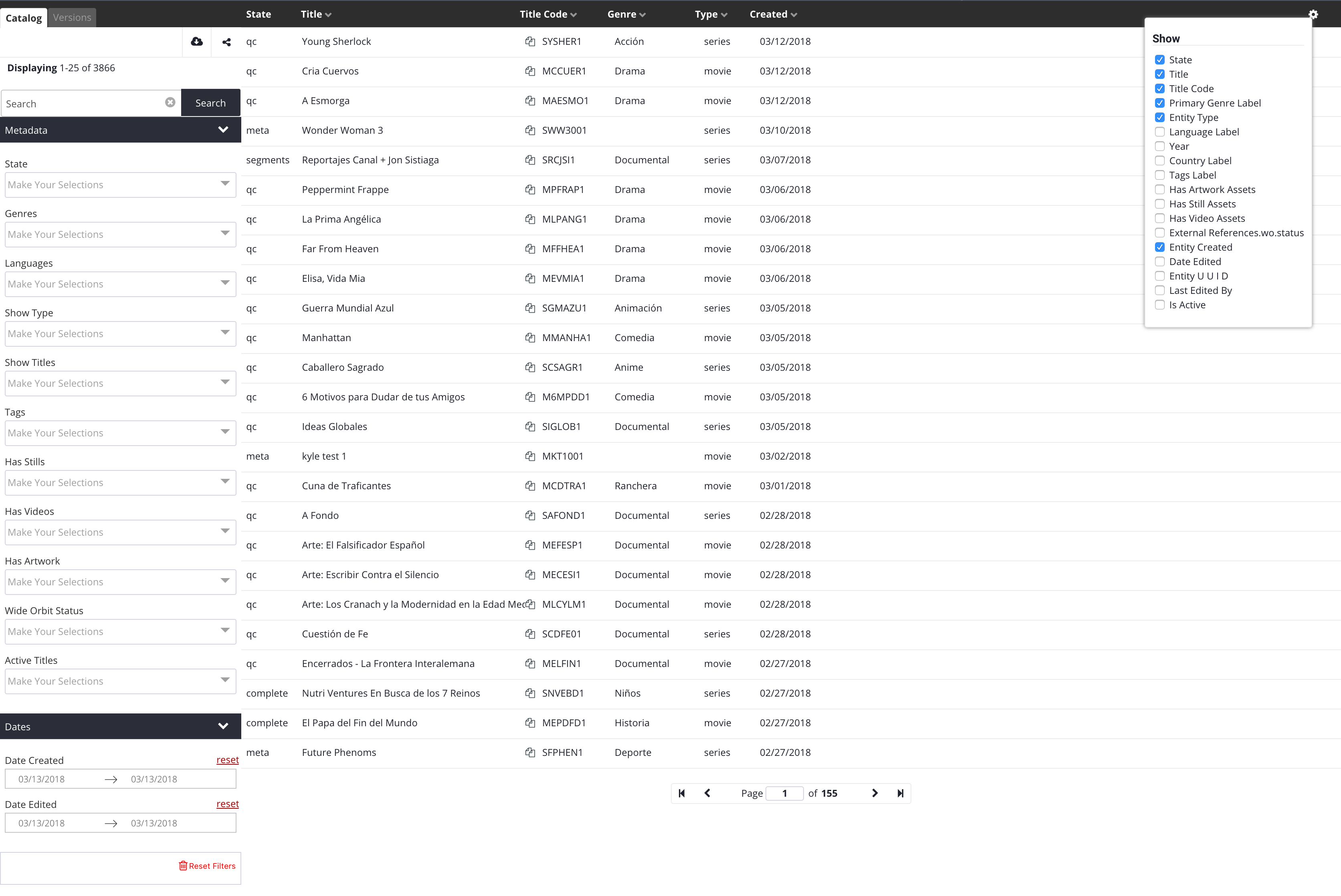
Development
To build the examples locally, run:
npm install
npm start
Then open localhost:8000 in a browser.
Installation
The easiest way to use react-filteredlist is to install it from NPM and include it in your own React build process (using Browserify, Webpack, etc).
You can also use the standalone build by including dist/react-filteredlist.js in your page. If you use this, make sure you have already included React, and it is available as a global variable.
npm i -S react-filteredlist
Usage
See that dataListConfig being passed into the config prop on the component usage in the below example? That is essentially a large object. At the end of the docs, you will find an example of a basic config object. Pop it in there and you should see a simple list running. What follows after this section are the details for building that config object in a more advanced way.
Note: The pushDispatch={Items: users.items, count: users.totalCount} prop is optional. If it's provided and passed data, then the list and pagination will prefer the data here for list rendering over incoming data via other sources. This behavior mimicks the pushDispatch hook for using socket based data pushes into the component. This prop is useful for when you want a record of your list items to come from your parent application's store. This way changes in the parent store will be propagated to the list. This is useful for orm based store structures.
Styles
It's important that the stylesheet be imported separately. In ES6, depending on your tooling, import directly into js otherwise use @import '../node_modules/react-filteredlist/dist/main.css'; in your stylesheet. Fix the path to point correctly to your node_modules folder.
const FilteredList = require('react-filteredlist');

<FilteredList config={dataListConfig} pushDispatch={Items: users.items, count: users.totalCount}/>
Or in ES6
import FilteredList from 'react-filteredlist';
import '../node_modules/react-filteredlist/dist/main.css';

<FilteredList config={dataListConfig} pushDispatch={Items: users.items, count: users.totalCount}/>
Breaking Changes
1. OnCheck hook arg is has been updated to {item: {}, items: [], checkedItems: [], action: checked/unchecked}
2. Since version 16.1.1 the need to import a stylesheet has been removed. Your app will throw an error now telling you it can't find the file to import. Just remove your stylesheet import for the filteredlist. JS takes care of this for you now.
This change gives visiblity to an array of items with a state of checked (checkedItems), the action on the item performed(add, update, remove) and the list of items mutated state.
Documentation
Top level configuration
This (in the example folder structure this is the top-level index.js file) is the entrypoint for pulling together all the datalist, views, filter groups, and filters configs.
| Property | Type | Default | Possible Values | Description |
|---|---|---|---|---|
| id | string | '' | '' | The UNIQUE id of the filteredlist component. |
| selector | string | '' | '' | Currently not used. @todo program in the custom selector option for the entire component. |
| defaultView | string | '' | '' | The UNIQUE id of the view to use by default. Matches the view's id property. |
| writeQueryStringToURL | boolean | false |
true,false |
If true, the queries will be converted to query string params and written to the url. |
| runQueryStringURLOnRender | boolean | false |
true,false |
If true, when a filters query string is present in the url, the component will attempt to run it. This is necessary for sharing and in general for tracking internal state. |
| showFilters | boolean | false |
true,false |
If false, the filters sidebar willbe hidden. |
| filtersLabel | string | '' | '' | A label for the filters sidebar. |
| pinPagination | boolean | false |
true,false |
If true, the pagination compnent will be position fixed to the bottom of the datalist. |
| notify | function | Accepts a function that gets passed 3 parameters (message, type, position). Use this to either console.log your notifications or pass them to the app's notification system, e.g. noty | ||
| header | object | undefined | undefined,object | Header options container. |
| header.title | string | '' | '' | A title for the entire component. |
| footer | object | undefined | undefined,object | Currently not used but could contain footer specific options in the future. |
| dataList | object | undefined | undefined,object | The datalist config object gets passed in here. |
| views | array | undefined | undefined,array | The views config objects array gets passed in here. |
| hooks | object | undefined | undefined,object | The hooks config object gets passed in here. |
| graphql | object | undefined | undefined,object | LEGACY. Currently not used. @todo: remove. The graphql config object gets passed in here. |
Example
import dataList from './dataList';
import views from './views';
import hooks from './hooks';
import graphql from './graphql';

import { GOOGLE_UA_ID } from '../../config';
import utils from '../../';

export default {
  id: 'main',
  selector: '',
  defaultView: 'buyer',
  writeQueryStringToURL: true,
  runQueryStringURLOnRender: true,
  showFilters: true,
  filtersLabel: '',
  pinPagination: true,
  notify: (message, type, position) => { utils.notify({ message, level: type, position: 'tr' }); },
  header: {
    title: ''
  },
  footer: {},
  dataList,
  views,
  hooks,
  graphql
}
window.ReactFilteredlist
There is a global object on the window that has some useful functions. It's in its early development so it's sparse.
| Property | Type | Default | Possible Values | Description |
|---|---|---|---|---|
| changeView | function | undefined | (viewId) | Passing this fn a view id, ie. apps, will behave the same as if you clicked on a tab in the views section. |
| resetFilters | function | undefined | () | Calling this runs a reset filter command |
| runFilterChange | function | undefined | ({id, view, value}) | Calling this with a valid filter object will run that filter query. ie. window.ReactFilteredlist.runFilterChange({id: 'isActive', view: 'apps', value: 'true'}) |
| state | object | {} | {} | This will always be the up-to-date state of the internal store. It is closesly connected to onStateUpdate. When onStateUpdate run, that's when the state property is populated. |
Datalist
Some basic properties for the datalist. Most of the datalist props are controlled by the view, specifically. These properties apply across views. Honestly, these should really be reprogrammed to exist in the index.js file or vice-versa.
| Property | Type | Default | Possible Values | Description |
|---|---|---|---|---|
| height | string | undefined | '100%','200px' | Takes a stringified css height value with units. Controls the overall height of the filteredlist component. |
| paginationBottomPosition | string | '' | '36px','5%' | Takes a stringified css value with units. Controls where near the bottom pagination controls sit. |
Example
export default {
  height: '600px',
  paginationBottomPosition: '36px',
}
Views
Views are higher level filters & datalist pairs that run independent of eachother. They are rendered as tabs above the filters sidebar when more than one view is present. Essentially they are sub instances of the entire component within the component.
| Property | Type | Default | Possible Values | Description |
|---|---|---|---|---|
| id | string | '' | '' | The UNIQUE id of the view. |
| label | string | '' | '' | The display name for the view. Used by the tabs. |
| enableRowChecks | boolean | false |
true,false |
This switch shows the row checks (thus enabling the checked items queue functionality) on the built in 'display' and 'text' displayTypes. |
| writeQueryStringToURL | boolean | false |
true,false |
This switch controls if the filter query object can be written to the url for re-running the current state on page reload or share. |
| displayType | string | '' | 'text','display', 'custom' | Controls what to render on each of the datalist line item rows. Types: text [simple line item], display [image & details line item. Expects an array of image objects to exist. images:[{src: 'http://fillmurray.com/200/300',caption: "Bill Murray"}], or custom [Provide a React component to the customDisplayTypeComponent prop below and it will receive the row item in its props]. A note on custom display types: If you want your custom item to work with the grid, have it return an <li>, and use <span> inside it for cells. Whatever the direct wrapper of the <span> is ie. <li><a className="dl__listGridContainer"><span></span><span></span><span></span></a></li>, add the class dl__listGridContainer to it. It will become display:grid and it'll match the header row in behavior. |
| highlightSearchTermInText | Boolean | falsy | true/false |
When set to true, this will take the cell text and add html <mark> tags around the search term in the queryObject (in the search bar). Right now this only works on the text displayType |
| customDisplayTypeComponent | React component | undefined | undefined, React component | See the displayType property description for why this is used. |
| customContentPlaceholder | React component | '' | '' | Used for displaying a content placeholder component instead of a loading gif while the user waits for item data to load and populate the rows. |
| customContentPlaceholderAmount | int | undefined | undefined,int | Sets the number of content placeholder rows to render while loading data. |
| enableGalleryLightbox | boolean | false |
true,false |
Controls showing lightbox of the row image in the built-in display component when the user clicks the image. |
| showTabsHeader | boolean | false |
true,false |
Enables the container for the view tabs. |
| showTabs | boolean | false |
true,false |
Turn on and off displaying the view tabs. You need this to click to more than one view. You can still get to a view via the url query string (?view=myotherview), but there will be no ui to switch back-and-forth. |
| showListHeader | boolean | false |
true,false |
Turns on and off the datalist items column header. The header is good for text row views, but not applicable when using display components. This turns it off. |
| showSearch | boolean | false |
true,false |
Force hide the search component, even if it was provided as a special filter group(see filter groups below). |
| enableListSort | boolean | false |
true,false |
Switch the data list header click column name to sort behavior. |
| showListSettings | boolean | false |
true,false |
Shows/hides a list properties checkbox interface for showing and hiding datalist columns. It sits in the top right corner of the datalist. |
| persistListSettings | boolean | false |
true,false |
This is used to set whether or not the user list settings options (what columns to show/hide) are persisted on reload. If true, the selected settings are stored in localstorage. |
| showResetFiltersButton | boolean | false |
true,false |
Enables the reset filters link at the bottom of the filters sidebar UI. |
| showSaveFiltersInterface | boolean | false |
true,false |
Enables the user saved filterset interface. If set to false it will not show up even if you have the filterset filter group imported in your configuration. (See the filter groups documentation for details.) |
| infoDisplaySettings | object | undefined | undefined,{} | Container for the info display strip located at the top of the filters sidebar ui, just below the view tabs. It contains the share link icon and any other icons you want to pass in. |
| infoDisplaySettings.showIconStrip | boolean | false |
true,false |
Turn on and off the display of the icon strip. |
| infoDisplaySettings.showShareLink | boolean | false |
true,false |
Enables a prebuilt share link in the icon strip that will copy to clipboard the current url and any query string in it. |
| infoDisplaySettings.showPaginationData | boolean | false |
true,false |
Show data about the current page, total number of items, and loading status in the info bar. |
| infoDisplaySettings.iconComponents | array | undefined | undefined,[React component] | Accepts an array of React components to create icons for displaying in the info/icon bar. The component will receive the entire config and the selectedView data in its props. Useful for custom actions on the dataset. |
| infoDisplaySettings.exports | object | undefined | undefined, {} | Container for the export feature settings accessed when showExport is true. |
| infoDisplaySettings.exports.apiUrl | string | undefined | undefined, 'url' | If a url is passed here, then the ajax call will use this url instead of the one set in the view's api settings. Useful for rest requests. |
| infoDisplaySettings.exports.Component | React Component | undefined | undefined, | If a component is passed here, the internal modal will display this component over the built in internal export interface. The component is passed exportsSettings, selectedView, parentProps to its props. Important to note that the parent props has the modal in it as well as the action to controlModal. If you trigger controlModal({show: false}), you will close the modal. Useful for on success events. |
| filterGroups | array | undefined | undefined,[FilterGroup] | An array of Filter Group object. See filter groups documentation for details on their contents. |
| itemIdProp | string | '' | '' | The property containing the item id in the datalist item being rendered. |
| listEntityTypes | [] | undefined | undefined,[] | LEGACY. Most likely not used anymore. @todo this one. |
| renderTo | string | undefined | undefined,'store' | 'store' is the default. In the future we could render html, or to Meteor sessions, or anywhere else. |
| api | object | undefined | undefined,{} | Container for api settings used to make xhr requests |
| api.type | string | undefined | 'graphql','rest' | Request type to use. LEGACY: Everything is treated as rest and handled in the before XHR hook. @todo remove |
| api.url | string | undefined | '' | The endpoint url used to make requests for data. |
| api.method | string | undefined | 'POST','GET' | Request type. Usually POST. |
| api.xhrProxy | function | undefined | undefined, function | If not falsy, this get called instead of the filtered-list's internal xhr request library. The entire body of the request and the api options are passed through this function, you can make your xhr call, then use the callback to return your data. NOTE: This is the primary data entrypoint. The other entrypoint is the pushDispatch hook that allows pushing into the internal store. |
| api.token | string | '' | undefined,'' | provide a token to pass to the authorization headers on the xhr request. If falsy the filtered-list will make untokened requests. |
| api.onTokenNeedsRefresh | function | undefined | undefined, function | This hook gets called if the token provided failed to pass the token validation check just before trying to make the running request. This is an opportunity to refresh the token then call the callback and continue making the request. |
| link | object | undefined | undefined,object | Container for the datalist row item link settings. |
| link.row | function | undefined | undefined, function | This gets called when building the datalist item rows. The item is passed into the function and you need to return a link that the row item's anchor href will use when the user clicks a row item. |
| link.target | string | '' | '', '_blank' | The row item link target settings. _blank opens the row item click in a new tab/window, '' opens it in place. |
| paginationPerPageOptions | Array or int | undefined | undefined, int, [int,int] | THis array of ints populates the pagination bar's items per page dropdown, providing the possible values the user can choose from. |
| paginationTake | int | undefined | undefined,int | Sets the number of items to fetch on each paginated request. This is page size. |
| noResultsMessage | string | '' | '' | The message to display in the datalist container when the filter query returned no results. |
| usersSavedFiltersets | function | undefined | undefined, function | Must return a Promise containing a collection of items. This is how you populate the user saved filtersets select box options. In the hooks you can save to a database or local storage what the user saved then here you can retrieve it for option population. |
| props | array | undefined | undefined,[] | See the view props section below for an explanation of what goes in this array. |
| addons | array | undefined | undefined, [] | Addons are pseudo filter types that can be added to the view outside of a a filter group. These exist in the internal store a filters and can store state. e.g. The search filter item is a built-in addon filter type. |
| searchButton | object | undefined | undefined,object | Container for search button themeing options. |
| searchButton.background | string | '' | '' | Accepts a hex string to set the background color of the search button. |
| searchButton.text | string | '' | '' | Accepts a hex string to set the color of the search button text. |
Example
import versionMetadata from '../filterGroups/version-metadata';
import versionContentType from '../filterGroups/version-contentType';
import versionRightsType from '../filterGroups/version-rightsType';
import userFiltersets from '../filterGroups/userFiltersets';
import sorting from '../filterGroups/sorting';

import search from '../filters/search';
import mapDictionary from '../maps';
import config from '../../config';
import { ENDPOINT_OFFERS } from '../../../config';

import DisplayItem from '../components/DisplayItem';
import ContentPlaceholder from '../components/ContentPlaceholder';
import filterDefaults from '../../../defaults';
import ExportIcon from '../components/ExportIcon';//icon component

export default {
  id: 'buyer',
  label: 'Buyer',
  enableRowChecks: false,
  writeQueryStringToURL: true,
  displayType: 'custom',

  customDisplayTypeComponent: DisplayItem,
  customContentPlaceholder: ContentPlaceholder,
  customContentPlaceholderAmount: 20,

  enableGalleryLightbox: true,
  showTabsHeader: false,
  showTabs: false,
  showListHeader: false,
  showSearch: true,
  enableListSort: false,
  showListSettings: false,
  showResetFiltersButton: true,
  showSaveFiltersInterface: true,

  infoDisplaySettings: {
    showIconStrip: true,
    showShareLink: true,
    showPaginationData: true,
    iconComponents: [ExportIcon]
  },
  filterGroups: [versionMetadata, sorting, userFiltersets],//versionRightsType,
  filterDefaults,
  itemIdProp: 'entityUUID',
  listEntityTypes: ['olyplat-entity-catalog'],
  renderTo: 'store',
  api: {
    type: 'rest',
    url: ENDPOINT_OFFERS,
    method: 'POST',
    xhrProxy: ({ uri, body }, cb) => {
        axios(uri, body)
          .then(res => {
            b(null, res, res);
          })
          .catch(err => {
            cb(err, null, null);
          });
    },
    token: (() => localStorage.getItem('id_token'))(),
    onTokenNeedsRefresh: cb => {cb();}
  },
  paginationTake: 25,
  link: {
    row: item => `https://mysite.com/item/${item.externalId}`,
    target: ''//use '' or '_blank'
  },
  noResultsMessage: "No items found",
  usersSavedFiltersets: () => new Promise((resolve, reject) => {
    //Do some stuff with the data, like storing it in your api, then resolve the promise.
  }),//returns a promise .
  props: [
   //See the view props object below for the contents of this array.
   // There should be one props object for each column displayed
  ],
  addons: [
    search
    // Use a filter object here
  ],
  searchButton: {
    background: '#4db3d7',
    text: '#fff'
  }
};
View Props
These are props objects that configure how default row text components display data.
Available item properties to the row. Also controls which props are visible by default or which are configurable in the column settings
| Property | Type | Default | Possible Values | Description |
|---|---|---|---|---|
| key | string | '' | '' | The key/property name of the property to display from the item being rendered as a row. This is the column data essentially. |
| label | string | '' | '' | The column name. |
| mapTo | object | falsy | falsy, {} | Takes an object that it will use as a map to map item property names from one key to another. If the custom component you're using to render rows requires a certain schema and your item has a different schema, you can map property to property here. |
| hasCopy | boolean | false |
true,false |
Switch on the "copy to clipboard" icon/feature for the particular cell data. |
| isDate | boolean | false |
true,false |
If you're passing in a date, switching this will convert the date timestamp to a human readable date. |
| isImage | boolean | false |
true,false |
Use this to tell the component we need to render the value as an image. This is useful for rendering a logo or user profile image in the cell. |
| fallbackImageSrc | string | '' | image.ext |
Used in conjunction with the isImage prop. Ensures that a fallback is rendered if the previous image src is invalid. |
| isSortable | boolean | false |
true,false |
Switch whether or not to allow the user to be able to sort this property from the list header column name interface. |
| width | string | '' | '11px', '100%' | A stringified css value to determine the column width on the default text. |
| display | boolean | false |
true,false |
Lets the datalist know that it should display that column on load. If it's false, it will not dipslay on load but will still be available to the column settings interface. |
| before | function | A hook to transform the value (mostly for mapping) before rendering to the screen. If not using it, please set it like this until a default can be built in: before :(val,item)=>val @todo add default function check |
||
| lightboxImages | function | ({}, [{}]) |
(item, items) |
A hook to send an array of images for react-images lightbox configuration. The function takes an initial image, then an array of images as its params. Please see react-images for configuration settings |
Example
{
  key:'createdDate',
  label:'Created',
  mapTo : {"cardToOffer":"createdDate", "someProp":"alias"},
  hasCopy:false,
  isDate: true,
  isSortable : true,
  width:'12%',
  display: true,
  before :(val,item)=>val,
  lightboxImages: (item, items) => {}
}
Filter Groups
Filter groups are objects that have group configuration properties and a collection of filters. Take note of the 'filterset' id option. If 'filterset' is the filter group's id, then a user save filters group is renders that provides an interface for allowin the user to create, list, and delete saved filtersets.
| Property | Type | Default | Possible Values | Description |
|---|---|---|---|---|
| id | string | '' | '', 'filterset' | The UNIQUE id of the group of filters. See filtergroup description above about the 'filterset' id behavior. |
| label | string | '' | NA | The display label that will be shown to the user next to the chevron open/close icon. |
| defaultOpen | boolean | false |
true,false |
When true, the filter group accordian will be open by default, showing all the filters. False means the group renders closed and the user has to click the checron to reveal the filters in the group accordian. |
| accordian | object | {} | NA | OPtions for the themeing the filter group accordian display. |
| accordian.color | object | {} | NA | Container object for the color themeing options. |
| accordian.color.background | string | undefined | NA | Accepts a hexadecimal color string. Controls the accordian filter group title bar background color. |
| accordian.color.text | string | undefined | NA | Accepts a hexadecimal color string. Controls the accordian filter group title bar text & chevron background color. |
| filters | array | [] | NA | Takes an array of filter objects to render inside it's accordian. See filters description below. |
Examples
Filter group object
import sortCreatedDate from "../filters/sort-createdDate";

export default {
    id:'sorting',
    label : 'Sort by',
    defaultOpen: false,
    accordian:{
        color:{
            background: 'transparent',
            text:'#98999a'
        }
    },
    filters:[ sortCreatedDate ]
};
Special user filterset group
export default {
    id:'filterset',// This exact id is necesary to render the user save filterset interface as a group.
    label : 'Filters',
    defaultOpen: true,
    accordian:{
        color:{
            background: 'transparent',
            text:'#98999a'
        }
    },
    filters:[]
};
Filters
Used to take action on the dataset. Primary items used in building a query object that gets passed to the hooks and is used for writing the query string to the url. The id key becomes the property key in the queryObject.
| Property | Type | Default | Possible Values | Description |
|---|---|---|---|---|
| id | string | '' | NA | The id of the filter. Must be UNIQUE. |
| type | string | 'select' | 'select', 'autocomplete', 'range', 'checkbox', 'radio', 'search', 'sort' | This determines what type of filter item will be rendered. Special NOTE: Search type is a special filter that will render a search box where anything input will be passed as the value of a search filter property on the final object. The sort type is also special. It enables a sort toggle & request for the specified id/prop property. Also of note, the select and autocomplete type options.getOptions function needs to return a Promise. The rest just return the data they need. |
| prop | string | '' | NA | Essentially the same as id. Just match this to the id until the api changes, then we'll handle that by default. |
| label | string | '' | NA | The filter item's Label property. THis displays to the user above the filter item. |
| value | array/null/undefined | null | [{},{},{}] | Use this to set a default value. Value must be an array of objects (matching options), null or undefined to be excluded. (Filters recognize boolean true/false. An collection matching the select filter type can be passed to pre-populate the value. |
| placeholder | string | '' | placeholder |
The filter item's input placeholder property. |
| multi | boolean | false |
true,false |
For select filter types, this allows the select to be a multi select when set to true |
| fixedKey | string | `` | prop1 |
For property-search filter types, this allows the the filter to search on a fixed property and removes the select component |
| options | object | {} | {},falsy | For 'select' & 'checkbox' type only: The select type filter item's options handling. This takes care of property matching items so they can fill the value of the options element. |
| options.key | string | '' | NA | This is the select box options item's key(property) to use for the option element's value property. |
| options.value | string | '' | NA | This is the select box options item's Label/Text to use in the option item's display. |
| options.getOptions | function/null/undefined | Promise, return | NA | This function must return a promise if using it for a select box and a collection if using it for a checkbox or range. It should return a collection to populate the select item's options. The items should have the properties specified in the key/value mapping above. |
| range | object | {} | {},falsy | For 'range' type only: Range type settings and defualts. |
| range.start | UNIX timestamp | null | UNIX timestamp, null | Sets the start time value for the range calendar in seconds. |
| range.end | UNIX timestamp | null | UNIX timestamp, null | Sets the end time value for the range calendar in seconds. |
Examples
Select filter type
export default {
  id: 'countries',
  type:'select',
  prop: 'countries',
  label: 'Countries',
  value:null,
  multiple : true,
  options : {
      key : 'myPropId',
      value : 'myPropValue',
      getOptions : new Promise((resolve,reject)=>{
        resolve([
          {myPropId : 1, myPropValue: "Canada"},
          {myPropId : 2, myPropValue: "United States"},
          {myPropId : 3, myPropValue: "Mexico"}
        ]);
      })
  },
};
Autocomplete filter type
export default {
    id: 'tags',
    type: 'autocomplete',
    prop: 'tags',
    label: 'Tags',
    value: null,
    placeholder: 'Search for tags',
    options: {
        key: 'id',
        value: 'label',
        // Must return a promise containing a collection
        getOptions: new Promise((resolve,reject)=>{
            resolve([
                  {myPropId : 1, myPropValue: "Canada"},
                  {myPropId : 2, myPropValue: "United States"},
                  {myPropId : 3, myPropValue: "Mexico"}
            ]);
        })
    }
};
Property Search filter type
This filter is used for doing an "OR" search across a certain property. ie. search for a list of email addresses across the 'email' field on an entity.
When the options object is not being used to provide defaults for the select box, then the select box is automatically populated with all the properties listed in the props array for the selected view.
export default {
  id: "propertySearch",
  type: 'property-search',
  prop: "propertySearch",
  label: 'Property Search',
<<<<<<< HEAD
  placeholder: 'Placeholder',
=======
>>>>>>> origin/master
  fixedKey: 'property',
  inputType: 'number | text | date | ...' // value corresponds to the html input types
  value: null
  // options: {
    // key: 'id',
    // value: 'name'

    // Must return a promise containing a collection
    // Optional getOptions. If falsy, the component will get properties from the selectedView props
    // getOptions: () => Promise.resolve([
    //   {id: 0, name: 'entityUUID'},
    //   {id: 1, name: 'email'},
    //   {id: 2, name: 'name'},
    //   {id: 3, name: 'olyId'}
    // ])
  // }
};
Range filter type
export default {
    id: 'dateAvailable',
    type:'range',
    prop: 'dateAvailable',
    label: 'Dates Available',
    range:{
        start: 1520355600000 || null,
        end: 1520355600000 || null,
    }
};
Checkbox filter type
export default {
    id: filterKey,
    type:'checkbox',
    prop: filterKey,
    label: 'Checkbox Example',
    value:null,
    multiple : true,
    options : {
        key : 'externalId',
        value : 'entityValue',
        getOptions : ()=>[
            {externalId:'true',entityValue:'Exclusive'},
            {externalId:'false',entityValue:'Non-Exclusive'}
        ]
    }
};
Radio filter type
export default {
    id: "isActive",
    type:'radio',
    prop: "isActive",
    label: 'Active',
    value:null,
    multiple : true,
    options : {
        key : 'id',
        value : 'label',
        getOptions : ()=>[
            {id:'true',label:'Yes'},
            {id:'false',label:'No'}
        ]
    }
};
Search filter type
export default {
    id: 'search',
    type:'search',
    prop: 'search',
    label: 'Search',
    value:null,
};
Sort filter type
export default {
    id: filterKey,
    type:'sort',
    prop: filterKey,
    label: '',
    value:null
};
Hooks
The hooks are powerful. At different points in time throughout the lifecycle of the filteredlist component and on different actions the hooks are triggered. USe them to trigger actions in the parent app or to mutate data before sending requests to your apis. All hooks are just functions that get passed certain parameters and sometimes expect a response.
| Property | Type | Return schema | Parameters | Description |
|---|---|---|---|---|
| beforeXHR | function | {data, xhrOptions} | (data, xhrOptions, requestData, requestType) | Hook gets called just before the xhr request. It passes through the entire xhr params & the request body data raw. requestType will be undefined for primary requests, but can return a value of 'export' for when an export request is being generated. This allows specific export request handling inside the hook. |
| onXHRSuccess | function | resolve({Items:[{}],total:1}),reject("some error message") |
(body,resolve,reject) | Hook gets called when the xhr request returns successfully. A Promise is passed in the argument, it must be resolved. It's here that you can mutate data received from the api, then return wither an error message or an object of Items and the total. |
| onXHRError | function | resolve({Items:[{}],total:1}),reject("some error message") |
(err, body,resolve,reject) | Hook gets called when the xhr request kicks back an error |
| onCheck | function | item | ({item,workspaceItems}) | Hook for picking up check events. Note: You have access to all items currently in the workspace, but you must only return the item being mutated. Warning: a select all command will run this hook once for each item as it builds the workspaceItems list |
| onUnCheck | function | NA | ({item,workspaceItems}) | Hook for picking up check events. Note: You have access to all items currently in the workspace, but you must only return the item being mutated. Warning: a select all command will run this hook once for each item as it empties the workspaceItems list |
| onStateUpdate | function | NA | (state, actionType, action) | Hook gets called whenever the main application state gets updated. Useful for getting the filters' current queryObject, queryString or the action type. Pagination can also be read here as well as the current Selected View. THis is the ideal place to tie in Google Analytics from your parent app. You can use the actionType argument to determine what took place for your custom events. |
| onInit | function | NA | (app) | Hook used to know when the app is initialized. If a fn is returned a callback is made accessible. If that callback is called(it has to be) then whatever data (an object) is passed to it will be made avialable in the preferences branch of the internal store on bootstrap. ie. onInit=(app)=>cb=>{cb({someDataForPrefs})}} |
| onSaveFilterset | function | NA | ({name,queryString,queryObject}) | Hook gets called when the user opted to save their filter set. |
| onDeleteFilterset | function | NA | ({name,filterset}) | Hook gets called when the user opted to delete their saved their filter set |
| onRowClick | function | true,falsy |
(e, rowPath) | Hook used to override the default row click event of a TextItem component. Return values of 'true' or 'falsy' enables this hook to break or continue the default TextItem onclick event respectively. |
| pushDispatch | function | ({Items: [{}],count: 1}) | NA | See the note below on the push dispatcher. |
| doFilterChange | function | callback | cb({id: 'isActive', view: 'users', value: 'false'}) | Exposes a callback function that when called passed a filterChange object it will run that filter change request. Good for programmatically triggering filter changes from the parent application. A filterChange object accepts 3 properties in the object, id(the id of the filter), view(the id of the current selected view), and value(the value to run OR 'null' to clear the filter) |
| doSort | function | callback() | cb('createdAt', 'ASC'); | Because there is no easy to way refresh the last filter run(requests are memoized) it's convenient to have a sort hook. A callback function is exposed so you can programmatically trigger sort changes to refresh the current dataset. Use ASC or DESC as second argument values. If omitted DESC is the default value. |
Push dispatch hook
This is a special "hook" used to push data structures directly to the internal Redux store. When the puser callback is triggered an internal dispatch is run. This is an experimental feature for connecting websocket data to the fitleredlist. See below example for some boilerplate code using Rxjs subscriptions.
Example
let pusher = () => { };

export default cb => {
  pusher = cb;
}

window.Oly.$tream
  .subscribe(data => {
    if (data.hasOwnProperty('data') && data.data.offers) {
      console.log('PUSHER', data.data.offers);
      pusher({
        Items: data.data.offers.items,
        count: data.data.offers.total
      })
    }
  });
Complete Example
Putting it all together: Complete configuration object example
Does not contain the imports, just the final structure example. It's wise to split this up into folders using ES6 imports and exports, for manageability.
Example suggested folder structure
filteredlistConfig
  index.js
  dataList.js
  /_utils
    index.js
  /components
    index.js
    DisplayComponent.js
  /filterGroups
    index.js
    sorting.js
    datesFiltergroup.js
  /filters
    index.js
    createdDate.js
    search.js
    genres.js
  /hooks
    index.js
    beforeXHR.js
    ...etc
  /views
    index.js
    primary.js
    secondary.js
Example complete configuration object
  export default {
    id: 'main',
    selector: '',
    defaultView: 'buyer',
    writeQueryStringToURL: true,
    runQueryStringURLOnRender: true,
    showFilters: true,
    filtersLabel: '',
    pinPagination: true,
    notify: (message, type, position) => { console.log(message, type, position); },
    header: {
      title: ''
    },
    footer: {},
    dataList:{
      height: undefined,
      paginationBottomPosition: '36px'
    },
    views: [
      {
        id: 'buyer',
        label: 'Buyer',
        enableRowChecks: false,
        writeQueryStringToURL: true,
        displayType: 'text',

        customDisplayTypeComponent: false,
        customContentPlaceholder: false,
        customContentPlaceholderAmount: 20,

        enableGalleryLightbox: true,
        showTabsHeader: false,
        showTabs: true,
        showListHeader: true,
        showSearch: true,
        enableListSort: true,
        showListSettings: true,
        showResetFiltersButton: true,
        showSaveFiltersInterface: true,

        infoDisplaySettings: {
          showIconStrip: true,
          showShareLink: true,
          showPaginationData: true,
          iconComponents: []
        },
        filterGroups: [
          {
            id:'sorting',
            label : 'Sort by',
            defaultOpen: false,
            accordian:{
                color:{
                    background: 'transparent',
                    text:'#98999a'
                }
            },
            filters:[
              {
                id: "sort-createdDate",
                type:'sort',
                prop: 'sort-createdDate',
                label: '',
                value:null
              }
            ]
          }
        ],
        filterDefaults:[],
        itemIdProp: 'entityUUID',
        listEntityTypes: ['olyplat-entity-catalog'],
        renderTo: 'store',
        api: {
          type: 'graphql',
          url: "http://localhost",
          method: 'POST',
          xhrProxy: ({ uri, body }, cb) => {
              cb();
          },
          token: (() => localStorage.getItem('id_token'))(),
          onTokenNeedsRefresh: cb => {cb();}
        },
        paginationTake: 25,
        link: {
          row: item => `http://localhost:8000/item/${item.externalId}`,
          target: ''//use '' or '_blank'
        },
        noResultsMessage: "No items found",
        usersSavedFiltersets: () => new Promise((resolve, reject) => {
          resolve();
        }),
        props: [
          {
            key:'image',
            label:'Image',
            mapTo : {},
            hasCopy:false,
            isDate: false,
            isSortable : true,
            width:'33%',
            display: true,
            before :(val,item)=>val
          },
          {
            key:'entityUUID',
            label:'Id',
            mapTo : {},
            hasCopy:false,
            isDate: false,
            isSortable : true,
            width:'33%',
            display: true,
            before :(val,item)=>val
          },{
            key:'title',
            label:'Title',
            mapTo : {},
            hasCopy:false,
            isDate: false,
            isSortable : true,
            width:'33%',
            display: true,
            before :(val,item)=>val
          },
        ],
        addons: [{
          id: 'search',
          type:'search',
          prop: 'search',
          label: 'Search',
          value:null,
        }],
        searchButton: {
          background: '#4db3d7',
          text: '#fff'
        }
      }
    ],
    hooks: {
      beforeXHR: (data, xhrOptions, requestData) => {return {data, xhrOptions}},
      onXHRSuccess: (body,resolve,reject)=> { resolve( {
        Items: [
          {
            entityUUID: '0234',
            title: "Item 1",
            image: 'http://fillmurray.com/200/300'
          },
          {
            entityUUID: '023s4',
            title: "Item 2",
            image: 'http://fillmurray.com/200/300'
          },{
            entityUUID: '02g34',
            title: "Item 3",
            image: 'http://fillmurray.com/200/300'
          },
          {
            entityUUID: '02jh34',
            title: "Item 4",
            image: 'http://fillmurray.com/200/300'
          },
          {
            entityUUID: '023r4',
            title: "Item 5",
            image: 'http://fillmurray.com/200/300'
          }
      ],
        total: 5
      });
      },
      onXHRFail: (err,body)=>body,
      onCheck: ({item,workspaceItems})=>item,
      onUnCheck: ({item,workspaceItems})=>item,
      onStateUpdate: state => {},
      onRowClick: (e, rowPath) => true || falsy,
      onInit: app=>{},
      onSaveFilterset: ({name,queryString,queryObject})=>{},
      onDeleteFilterset: ({name,filterset})=>{},
      // pushDispatch: cb => { cb(); }
    }
}
Troubleshooting
Because this is a react component library, you may find (after react@16) that you get a react ref error saying you could have multiple copies of react running. If that's the case, in your parent application's webpack.config.dev.js or webpack.config.prod.js file add aliases for both react and react-dom that point to the parent app's node_modules folder.
alias: {
  react: path.resolve('./node_modules/react'),
  'react-dom': path.resolve('./node_modules/react-dom')
},
Also, in doing these aliases, you may need to allow webpack to use scope outside your src folder. If you see ModuleScopePlugin in your webpack config file (Ejected Create React Apps), then just remove that plugin. See this issue for more info: https://stackoverflow.com/questions/44114436/the-create-react-app-imports-restriction-outside-of-src-directory