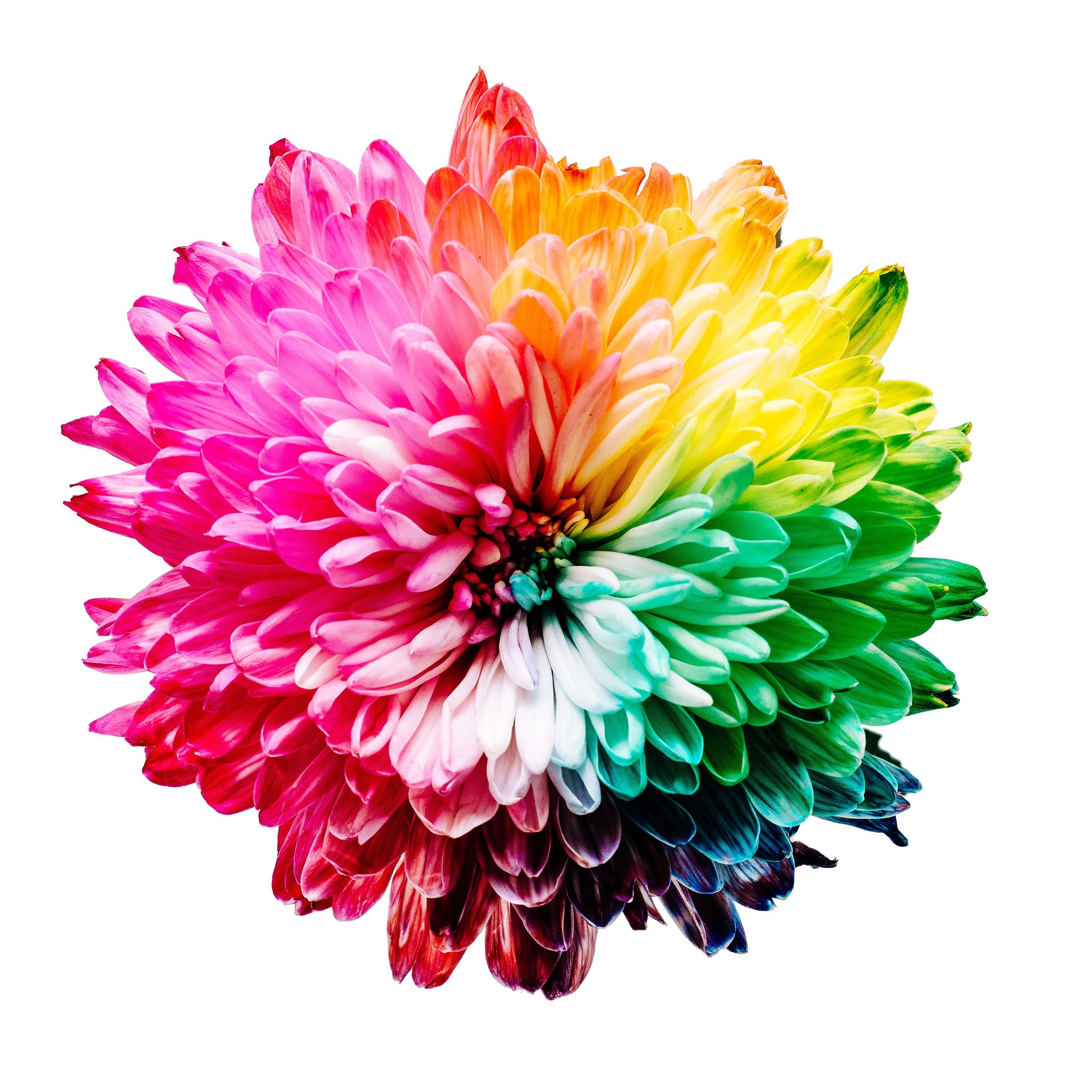
A highly customizable, fully typed & tested color eye-dropper for your React project.
React Component or React Hook, you have both at your disposal.
A example project is included for basic usage of both Component & Hook.
Credits to Sharon for such splendid taste in color.
Yarn:
yarn add react-eyedrop
NPM:
npm install --save react-eyedrop
- React Component
- React Hook
Example:
function onChange({ rgb, hex }) {
    /* Do stuff */
}
<!-------->
<EyeDropper onChange={onChange} />
Example:
<EyeDropper wrapperClasses="my-css-class" />
/* or even */
<EyeDropper wrapperClasses={`my-css-class ${active ? 'my-active-css-class' : ''}`} />
Example:
<EyeDropper buttonClasses="my-css-class" />
/* or even */
<EyeDropper buttonClasses={`my-css-class ${active ? 'my-active-css-class' : ''}`} />
Example:
const Button = ({ onClick }) =>
    <button className="btn" onClick={onClick} >My custom button</button>
<!-------->
<EyeDropper customComponent={Button} />
User can pass in their own data to the customComponent, the data can then be retrieved along with the color values in the onChange handler.
Example:
const onChange = ({ rgb, hex, customProps }) => {
    const { data1, data2, } = customProps
}
<!-------->
<Eyedropper customComponent={Button} customProps={{data1, data2, data3}} onChange={onChange}/>
Example:
const Button = ({ onClick, pixelColors }) =>
    <button className="btn" onClick={onClick} style={{backgroundColor: pixelColors.hex}}>My custom button</button>
<!-------->
<EyeDropper customComponent={Button} colorsPassThrough='pixelColors' />
Internal property provided by the eyedropper component for passing down to the customComponent. It gives control disabling the button element while color picking is active
Example:
const Button = ({ onClick, disabled }) =>
    <button className="btn" onClick={onClick} disabled={disabled} >My custom button</button>
Decide if EyeDropping should stop after having pressed once. Dynamically changing this property during runtime will remove event listener & set cursorInactive. (if false -> true during runtime)
Example:
<EyeDropper once />

/* or */

<EyeDropper once={false} />
Size of the pick radius. The final value will be the average sum of all the pixels within the radius.
Example:
<EyeDropper pickRadius={1} />
Example:
<EyeDropper cursorActive="cursor" />
Example:
<EyeDropper cursorActive="auto" />
Example:
function getPeanut() {
    console.log('Mmm... Definately overrated.')
}

<!-------->

<EyeDropper onInit={getPeanut} />
/* Will be called when component is mounted */
Example:
function getBananas() {
    console.log('Ahhh... Much better.')
}

<!-------->

<EyeDropper onPickStart={getBananas} />

/* Will be called when starting to EyeDrop */
Example:
function buyBurritos() {
    console.log('Yum!')
}

<!-------->

<EyeDropper onPickEnd={buyBurritos} />

/* Will be called when you finish EyeDropping */
colors will contain whatever is clicked once pickColor is called.
Call cancelPickColor to stop picking colors. 🤪
Example:
import { useEyeDrop } from 'react-eyedrop'

const [colors, pickColor, cancelPickColor] = useEyeDrop({
  once: boolean,
  pickRadius: number,
  cursorActive: CSS Cursors,
  cursorInactive: CSS Cursors,
  onPickStart?: () => void
  onPickEnd?: () => void
  onPickCancel?: () => void
})
Run the unit tests locally:
npm i
/* or */
yarn

/* and then */

npm run test
- 5.4.2
- Fixed bug with color picking HTML elements
- Now functions with React 18
- 5.4.1
- Added onPickStart, onPickEnd and onPickCancel to hook
- 5.3.0
- Now handles any HTML element with background property
- 5.2.1
- Added
onPickEndproperty
- Added
- 5.1.3
- Pretty serious bugfix
- 5.0.4
- Rewritten in TypeScript
- Introduced useEyeDrop React hook
- 4.2.0
- Fixed fundamental issue with color picking
- Now handles cross-origin images
- 4.1.3
- Bug fix related to color picking from the correct target
- 4.1.2
- No longer inline styling
- 4.1.1
- Added Unit test Coverage badges in README
- 4.1.0
- 100% Unit Test Coverage
- 4.0.0
- Removed property
onPickEndsince same functionality can be achieved with handleChange
- Removed property
- 3.4.2
- Now supports color-picking images presented through
imgtags on the DOM
- Now supports color-picking images presented through
- 3.0.0
- Updated
pickRadiusfeature to work with different units; radius & pixel.
- Updated
- 2.1.2
- Fixed a typo in documentation
- 2.1.1
- Added
pickRadiusfeature
- Added
- 2.0.1
- Updated documentation
- 2.0.0
- Changed prop name from
buttonComponenttocustomComponent
- Changed prop name from
- 1.0.0
- Initial release
Manjodh "Mango" Singh – manjodheriksingh@gmail.com
Distributed under the MIT license. See license for more information.
- Fork it (https://github.com/jodhman/react-eyedrop/fork)
- Create your feature branch (
git checkout -b feature/fooBar) - Commit your changes (
git commit -am 'Add some fooBar') - Push to the branch (
git push origin feature/fooBar) - Create a new Pull Request

