
react-edit-list


Universal Editable List React Component
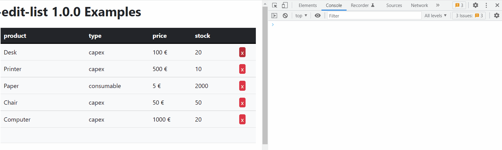
react-edit-list allows for easy creation of editable lists in React that can be interfaced with a database
- Fully customizable
- Zero-dependency
- Supports async callbacks for calling externals APIs
- Supports input validation
- Supports optional
nullfields - Supports custom field types
Installation
npm i --save react-edit-layersUsage
Refer to the examples
API
Table of Contents
- Element
- Schema
- Row
-
Props
- schema
- onLoad
- format
- edit
- editProps
- headers
- onChange
- onInsert
- onUpdate
- onDelete
- defaultValues
- className
- btnValidateClassName
- btnDeleteClassName
- btnCancelClassName
- headClassName
- bodyClassName
- trClassName
- thClassName
- tdClassName
- inputClassName
- btnValidateElement
- btnDeleteElement
- btnCancelElement
- disableUpdate
- disableDelete
- disableInsert
- tableElement
- tbodyElement
- theadElement
- thElement
- trElement
- tdElement
- filler
- rowClassName
- insertClassName
- ReactEditList
Element
Field type
id means a hidden field that will be carried on by react-edit-list without any processing
string and number have default rendering and input components
custom allows you to define your own rendering and input components
Passing an array of name/value pairs allows defining of an enum field
Type: ("id" | "string" | "number" | Array<{name: string, value: (string | undefined)}> | "custom")
Schema
Schema for the data
Type: Array<{name: string, type: Element}>
Row
A row of data
Type: Record<string, Value>
Props
ReactEditList properties
schema
The schema for the data
Type: Schema
onLoad
Will be called to load the data, can be asynchronous
Type: function (): (Array<Row> | Promise<Array<Row>>)
format
Custom field formatters
Each field formatter must be a React component
It will receive the value to be rendered in props.value
Type: Record<string, Formatter>
Examples
function DefaultFormatString(props: {value: Value}): JSX.Element {
  return <React.Fragment>{props.value as string}</React.Fragment>;
}
edit
Custom field editors
Each field editor must be a React component
It will receive the previous value in props.value and
should call props.onChange to update it
Type: Record<string, Editor>
Examples
function DefaultEditString(props: {
  value: Value;
  opts?: unknown;
  className?: string;
  editProps?: Record<string, unknown>;
  onChange: (v: Value) => void;
}) {
  const onChange = React.useCallback(
    (e) => props.onChange(e.target.value != '' ? e.target.value : undefined),
    [props]
  );
  return (
    <input
      className={props.className}
      {...props.editProps}
      value={props.value as string}
      type='text'
      onChange={onChange}
    />
  );
}
editProps
Custom props to be passed to the field editors
Type: Record<string, Record<string, any>>
headers
Custom headers, set to null to completely disable headers
Type: (Record<string, JSX.Element> | null)
onChange
Called on every change with all the elements
Return false to deny the operation
Return true to trigger a refresh through onLoad
Return undefined for default behavior
Type: function (data: Array<Row>): (boolean | void | Promise<(boolean | void)>)
onInsert
Called after insertion of a new element
Return false to deny the operation
Return a new item to modify its contents
Type: function (item: Row): (boolean | void | Row | Promise<(boolean | void | Row)>)
onUpdate
Called after updating an existing element
Return false to deny the operation
Return a new item to modify its contents
Type: function (updated: Row, old: Row): (boolean | void | Row | Promise<(boolean | void | Row)>)
onDelete
Called after deleting an element
Return false to deny the operation
Type: function (item: Row): (boolean | void | Promise<(boolean | void)>)
defaultValues
Optional default values for new elements
Type: Row
className
Optional CSS class name
Type: string
btnValidateClassName
Optional validate button class name
Type: string
btnDeleteClassName
Optional delete button class name
Type: string
btnCancelClassName
Optional cancel button class name
Type: string
headClassName
Optional table head class name
Type: string
bodyClassName
Optional table body class name
Type: string
trClassName
Optional table TR class name
Type: string
thClassName
Optional table TH class name
Type: (string | Record<string, string>)
tdClassName
Optional table TD class name
Type: (string | Record<string, string>)
inputClassName
Optional table INPUT class name
Type: string
btnValidateElement
Optional custom button element
Type: JSX.Element
btnDeleteElement
Optional custom button element
Type: JSX.Element
btnCancelElement
Optional custom button element
Type: JSX.Element
disableUpdate
Disable updating
Type: boolean
disableDelete
Disable deleting
Type: boolean
disableInsert
Disable inserting
Type: boolean
tableElement
Element to use instead of
|
Type: (string | React.FunctionComponent<{className: string?}>) trElementElement to use instead of |
|---|
|
Element must accept mouse and keyboard input Type: (string | React.FunctionComponent<{className: string?, onClick: function (e: React.MouseEvent): void?, onKeyDown: function (e: React.KeyboardEvent): void?}>) fillerElement to use for the empty row that allows adding a new item Type: JSX.Element rowClassNameOptional class to use for regular rows Type: string insertClassNameOptional class to use for the empty row allowing insertion Type: string ReactEditListAn universal editable list for React Parameters
Returns JSX.Element |