
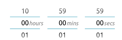
React duration picker for mobile, inspired by Android number pickers. A live demo is available here. Supports keyboard and mouse events in addition to touch. A type declaration file is also included.
Installation
npm install react-duration-picker
Then in your React component:
import DurationPicker from 'react-duration-picker'
API
| Prop | Type | Default | Description |
|---|---|---|---|
| onChange | ({hours: number, minutes: number, seconds: number}) => void | () => {} | Callback executed by DurationPicker whenever the duration displayed on the picker is updated |
| initialDuration | {hours: number, minutes: number, seconds: number} | {hours: 0, minutes: 0, seconds: 0} | Duration to display on first render |
| maxHours | number | 10 | Max number of hours that can be selected |
| noHours | boolean | false | If true, omits 'hours' column from picker |
Example
const onChange = { const hours minutes seconds = duration; ;}; return <Modal open=isOpen> <DurationPicker onChange=onChange initialDuration= hours: 1 minutes: 2 seconds: 3 maxHours=5 /> <button onClick=closeModal /> </Modal>;The example directory contains the code for the demo.
Contributing
Contributions and feedback are welcome. Submit bugs or suggestions as an issue on Github.