
An advanced React Dropdown Component
Key features
- caters for different types of dropdown items (action, checks, header, seperator)
- lazily calls back for dropdown items (synchronously or asynchronously!)
- dropdown items are removed from the markup when dropdown is closed
- a variety of life-cycle events are raised on check, click, open/close etc
- popup location is configurable (left/right/top/bottom)
- the dropdown can be created through code using any html element as source
- popup is closable through code
- and much more!
Demo
Have a look at the demo-page to check it out!
Typescript
Because I believe in typesafe code! The code snippets below are extracts from my Typescript test project. An index.d.ts file has now been included within the bundle and should provide intellisense in your code.
Using the DropDown
A basic 'fixed' dropdown items
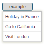
...// specify some fixed itemsthisfixedItems;thisfixedItems;thisfixedItems;...private { console;}...<div id='test-menu-lt'> fixed items <DropDownMenu items=thisfixedItems onClick=thisonClick direction=DropDownDirectionDownRight /></div>Bit boring, let's see what else we can do.
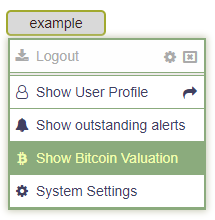
Dynamic dropdown items (calls back for dropdown items)
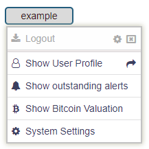
...private { var arr: DropDownItemBase = ; var item = "A" "Logout" "fa-download"; itemdata = pos ; // associate some data with the item item; item; arr; arr; item = "profile" "Show User Profile" "fa-user-o"; item; itemtextMarginRight = 30; // forces some extra space beteen the text and the right image arr; arr; arr; arr; return arr;} <div id='test-menu-lt'> dynamic <DropDownMenu getItems=thisgetDynamicItems onClick=thisonClick direction=DropDownDirectionDownRight /></div>Bit more interesting. The code above calls back for its items when clicked. So items can be (re)configured before returning the array with dropdown items.
It also shows the use of right side images. These can have their own tooltip and on selection the item gets triggered as if it were selected itself. The user can check the clickedImage property on the ActionItem to check if the user clicked the full item or the image specifically!
The data property is a free data-storage property that can be used to attach some context and can be accessed when dealing with the clicked item.
The textMarginRight property can be set to force additional margin between the text and its adjecent right hand image.
Dynamic Async dropdown items (calls back asynchronously for dropdown items)
...private { return <DropDownItemBase> { ; };} <div id='test-menu-lt'> dynamic <DropDownMenu getItemsAsync=thisgetItemsAsync onClick=thisonClick direction=DropDownDirectionDownRight /></div>The code above calls back and expects to be given an ES6 Promise. On resolving the promise it returns the array of dropdown items.
Load the CSS!
Do not forget to load the rdropdown.css into your project (using a 'require' or other means)
require('react-dropdown-advanced/styles/rdropdown.css')
How to use this programmatically
In cases where you just want to attach the dropdown to an existing element somewhere on your form using code you must use the DropDownControl class.
- Simply create a new DropDownControl object passing in the element (or a selector) you wish to attach the dropdown to. This could be any html element.
- Create a number of dropdown items to show
- Attach some event handler(s)
- Once configured call 'createMenu()' which will prepare the given element
In its simplest form it would look something like this:
static { // 1. create a new DropDownControl for this element var dd: DropDownControl = '#test-menu-lt'; // 2. specify the dropdown items dditems; dditems; dditems; dditems; dditems; // 3. act on user selecting a dropdown item dd { console; } // 4. create the react dropdown dd;}Selecting your target DOM element
You can tell the DropDownControl about the element to attach itself to in three ways:
- The element you pass in can be the real DOM element already (i.e. using
document.getElementById('my-element-id')) - Pass in a
#idand the control will find the element or - Pass in a classname using the
'document.querySelectorAll'method (i.e. ".settings" or "div.note, div.alert")
Options - DropDownControl / DropDownMenu
The table below describes all properties and events exposed by the DropDownControl.
| Type | Name | args/value (default) | Description |
|---|---|---|---|
| event | onOpened | () => void | raised when Dropdown Menu has opened |
| event | onClose | (item, checkedOptionItems, allOptionItems) => void | raised when Dropdown Menu closes, first returned item is the last item that was clicked |
| event | onClick | (item, checkedOptionItems, allOptionItems) => void | called when user clicks on either an Action or Option item |
| event | onChecked | (optionItem, checkedOptionItems, allOptionItems) => void | called when user checks or unchecks an Option item |
| event | onHover | (item) => void | called when user hovers over a dropdown item (item is null if we moved out of the item) |
| property | direction | DownRight |
direction the popup will show when opened |
| property | openOnCreate | false |
true will force the dropdown to open upon creation (programmatic mode only!) |
| property | alignText | true |
true will force ActionItems that have no image to be aligned with ActionItems that do have an image or with OptionItems (example given at 'Other' section below) |
| property | closeOnActionItemClick | true |
Set to false for the Dropdown Menu to stay visible on clicking an ActionItem |
| property | closeOnOptionItemClick | false |
Set to true for the Dropdown Menu to hide on clicking an OptionItem |
| property | setToRelativePositionIfNotSet | true |
'true' will allow the control to place a position=relative if 'position' is not set on the parent |
| property | items | DropDownItemBase[] | a static list of dropdown items that is presented to the user |
| property | getItems | () => DropDownItemBase[] | a function callback that allows the user to return a custom set of dropdown items |
| property | getItemsAsync | () => Promise<DropDownItemBase[]> | a function callback that allows the user to return a custom set of dropdown items asynchronously |
| method | close | () => void | closes the dropdown if in opened state |
Action, Option, Header and SeperatorItems
There are four different types of DropdownItem to choose from
| DropDownItem | Property | Type | Description |
|---|---|---|---|
| ActionItem | key | string | should be unique, if none is given then one is generated |
| ActionItem | text | string | the text shown to the user in the item |
| ActionItem | className | string | allows for some customisation |
| ActionItem | imageLeft | string | identifies the 'left' image, this can either be a font awesome image (i.e. 'fa-user-o') or a google material-design-icon |
| ActionItem | imageRight | RightImageInfo[] | an array of 'RightImageInfo' images (use addRightImage method to add these) |
| ActionItem | isDisabled | boolean | if true, the item is shown in disabled state |
| ActionItem | clicked | (ai: ActionItem) => void | if callback is given this will be called first when user clicks the item |
| ActionItem | data | object | handy storage for a data object that can be accessed when handling the clicked item later |
| ActionItem | textMarginRight | number | if > 0 this will be applied to the right-margin of the text of the dropdown item |
| OptionItem | key | string | should be unique, if none is given then one is generated |
| OptionItem | text | string | the text shown to the user in the item |
| OptionItem | isDisabled | boolean | if true, the item is shown in disabled state |
| OptionItem | isChecked | boolean | indicates if this option is in 'checked' state or not |
| OptionItem | groupBy | string | allows for certain OptionItems to be grouped, items with the same groupBy are mutually exclusive |
| -- | -- | -- | -- |
| HeaderItem | header | string | the text of the header |
| -- | -- | -- | -- |
| SeperatorItems | n/a | n/a | shows a thickened line indicating a seperation between items |
OptionItems in action
Option items render themselves differently depending on their mode.
A square (checkbox) image is shown when the groupBy property is not set, indicating a toggleable state (on/off).
A circle (radio button) is shown to indicate that only a single option is allowed within the group of items identified by the same groupBy property.
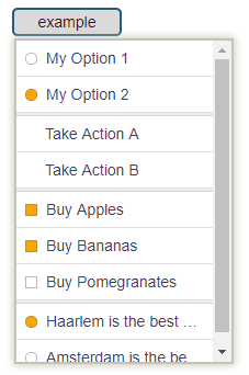
static { var arr: DropDownItemBase = ; arr; // groupBy of 'A' arr; // groupBy of 'A' and set to selected arr; arr; arr; arr; arr; arr; arr; arr; arr; arr; return arr;} static { // 1. create a new DropDownControl for this element var dd: DropDownControl = '#test-menu-lt'; // 2. specify the dropdown items ddgetItems = TestgetDynamicItems; // 3. prevent the dropdown from closing when an ActionItem is clicked ddcloseOnActionItemClick = false; // 4. place event handlers dd { console; //if (item.key == "cancel") dd. } dd { console; } dd { var txt = item ? itemtext : " no item was clicked"; console; }; // 4. create the react dropdown dd;}Showtime!
A mixtures of Action, Option, Header and Seperator items!
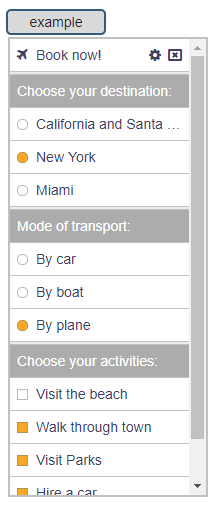
static { var arr: DropDownItemBase = ; var item = "booknow" "Book now!" "fa-plane"; itemdata = pos ; // save some random data with this item item; item; arr; arr; arr; arr; arr; arr; arr; arr; arr; arr; arr; arr; arr; arr; arr; arr; arr; arr; return arr;} static { // 1. create a new DropDownControl for this element var dd: DropDownControl = '#test-menu-lt'; // 2. specify the dropdown items callback ddgetItems = TestgetDynamicItems; // 3. prevent the dropdown from closing when an ActionItem is clicked (you may wish to validate options and close the dropdown manually by calling .close()) ddcloseOnActionItemClick = false; // 4. place event handlers dd { console; } dd { console; } dd { var txt = item ? itemtext : " no item was clicked"; console; }; // 4. create the react dropdown dd;}Styling the Dropdown
It's easy to customise the dropdown and change its look. The easiest way is to simply include this snippet somewhere in your own css.
dda-dropdown-list border: 2px solid #8eab7d!important; dda-dropdown-list > div border-bottom: solid 1px #8eab7d!important; dda-dropdown-list > div:hover background: #8eab7d!important; color: #f6ffae;to get a look like this:
Google Material Design Icons
Try not to mix Font Awesome images with Material-Icons. It will work but there may be some css margin issues.
You can use material-icons by simple passing the name into the ActionItem image field (as you would do for font-awesome). However, I have chosen to use the smaller image of md-18 as default but if you wish to use the google default then either set the className property of the DropDown item to 'md-24' or apply this globally by setting the static property like this: ActionItem.useMaterialImage24 = true;
An example of using material-design images is shown below:
var item = "logout" "Logout" "exit_to_app";//item.className = "md-24"; // use this to enlarge the imagethisfixedItems; thisfixedItems;thisfixedItems; thisfixedItems; var item = "setting" "System Settings" "report_problem";item;itemtextMarginRight = 15;thisfixedItems;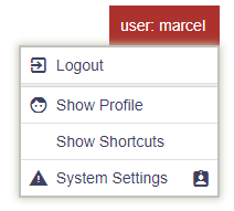
Further Comments
Tooltips
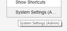
If an item does not fit ellipses are introduced and a tooltip will appear on hovering over the item
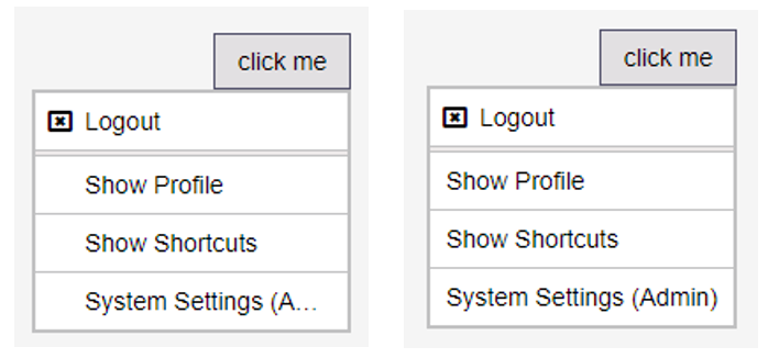
Wrap display text wrap
If an ActionItem with and without images are shown then their display text is aligned by default (alignText = true). Setting this to false will 'wrap' the text to fill up as much space as possible.
History
| version | Notes |
|---|---|
| v 1.2.9 | OpenOnCreate option - if set to true it will force the dropdown to open upon creation (code only!) |
| v 1.2.8 | Direct 'click' callback support on ActionItem |
| v 1.2.7 | Added Async support (dropdown items can now be retrieved asynchronously) |
| v 1.2.6 | Added onHover support |
| v 1.2.5 | Fix for positioning of popup (static pos) |
| v 1.2.4 | Update in TypeScript index.d.ts |
| v 1.2.3 | Better Google Material-Design icons support |
| v 1.2.2 | Small styling changes |
| v 1.2.1 | Styling changes and additional customisation |
| v 1.2.0 | Small but breaking change in the signature of the ActionItem plus some bug-fixes - now supports right images and more predictable popup placing. |
| v 1.1.9 | Linked up with github |
| v 1.1.8 | Improved selector (how to target the correct element - updated code and docs) |
| v 1.1.7 | TypeScript support (now part of the bundle) |
| v 1.1.6 | Fix of position of dropdown if the parent has a scrollbar which is scrolled down |
| v 1.1.3 | Initial release... (some issues with the prior ones...) |