react-digraph
Overview
A React component which makes it easy to create a directed graph editor without implementing any of the SVG drawing or event handling logic.
Installation
npm install --save react-digraphIf you don't have the following peerDependenies, make sure to install them:
npm install --save react react-domUsage
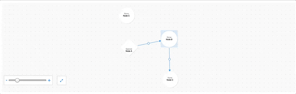
The default export is a component called 'GraphView'; it provides a multitude of hooks for various graph editing operations and a set of controls for zooming. Typically, it should be wrapped in a higher order component that supplies various callbacks (onCreateNode, onCreateEdge etc...).
All nodes and edges can have a type attribute set - nodes also support a subtype attribute. These can be passed to GraphView via the nodeTypes, nodeSubtypes, and edgeTypes props. GraphView will look up the corresponding SVG elements for the node's type/subtype and the edge's type and draw it accordingly.
It is often convenient to combine these types into a configuration object that can be referred to elsewhere in the application and used to associate events fired from nodes/edges in the graphView with other actions in the application. Here is an abbreviated example:
import GraphView from 'react-digraph' const GraphConfig = NodeTypes: empty: typeText: "None" shapeId: "#empty" shape: <symbol ="0 0 100 100" ="empty" ="0"> <circle ="50" ="50" ="45"></circle> </symbol> NodeSubtypes: EdgeTypes: emptyEdge: shapeId: "#emptyEdge" shape: <symbol ="0 0 50 50" ="emptyEdge" ="0"> <circle ="25" ="25" ="8" ="currentColor"> </circle> </symbol> const EMPTY_TYPE = "empty" // Text on empty nodes is positioned differentlyconst NODE_KEY = "id" // Allows D3 to correctly update DOM { ; thisstate = graph: sample selected: } /* Define custom graph editing methods here */ { const nodes = thisstategraphnodes; const edges = thisstategraphedges; const selected = thisstateselected; const NodeTypes = GraphConfigNodeTypes; const NodeSubtypes = GraphConfigNodeSubtypes; const EdgeTypes = GraphConfigEdgeTypes; return <div ='graph' => <GraphView ='GraphView' = = = = = = = = = = = = = = = = =/> </div> ; } A typical graph that would be stored in the Graph component's state looks something like this:
For a detailed example, check out src/examples/graph.js. To run the example:
npm installnpm run examplego to localhost:8000.
- To add nodes, hold shift and click on the grid.
- To add edges, hold shift and click/drag to between nodes.
- To delete a node or edge, click on it and press delete.
- Click and drag nodes to change their position.
All props are detailed below.
Props
| Prop | Type | Required | Notes |
|---|---|---|---|
| nodeKey | string | true | Key for D3 to update nodes(typ. UUID). |
| emptyType | string | true | 'Default' node type. |
| nodes | array | true | Array of graph nodes. |
| edges | array | true | Array of graph edges. |
| selected | object | true | The currently selected graph entity. |
| nodeTypes | object | true | Config object of available node types. |
| nodeSubtypes | object | true | Config object of available node subtypes. |
| edgeTypes | object | true | Config object of available edge types. |
| getViewNode | func | true | Node getter. |
| onSelectNode | func | true | Called when a node is selected. |
| onCreateNode | func | true | Called when a node is created. |
| onUpdateNode | func | true | Called when a node is moved. |
| onDeleteNode | func | true | Called when a node is deleted. |
| onSelectEdge | func | true | Called when an edge is selected. |
| onCreateEdge | func | true | Called when an edge is created. |
| onSwapEdge | func | true | Called when an edge 'target' is swapped. |
| onDeleteEdge | func | true | Called when an edge is deleted. |
| canDeleteNode | func | false | Called before a node is deleted. |
| canCreateEdge | func | false | Called before an edge is created. |
| canDeleteEdge | func | false | Called before an edge is deleted. |
| renderEdge | func | false | Called to render edge geometry. |
| renderNode | func | false | Called to render node geometry. |
| renderDefs | func | false | Called to render svg definitions. |
| renderBackground | func | false | Called to render svg background. |
| readOnly | bool | false | Disables all graph editing interactions. |
| enableFocus | bool | false | Adds a 'focus' toggle state to GraphView. |
| maxTitleChars | number | false | Truncates node title characters. |
| transitionTime | number | false | Fade-in/Fade-out time. |
| primary | string | false | Primary color. |
| light | string | false | Light color. |
| dark | string | false | Dark color. |
| style | object | false | Style prop for wrapper. |
| gridSize | number | false | Overall grid size. |
| gridSpacing | number | false | Grid spacing. |
| gridDot | number | false | Grid dot size. |
| minZoom | number | false | Minimum zoom percentage. |
| maxZoom | number | false | Maximum zoom percentage. |
| nodeSize | number | false | Node bbox size. |
| edgeHandleSize | number | false | Edge handle size. |
| edgeArrowSize | number | false | Edge arrow size. |
| zoomDelay | number | false | Delay before zoom occurs. |
| zoomDur | number | false | Duration of zoom transition. |
| graphControls | boolean | true | Whether to show zoom controls. |
Notes
- To run the tests, you'll need to be using at least node v4.0 (for jsDom).