React Dialogify


React-Dialogify allows you to add dialogs to your app, fast and easy.
Features
- Super fast setup - Plug & Play.
- Customizable - Use with predefined styles or use your own.
- Programmatically controlled - With a couple of functions you can make it show/close from anywhere in your app.
- No Redux/State required - Don't need to set Actions or States in your App to control it.
Installation
$ yarn add react-dialogify
or
$ npm install --save react-dialogify
Usage
Add the DialogContainer at the root level of your App, or as children of any specific container in your App. But remember to add it only once in your App.
import React, { Component } from 'react';
import { DialogContainer, dialog } from 'react-dialogify';

class App extends Component {
  showDialog = () => {
    dialog.show({
        title: 'Hello World!'
        text: 'This is your text in the dialog'
    });
  }

  render() {
    return (
        <div>
          <button onClick={this.showDialog}> Show Dialog </button>
          <DialogContainer />
        </div>
    );
  }
}
Using default dialog with predefined types
Methods
| Method | Description |
|---|---|
| success | Display default dialog with the success context (color green) |
| error | Display default dialog with the error context (color red) |
| warning | Display default dialog with the warning context (color gold) |
| pending | Display default dialog with the pending context (color light blue) |
| info | Display default dialog with the info context (color blue) |
| close | Close the dialog |
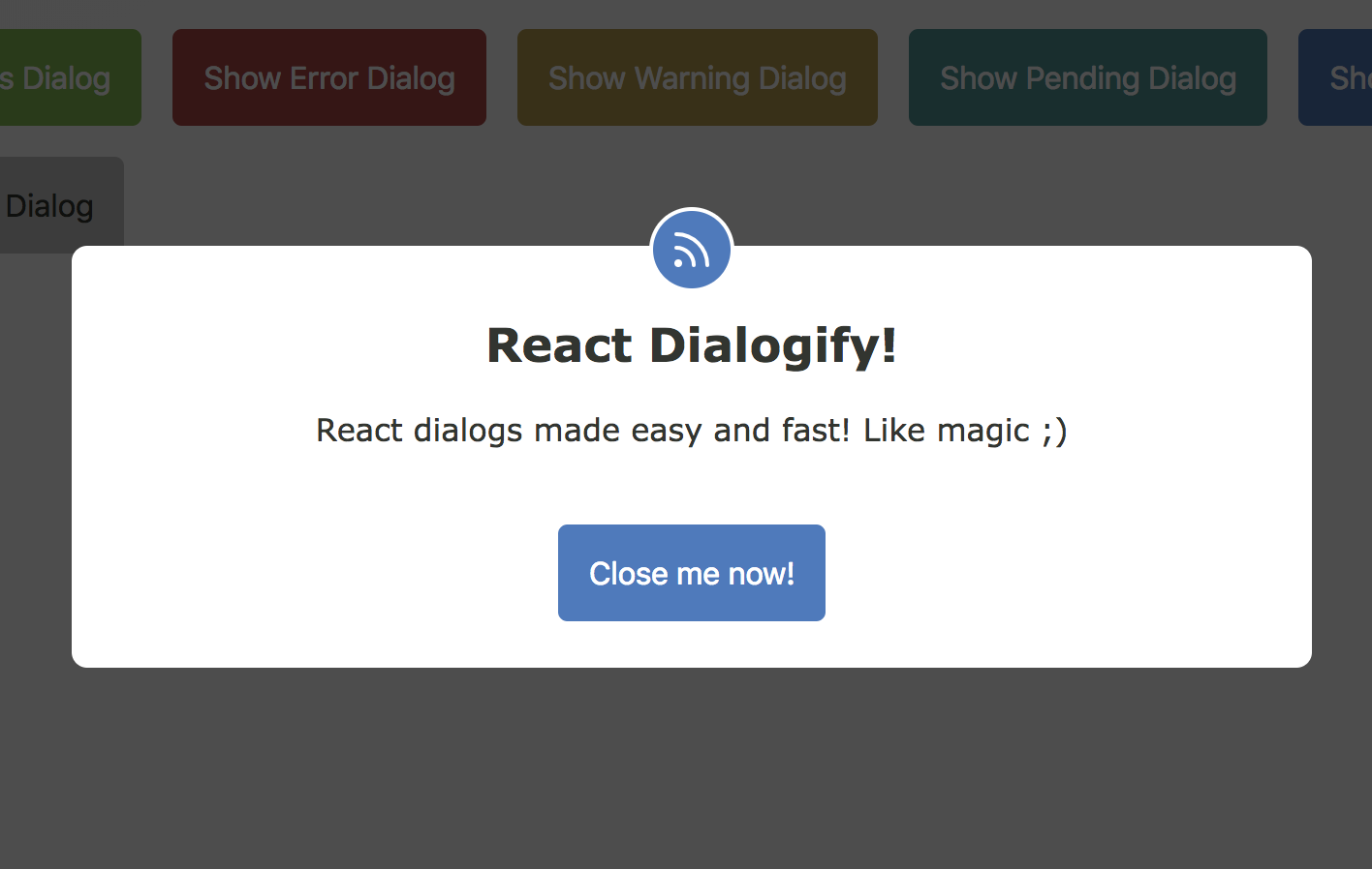
Example:
dialog.info({
  title: 'News! Some tips!',
  text: 'Read this! This dialog shows you some useful info!',
  btnText: 'Close me now!',
  btnOnClick() { dialog.close(); },
});
Required options
| Name | Type | Description |
|---|---|---|
| title | String | Displayed as title in the dialog |
| text | String | Displayed as content in the dialog |
| btnText | String | Displayed as text in the dialog's button |
| btnOnClick | function | Method called in the onClick event of the dialog's button |
Using a custom dialog component
You are able to use your own Dialog React Component, you just need to make sure your component takes the options as props. There are two ways:
1. Passing the Component to DialogContainer as a Prop
When you setup the DialogContainer in your App, you can pass to it the prop template to use a custom Dialog Component.
Example:
// App.js
import MyComponent from './my-component';

// ..... //

render() {
  return (
      <div>
        <button onClick={this.showDialog}> Show Dialog </button>
        <DialogContainer template={MyComponent} />
      </div>
  );
}
2. Passing the Component Argument
The show method takes as a second argument a React Component, the DialogContainer will pass the options argument as props to your Component, this way you can change the Dialog component on the fly!
Your component can take any props you decide :)
Example:
// App.js
import MyComponent from './my-component';

// ..... //
showDialog = () => {
  dialog.show({
      headline: 'Custom prop',
      content: 'Custom prop',
      cancelBtnText: 'Custom prop',
      submitBtnText: 'Custom prop'
  }, MyComponent);
}
render() {
  return (
      <div>
        <button onClick={this.showDialog}> Show Dialog </button>
        <DialogContainer />
      </div>
  );
}
Demo
You want to see some examples? Go to Online Demo