DatePicker
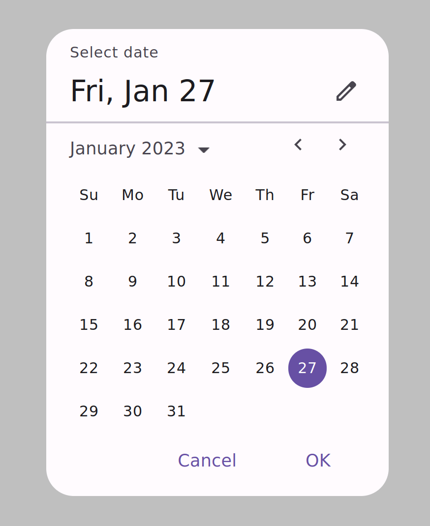
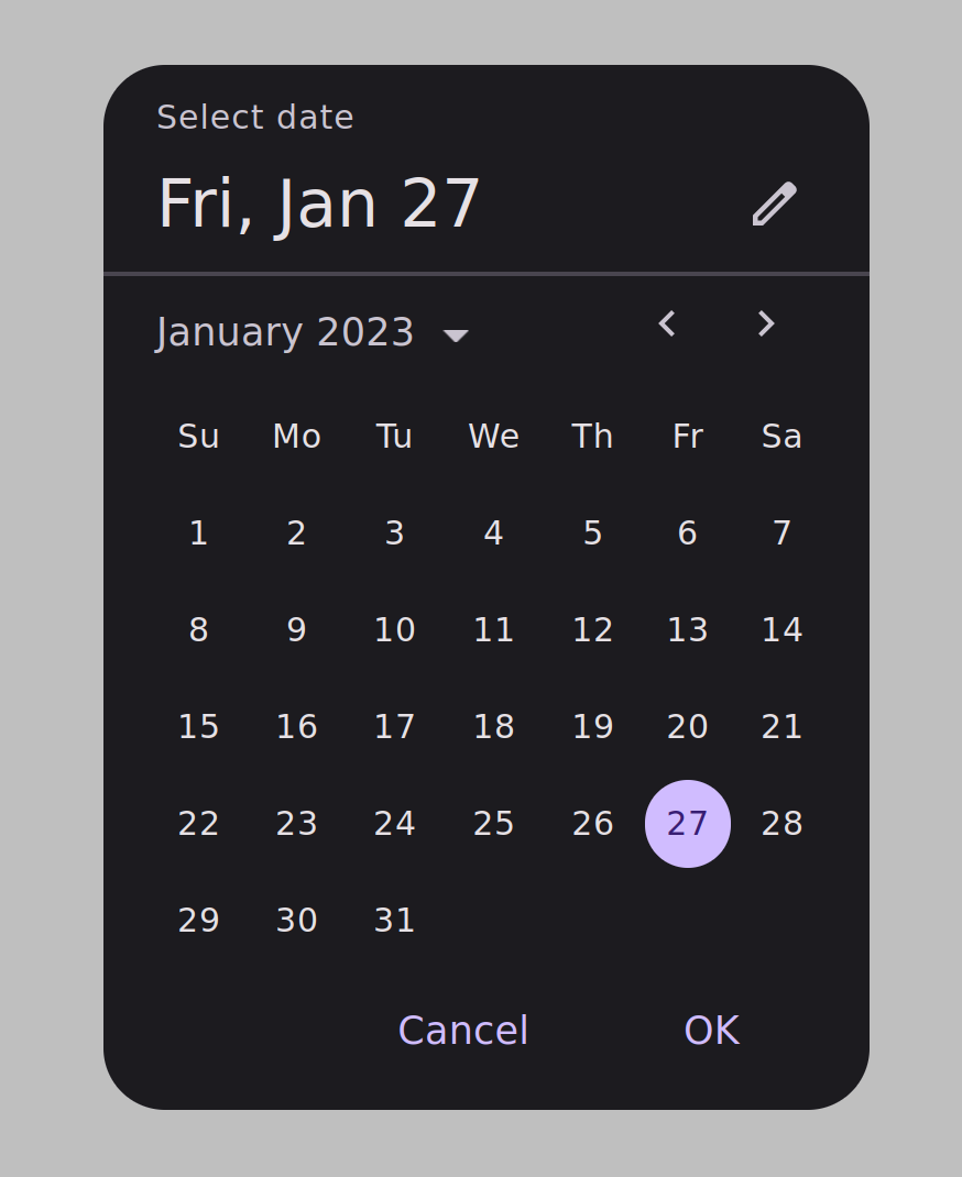
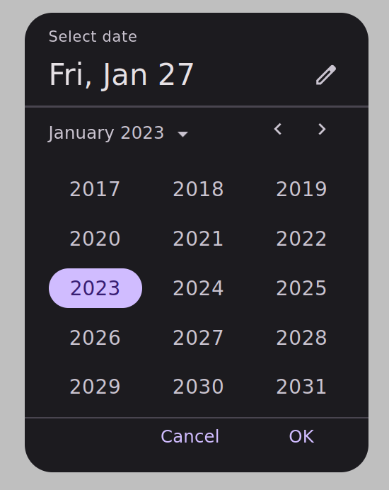
DatePicker is a user interface component that allows the user to easily select a specific date. It provides an analog clock interface that is easy to use and intuitive. DatePicker can be easily integrated into other user interface components, making it a perfect choice for applications that require the user to select a time.
Features
- DatePicker appearance is based on Material design v3.
Installation
To install DatePicker, run the following command:
npm install react-date-picker-material
Interactive Demo
To see DatePicker in action, you can use the following link: https://sh90fu.csb.app/
Usage
To use DatePicker in your React application, import the DatePicker component and use it in your JSX code:
import DatePicker from 'react-material-date-picker';
Once you have imported the component, you can use it in your app as follows:
  function App() {
    const [ date,setDate ] = useState(Date.now());
    const [ show,setShow ] = useState(true);
    function handleSelect() {
        alert('Saved!')
        setShow(false);
    }
  return (
    <div className="App">
      <button onClick={()=>setShow(true)}>
          Click me!
      </button>
        <div>Date: {date}</div>
      <DatePicker date={ date }
                  show={ show }
                  hide={ ()=>setShow(false)}
                  selectDate={ handleSelect }
                  setDate={ setDate }
                  theme={ 'dark' }
                  title={ 'Select a date' }
                  style={{ fontFamily:'Roboto',
                            width:'300px',
                            top:'10px',
                            zIndex:'1000'
                  }}
                  colors={{
                       light:{
                       primary : '#674444',
                       onSurfaceVariant: '#49454F',
                       onSurface: '#1C1B1F',
                       outlineVariant:'#CAC4D0',
                       scrim:'rgb(0,0,0,0.25)',
                       onPrimary: '#ffffff',
                       surface3: `linear-gradient(0deg, #FFFBFE, #FFFBFE),` +
                       `linear-gradient(0deg, rgba(103, 80, 164, 0.11), rgba(103, 80, 164, 0.11))`

                      },
                       dark: {
                       primary : '#D00000',
                       onSurfaceVariant: '#CAC4D0',
                       onSurface: '#E6E1E5',
                       outlineVariant:'#49454F',
                       scrim:'rgb(0,0,0,0.25)',
                       onPrimary: '#381E72',
                       surface3: 'linear-gradient(0deg, #1C1B1F, #1C1B1F),' +
                       '    linear-gradient(0deg, rgba(208, 188, 255, 0.11), rgba(208, 188, 255, 0.11))'
                     }
                   }}
      />
    </div>
  );
}
Props
DatePicker has the following props:
-
title: The title that will be displayed at the top of the DatePicker modal. -
hide: A function for hiding the modal from the page -
show: A boolean value for showing the modal -
setDate: A function to set the new date -
selectDate: A function that runs after the user clicks on 'OK', can be used to hide the menu or show a warning or message to the user -
date: Is a default value for date in form of a unix timestamp. By default this value is on the day timestamp. -
theme: Which can have two values of 'light' or 'dark'. This variable has set 'light' by default. -
style: Is an optional variable for styling the component. Can be used for changing font-family and etc. -
colors: An optional variable in form of an object including two objects named light and dark, which are possible modes of theme, that by default is on 'light' mode
Colors Variables
Each of the objects in the light and dark modes must include the following variables:
-
primary: a CSS color value that represents the primary color of the theme used in buttons and the calendar -
onSurface:a CSS color value that represents the color of text or other elements on top of the surface color -
onSurfaceVariant: a CSS color value that represents the color of text or other elements on top of the surface variant color -
outlineVariant: a CSS color value that represents the color of the lines -
scrim: a CSS color value that represents the scrim color of the theme -
onPrimary: a CSS color value that represents the color of text or other elements on top of the primary color -
surface3: a CSS color value that represents the background color of the modal.


