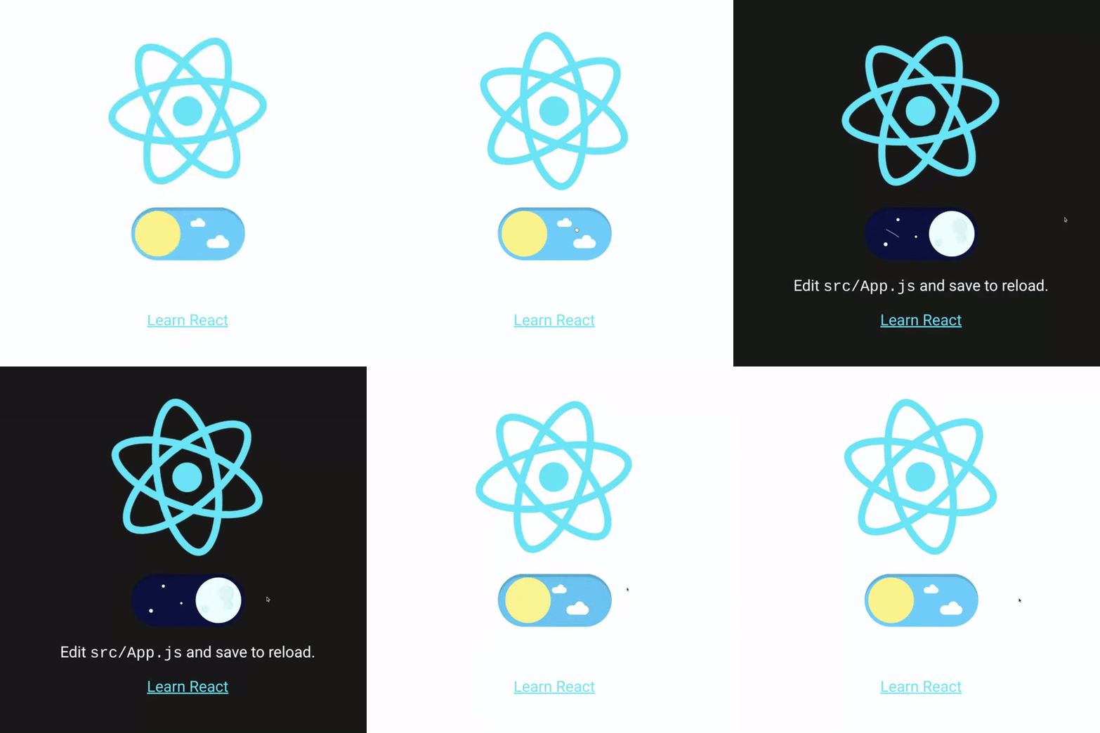
react-dark-mode-toggle-2
A cute dark mode toggle 🦉
🗝 Key features
🚀 Installation
yarn add react-dark-mode-toggle-2or
npm install react-dark-mode-toggle-2 --saveor
pnpm add react-dark-mode-toggle-2✨ Usage
import React from "react";
import { DarkModeToggle } from "react-dark-mode-toggle-2";

export const YourComponent = () => {
  const [isDarkMode, setIsDarkMode] = React.useState(false);

  return (
    <DarkModeToggle
      onChange={setIsDarkMode}
      isDarkMode={isDarkMode}
    />
  );
};
📌 Props
| Prop | Type | Default | Required |
|---|---|---|---|
isDarkMode |
boolean | N/A | Yes |
onChange |
function that recieves a single argument: the new value of isDarkMode
|
N/A | Yes |
size |
number (defaults to px) or a string containing a number+unit (e.g "10px", "2em", "4.5rem", "100%", etc). These units may also have a space between them (e.g. "10 px", "2 em", etc). |
85px |
No |
speed |
number | 1.3 |
No |
className |
string | '' |
No |
id |
string | '' |
No |
Note, this is not a dark mode theme implementation; it's just a button! You'll need to mix this with a management solution such as use-dark-mode.
📝 Notes
In Chrome, you may experience a blue outline around the toggle button after clicking it. If this behavior concerns you see this issue for more information and available workarounds.
🤝 Original Work
Original library react-dark-mode-toggle was created by Alex Thoma. Credit to them and the community for the original work.


