
React components with Dark and Light Mode
Live Demo 🔥
📚 Docs
See the documentation with live editable examples and API documention.
⚙ Installation
$ npm install react-dark-light-ui📷 Example GIFs
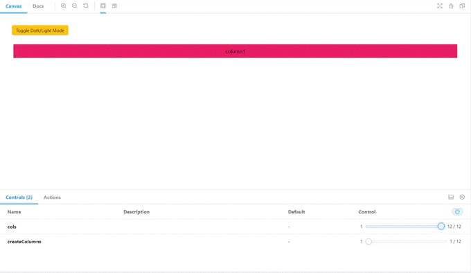
👉 Grid Component
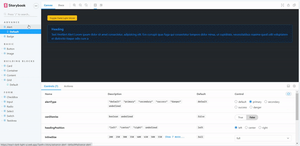
👉 Alert Component
🎉 Usage
Here is a quick example to get you started, it's all you need:
import React from 'react';import ReactDOM from 'react-dom';import 🌎 Cross-browser compatibility
React-dark-light-ui is compatible with almost all the browsers available, including some legacy ones that are still used. This includes but is not limited to:
✔️ Google Chrome
✔️ Safari
✔️ Mozilla Firefox
✔️ Microsoft Edge
✔️ Internet Explorer 11 and more
🚀 Looking for contributors 🚀
This package is under development.... !