
react-constraint-layout
react-constraint-layout is a Javascript library that provides a constraint based solution to position HTML elements relative to each other and to the parent with zero CSS.
You can support the project by starring it on Github. Click here to visit the projects Github page
If you like this project, you can support it by becoming a patreon here
Install
npm install --save-dev react-constraint-layoutor
npm i -D react-constraint-layoutScreenshots
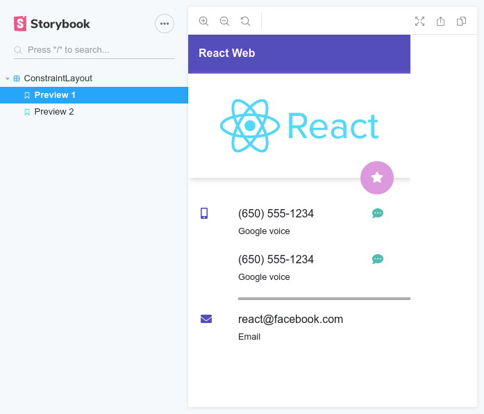

No, those screenshots are not Android. That's React, and the best part; they were done with zero CSS (No Bootstrap, No Flexbox, No CSS grid)
Usage
Below is an example of how you'd use the <ConstraintLayout />.
import { ConstraintLayout, ConstraintGuide } from "react-constraint-layout"; <ConstraintLayout width="200px" height="400px"> <ConstraintGuide id="guide1" orientation="vertical" percent="50%" /> {/* ConstraintGuide id="guide1" orientation="vertical" begin="100px" /> This works too */} <div leftToLeftOf="_parent" rightToLeftOf="guide1" height="match-parent"> Left box </div> <div leftToRightOf="guide1" rightToRightOf="_parent" height="match-parent"> Right box </div></ConstraintLayout>The width and height of the
<ConstraintLayout />are optional. If width is not provided, the component will be the same width as its parent. If the height is not specified, it will be as tall as its content.
The _parent string is a special reference to the parent
<ConstraintLayout />
Props
From the example above, you can see that the props can be specified even on HTML elements. The props are read by the <ConstraintLayout /> and stripped out before the children are rendered.
The table below lists the props that are available for children of the <ConstraintLayout />:
| Prop | Type | Description |
|---|---|---|
id |
string |
The identifier for the component. This is necessary if other views will be constrained to it. |
width |
string or number |
The width of the component in px. Defaults to 0px (E.g. 20px or 20) |
height |
string or number |
The height of the component in px. Defaults to 0px (E.g. 50px or 50) |
marginTop |
string or number |
The top margin of the component |
marginLeft |
string or number |
The left margin of the component |
marginRight |
string or number |
The right margin of the component |
marginBottom |
string or number |
The bottom margin of the component |
leftToLeftOf |
string or Array |
Indicates that the left of this component is aligned to the left of another component specified by this id |
leftToRightOf |
string or Array |
Indicates that the left of this component is aligned to the right of another component specified by this id |
rightToRightOf |
string or Array |
Indicates that the right of this component is aligned to the right of another component specified by this id |
rightToLeftOf |
string or Array |
Indicates that the right of this component is aligned to the left of another component specified by this id |
topToTopOf |
string or Array |
Indicates that the top of this component is aligned to the top of another component specified by this id |
topToBottomOf |
string or Array |
Indicates that the top of this component is aligned to the bottom of another component specified by this id |
bottomToBottomOf |
string or Array |
Indicates that the bottom of this component is aligned to the bottom of another component specified by this id |
bottomToTopOf |
string or Array |
Indicates that the bottom of this component is aligned to the top of another component specified by this id |
horizontalBias |
number |
The bias used to shift the component along its constraint axis if it is fully horizontally constrained. Ranges from 0 to 1. Defaults to 0.5 |
verticalBias |
number |
The bias used to shift the component along its constraint axis if it is fully vertically constrained. Ranges from 0 to 1. Defaults to 0.5 |
The
widthandheightprops can be set to match-content or match-parent. This sets the dimension to match the content width/height or the parent width/height respectively
Responsiveness
Except for id, all the props above can be prefixed to make them responsive.
The table below shows the responsive prefixes and window sizes for triggering them:
| Prefix | Window size | Example |
|---|---|---|
sm_ |
576px to 768px | sm_leftToLeftOf |
md_ |
768px to 992px | md_leftToLeftOf |
lg_ |
992px to 1200px | lg_leftToLeftOf |
xl_ |
Above 1200px | lg_leftToLeftOf |
The looks for the prop variant in the order of
xl_->lg_->md_->sm_. If none of those are found, the non-prefixed variant is used. If none of these exist, the prop is skipped.
An example of how the prefixes are used is shown below:
<div leftToRightOf="guide1" sm_leftToRightOf="guide2" topToTopOf="_parent" md_topToTopOf={null}> Right box</div>In this case, on a small screen, leftToLeftOf will have a value of guide2 instead of guide1 but on an extra small screen, leftToLeftOf will then have a value of guide1. Also in medium screens and above, topToTopOf is overridden with null.
Nesting
The <ConstraintLayout /> can be nested within another <ConstraintLayout />. In this case, you can use all the available props on it as well.
Using with custom components
If you'd like to use custom components as direct children of <ConstraintLayout />, you must wrap your component definition with React.forwardRef() to make the ref available to the root DOM element of the component.
For example, say you have this component:
const MyFancyButton = ({ children, ...rest }) => { return ( <button {...rest}> {props.children} </button> );}Now you'd like to use this component as a child of the <ConstraintLayout /> like so:
<ConstraintLayout> <MyFancyButton /></ConstraintLayout>To make this work, you'll have to modify your component to:
const MyFancyButton = React.forwardRef (({ children, ...rest }, ref) => { // Notice how the forwaded ref is used as the ref of button return ( <button ref={ref} {...rest}> {props.children} </button> );})However if the component is not yours (I.e. from another library), you can just enclose it in a <div /> and add the constraints on the <div /> itself.
ConstraintGuide
This is a non-visual component that serves as an anchor for other components. For example, if you want a component aligned at 20% from the left of the parent, you'd create a <ConstraintGuide /> and set its percent to 20%.
A good way to think of this component is as an invisible ruler within the <ConstraintLayout />.
It supports the following props:
| Prop | Type | Description |
|---|---|---|
id |
string |
The identifier for the guide. This is necessary if other views will be constrained to it. |
orientation |
string Can be vertical or horizontal |
Sets the orientation of the guide |
begin |
string or number |
The starting point of the guideline in px. If orientation is horizontal, it will be that number of pixels from the left of the <ConstraintLayout /> |
end |
string or number |
The starting point of the guideline in px. If orientation is horizontal, it will be that number of pixels from the right of the <ConstraintLayout /> |
percent |
number |
The starting point of the guideline in %. If orientation is horizontal, it will be that percentage of the <ConstraintLayout /> width from the left |
Examples
The examples folder contains code samples for the two user interfaces showcased in the screenshots.
Maintainers
Contributing
If you'd like to contribute to the project development, you can do so by:
- Clone the project from here
- Start storybook server by using
npm run storybook - Add features to project
- Create a PR on the project
I'll then review the pull request and if all checks out, it'll be merged to the master branch and you'll be added to the list of maintainers
Support
If you'd like to support this project, you can do so by becoming a patreon on Patreon
It would be really helpful if you can star the project on Github
Licence
MIT (c) Kwame Opare Asiedu
Changelog
- 2.0.0 (Breaking)
- Complete rewrite of the library's core.
- Added support for use of native HTML elements directly as children, hence
<ConstrainedView />is now not included in public API - Added support for responsive attribute prefixes, hence
useWindowBreakpointsis now removed from library - Added support for automatic height computation of parent
<ConstraintLayout />if height prop is not specified - Improved algorithm for
match-contentheight computation
- 1.0.2
- Fixed solver update on window resize feature in
<ConstraintLayout />component - Added
useWindowBreakpointshook. Handy for conditional rendering at different window breakpoints - Added optional types to props
- Fixed rollup configuration issue causing watch mode to fail after first trigger in development mode
- Fixed solver update on window resize feature in
- 1.0.1
- Fixed issue #1
- 1.0.0
- Initial release