🏛 react-columned


A component that, based on container's width, sorts given child nodes into a preferred number of columns.
Install
npm install --save react-columned
Or if you prefer yarn:
yarn add react-columned
Quick Example:
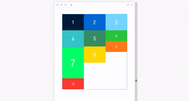
Sort images into columns. Use default columns configuration.
;<Columned> <img alt="Image 1" src="https://..." /> <img alt="Image 2" src="https://..." /> <img alt="Image 3" src="https://..." /> <img alt="Image 4" src="https://..." /> <img alt="Image 5" src="https://..." /> <img alt="Image 6" src="https://..." /> <img alt="Image 7" src="https://..." /> <img alt="Image 8" src="https://..." /> <img alt="Image 9" src="https://..." /> <img alt="Image 10" src="https://..." /></Columned>; Visit https://react-columned.netlify.com to see it live in action.
How it works
The component uses element-resize-detector
(which is the only dependency of this package) to get the
container's width. Based on received result, it then sorts the child
nodes into a needed number of columns, which are simple inline-block divs.
Props
| Prop | Type | Default | Description |
|---|---|---|---|
children |
React.Node |
null | Child nodes which are about to be sorted into columns |
className |
?string |
undefined | Class to append on columns container. |
columns |
{ [string] : number } \| number |
{ "320": 1, "480": 2, "800": 3, "1366": 4, "1920": 6 } |
Number of columns, per container size, eg. { "320": 1, "480": 2, "800": 3, "1366": 4 }. If you need a fixed amount of columns, regardless of the screen size, just pass a number, eg. 4. |
The default { "320": 1, "480": 2, "800": 3, "1366": 4, "1920": 6 }
translates to the following:
container <= 320px: 1 column321px <= container <= 480px: 2 columns481px <= container <= 800px: 3 columns801px <= container <= 1366px: 4 columns1367px <= container: 6 columns
Troubleshooting
If you're having visual issues, try applying the following two CSS rules on every child node:
display: 'block'; // Prevents spacing between child nodes in a column.
width: 100% // Child nodes might be wider than the column, this prevents it.
You can easily do this by setting a class on the <Columned> component.
For example, if the child nodes are img elements (using emotion for defining styles):
const columnedStyles = css({
    img: {
        display: "block",
        width: "100%"
    }
});
<Columned className={columnedStyles}>
    (...)
</Columned>
Contributors
Thanks goes to these wonderful people (emoji key):
 Adrian Smijulj 💻 📖 💡 👀 ⚠️ |
|---|
This project follows the all-contributors specification. Contributions of any kind welcome!